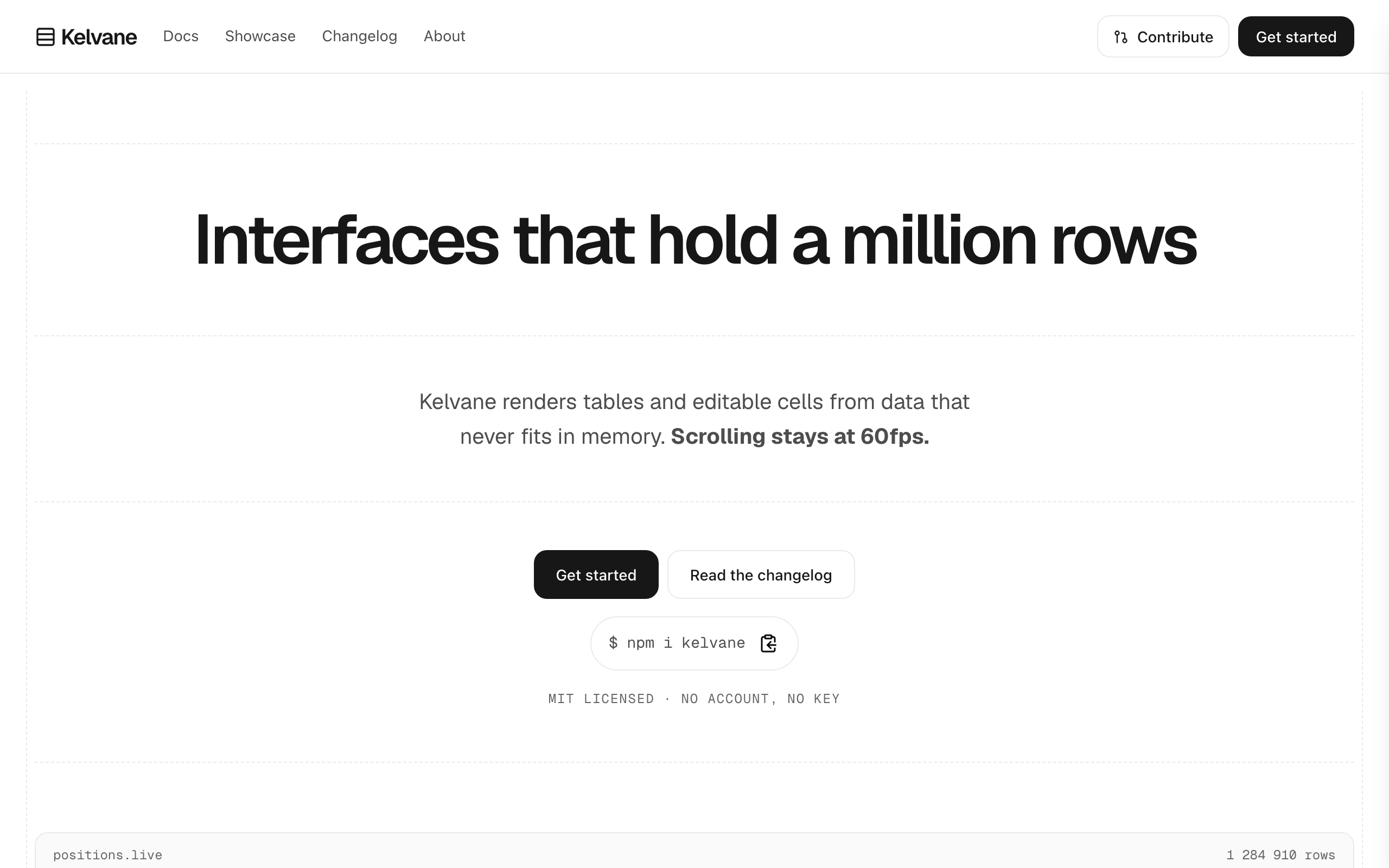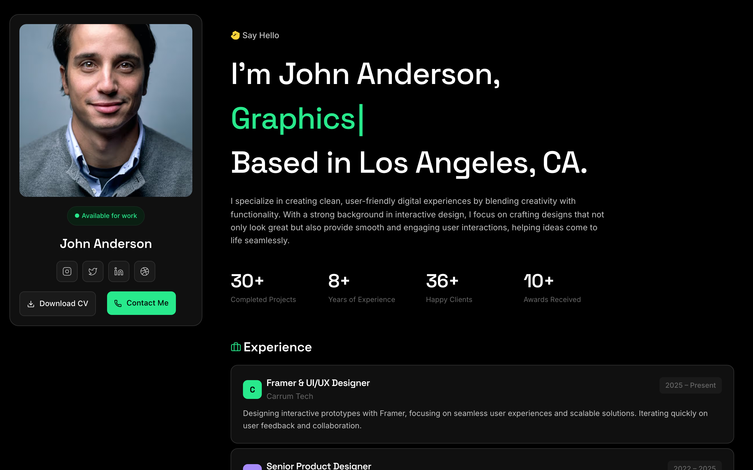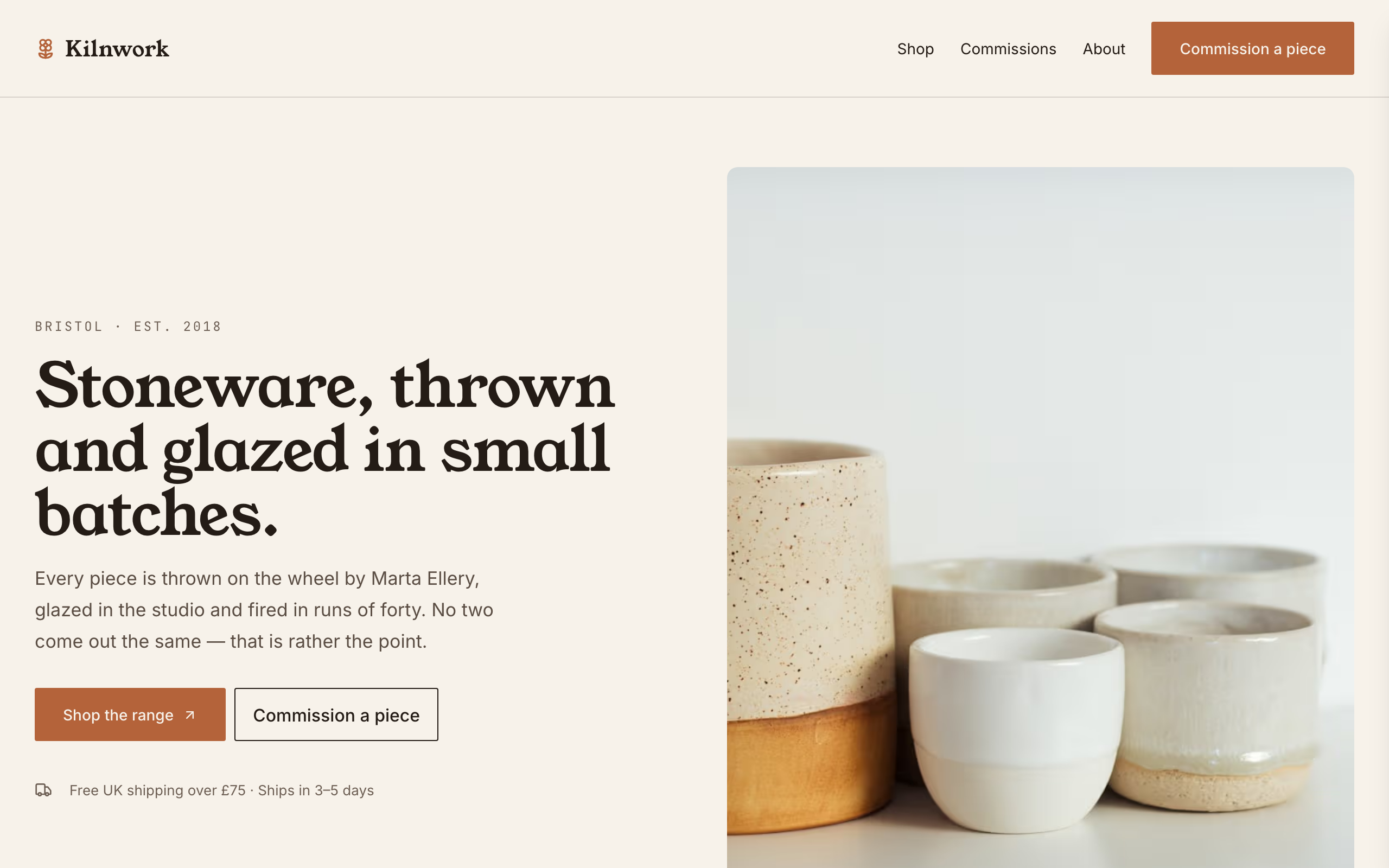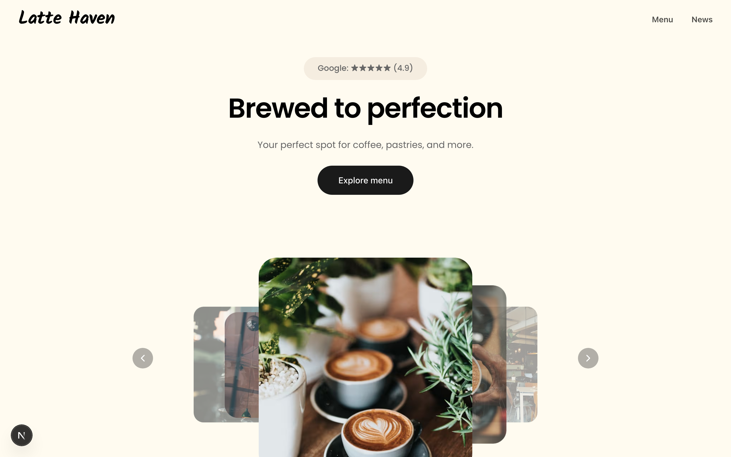
Hand-tuned starting points across portfolio, business, food, SaaS, academic, and more — describe your site and Claude customizes one for you.
Each template is an example of a website you can build with Sitelas. Sitelas sells the website builder — a software subscription — not the products or services these examples depict.
56 templates

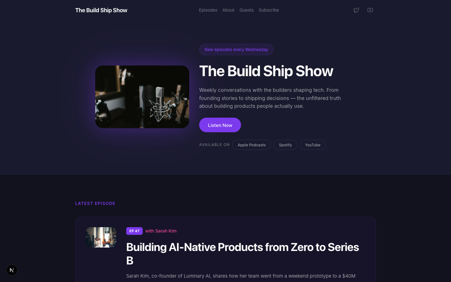
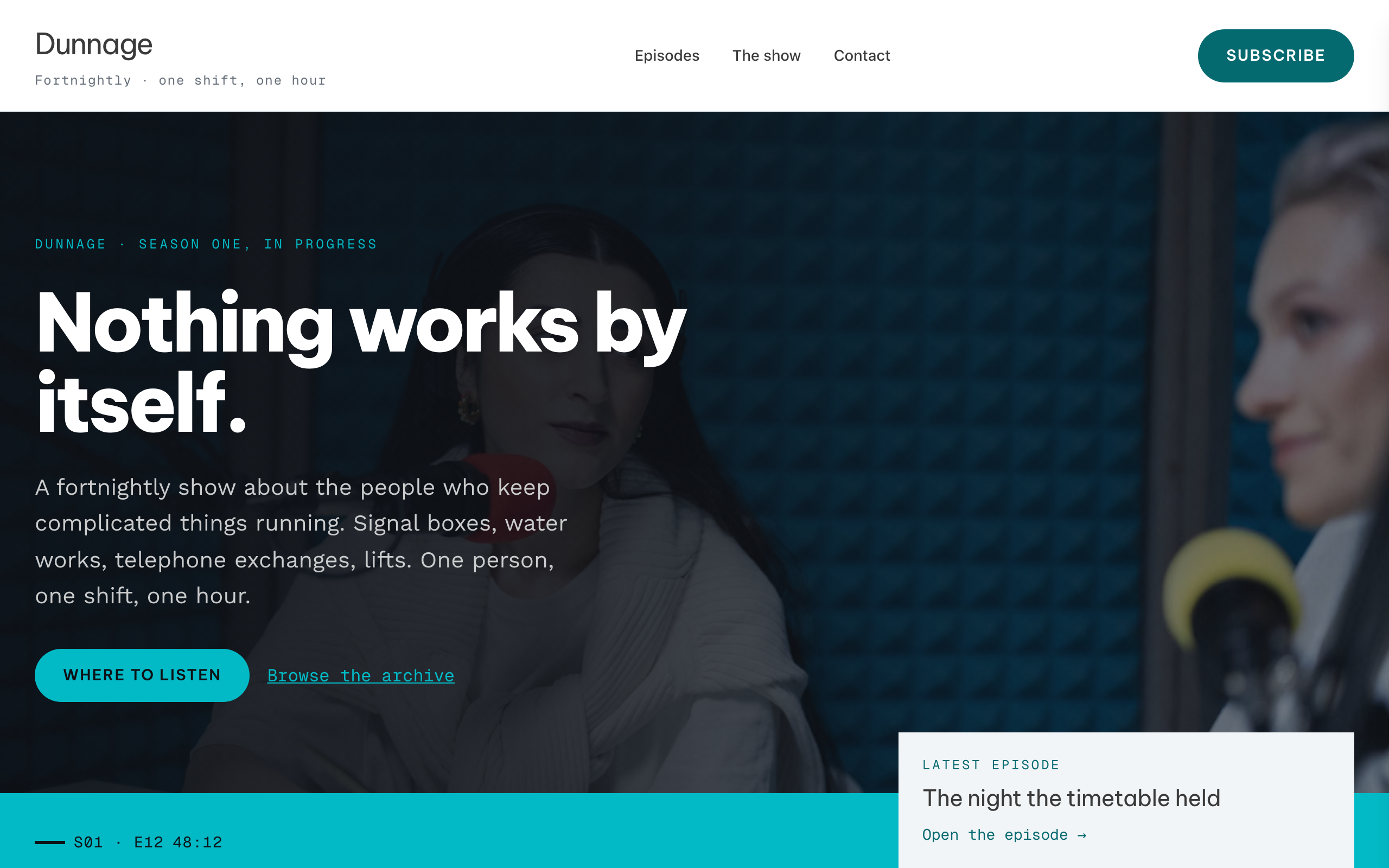
A bold podcast and creator page with dark charcoal tones, electric purple accents, episode listings, guest spotlights, and platform subscription links — designed for shows that want to look as good as they sound.

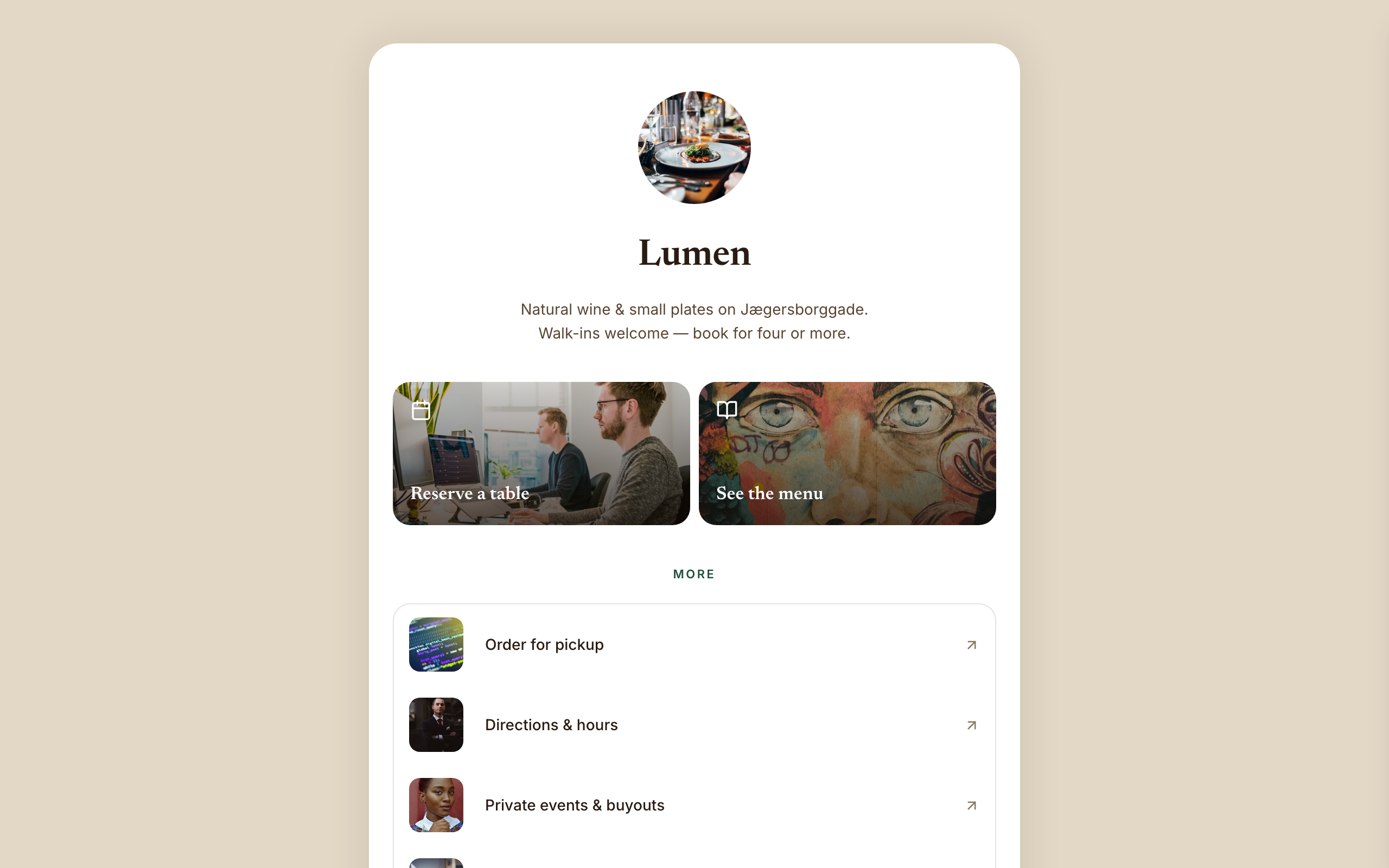
Warm hospitality link-in-bio for a café, wine bar, or restaurant — a faithful Linktree profile-card. A warm-sand page gutter with one elevated, fully-rounded ~600px centered white card; no header, no footer, and no email-capture section (a venue converts on reserve/menu/call). Ink-brown type, a bottle-green accent, Newsreader + Inter. Inside the card: circular logo → serif name → one-line bio → a 2-up photo-backed action pair (Reserve · Menu) → a grouped flat list panel with photo thumbnails → a social/contact row with a real tap-to-call link, then a horizontal 'on now' shelf of 3 Stripe items, and a short about block the card ends on. The action tiles ARE the conversion (menu-reservation).

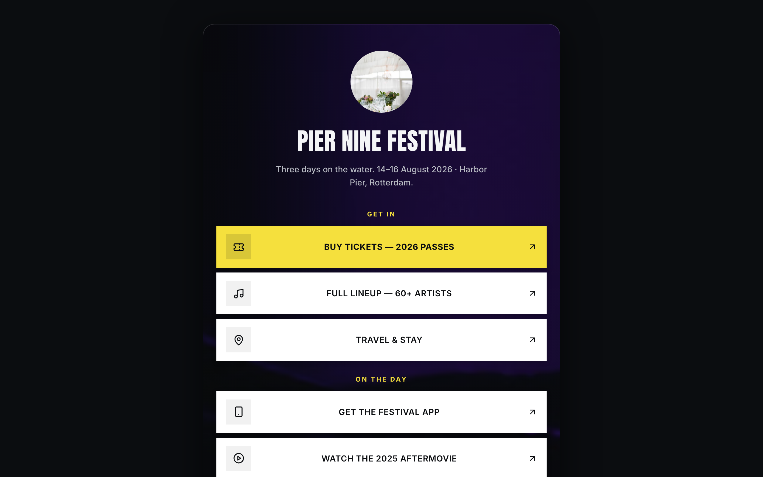
Brand/organization link-in-bio for festivals and live events — a faithful Linktree profile-card. A plain near-black page gutter with one elevated, fully-rounded ~600px centered card; the darkened event photo lives INSIDE the card. No header, no footer. Off-white type, festival-yellow accent, Anton + Inter. Inside the card over the photo: circular logo → bold condensed name → dates/location line → vertical stack of sharp white cards (square logo tile, 2-line label; the priority Buy-tickets card filled festival-yellow) → social-icon row, then a stacked passes strip with Stripe buy buttons, a short about block, and the inline presale-list capture the card ends on. The cards ARE the conversion (ticket-sale).

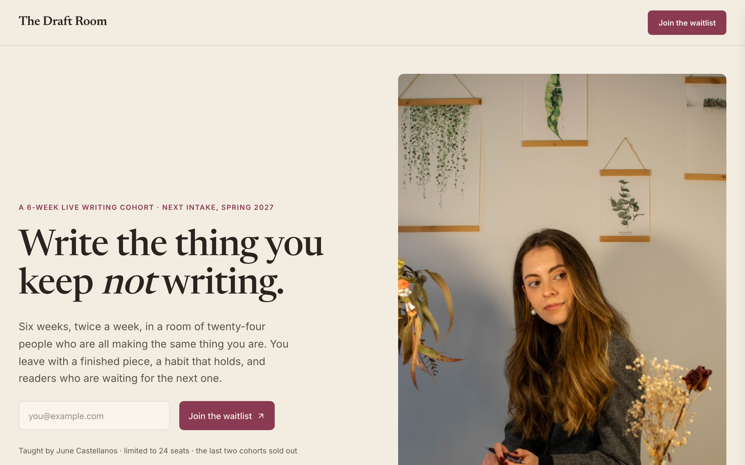
Waitlist for a cohort-based COURSE — the first education/creator-course waitlist in the catalog. Instructor-led register: warm paper, ink, a single plum accent, Newsreader (a bookish reading serif) against Inter — warm and personal, deliberately NOT the cream-serif-terracotta default. Course-native signatures no product waitlist has: an instructor front-and-centre with a portrait (the teacher is the draw), a 'cohort at a glance' details card (format / duration / commitment / cohort size / next date / investment), a week-by-week syllabus, past-cohort testimonials with star ratings, and a 'join the waitlist for the next cohort' form. Single-page: split hero (waitlist form + instructor portrait) → cohort details card → six-week syllabus → who's teaching → testimonials → waitlist-momentum band → FAQ → waitlist CTA → footer. Conversion is newsletter-signup (join the next-cohort waitlist). Demo persona is 'The Draft Room', a 6-week live writing cohort taught by June Castellanos, but the design suits any cohort course or bootcamp. Distinct from every software / product / real-estate waitlist.

Register-your-interest pre-launch for a new residential DEVELOPMENT — the first real-estate waitlist in the catalog. Image-led architectural register: cool limestone, ink, a single deep architectural-green accent, Bodoni Moda display against Inter — deliberately NOT the warm-cream-serif default. Real-estate-native signatures no software or product waitlist has: a register-interest form (name + email), a residences table (home type / size / from-price / availability), a location datasheet (walk-times to the neighbourhood), and a completion timeline. Single-page: split hero (register form + architectural photograph) → the homes table → the place / walk-times → the interiors (image + materials) → a philosophy statement → register-momentum band → FAQ → register CTA → footer with the developer disclaimer. Conversion is newsletter-signup (register your interest, no reservation). Demo persona is 'Marlowe Yard', 48 canalside homes in the Jordaan, Amsterdam, but the design suits any boutique development launch. Distinct from reyes (broker LISTINGS site, multi-page, lead-form) and from every software / product waitlist.

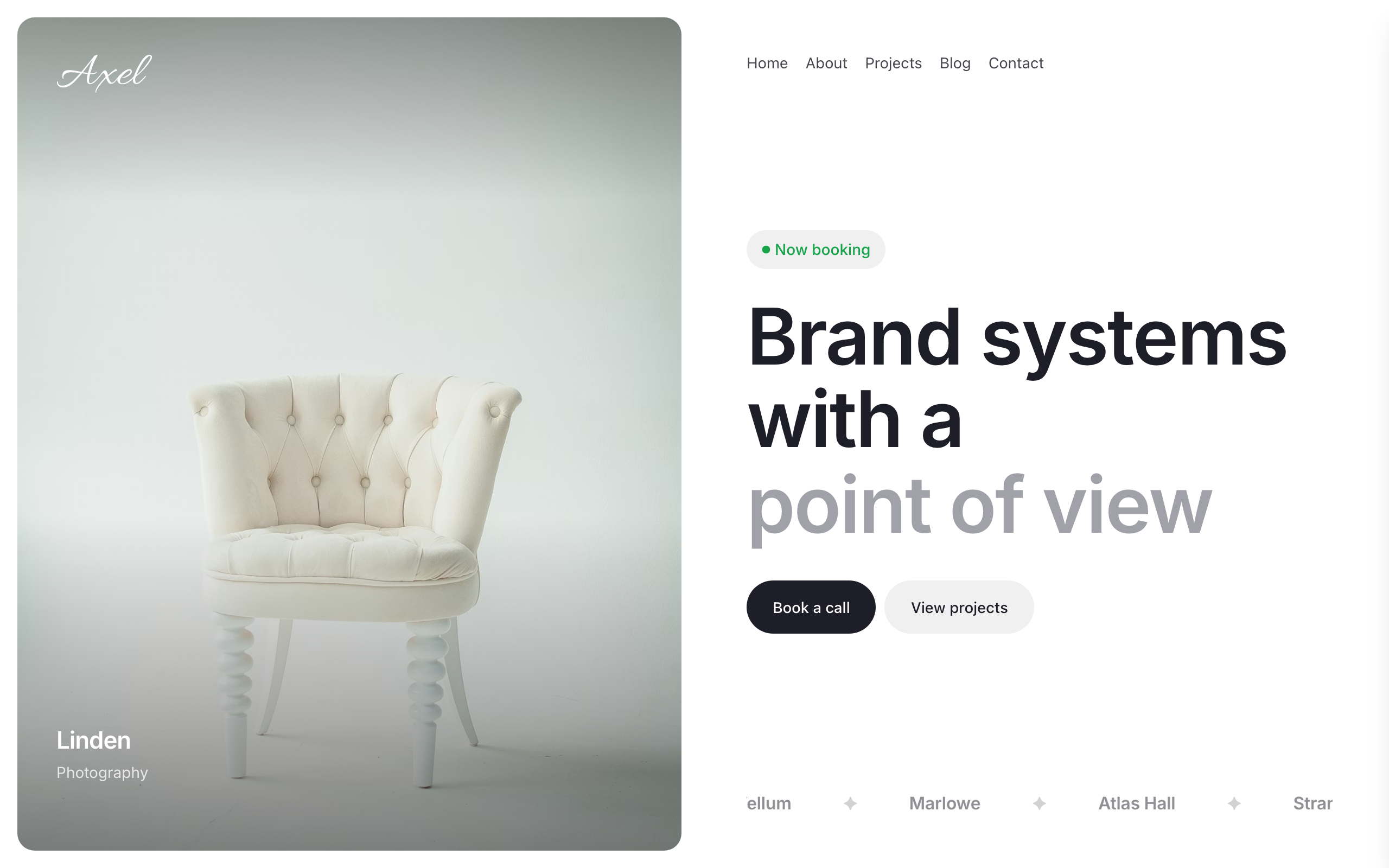
Split-screen personal portfolio for solo creatives. Left half is a full-bleed image rail with a handwritten brand mark and overlay project labels. Right half is a typography-led content rail with nav, status pill, and oversized headline. Five-page narrative (Home / About / Projects / Blog / Contact) with a status-pill conversion strip and a structured project list. Inter body, Style Script signature, Allura brand mark, neutral light palette with a single green status accent.
All-day neighborhood café / service template. Warm stone paper with hand-cut Young Serif display. Casual, approachable — for cafes, salons, clinics, gyms. Use midnight-creative for fine dining.

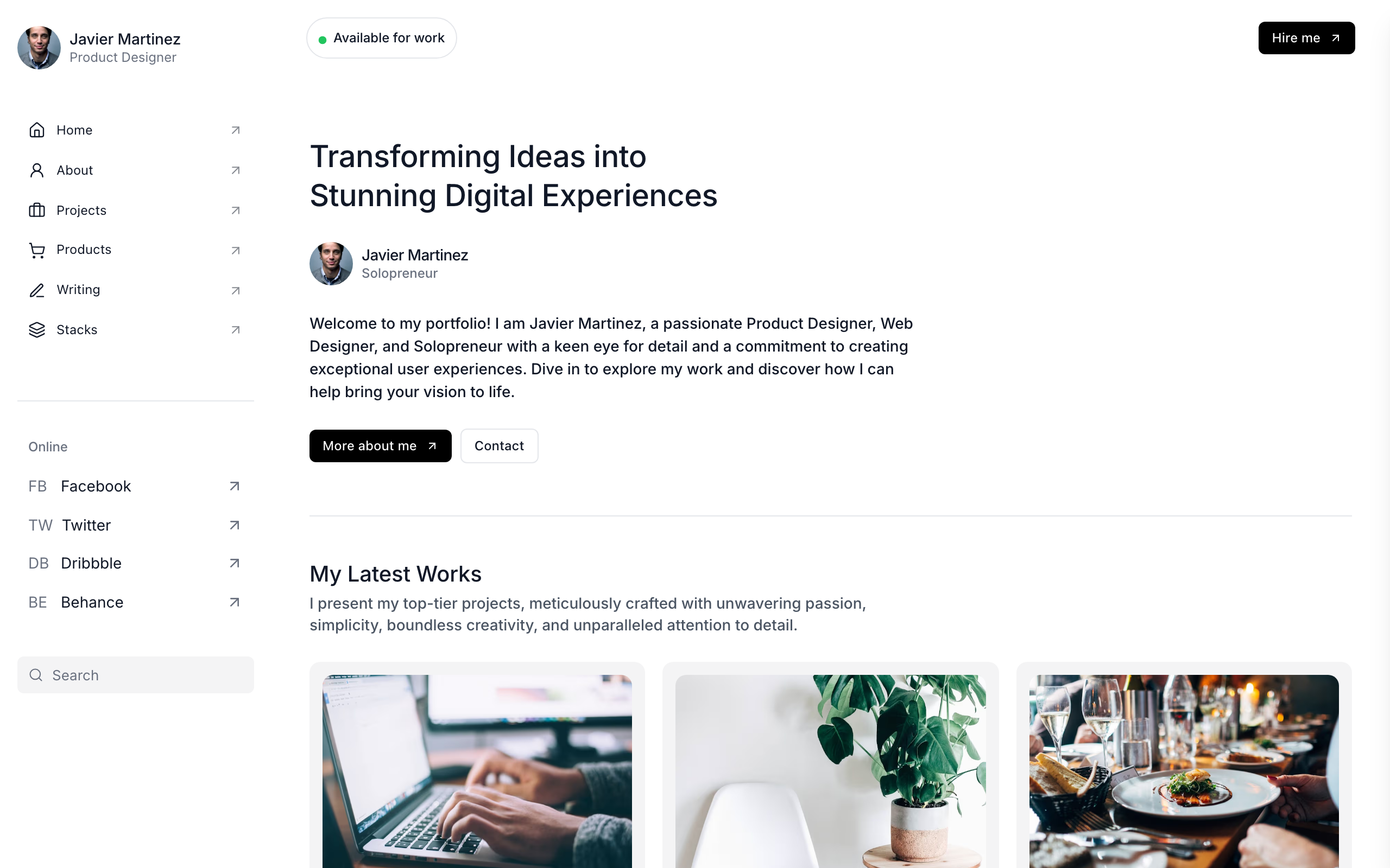
Personal portfolio with a persistent left sidebar — avatar, in-page nav, online socials, and search — beside a scrolling main column with project grid, services, testimonials, stack, and writing.

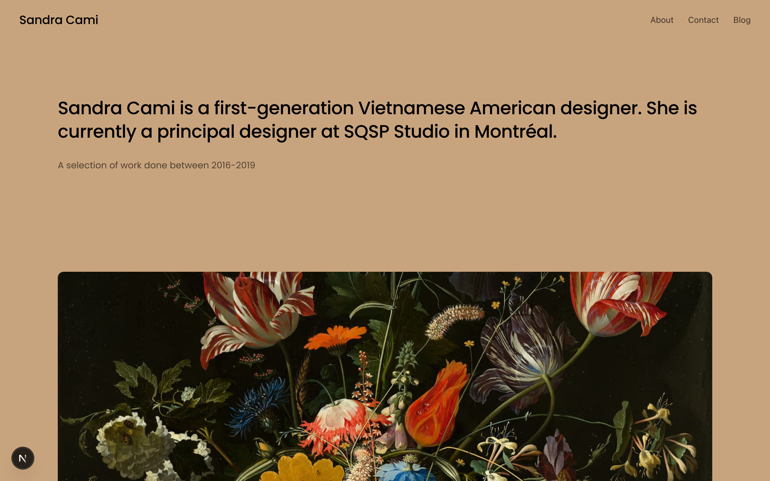
A warm, minimal designer portfolio with large project imagery, earthy tan background, and clean Poppins typography.

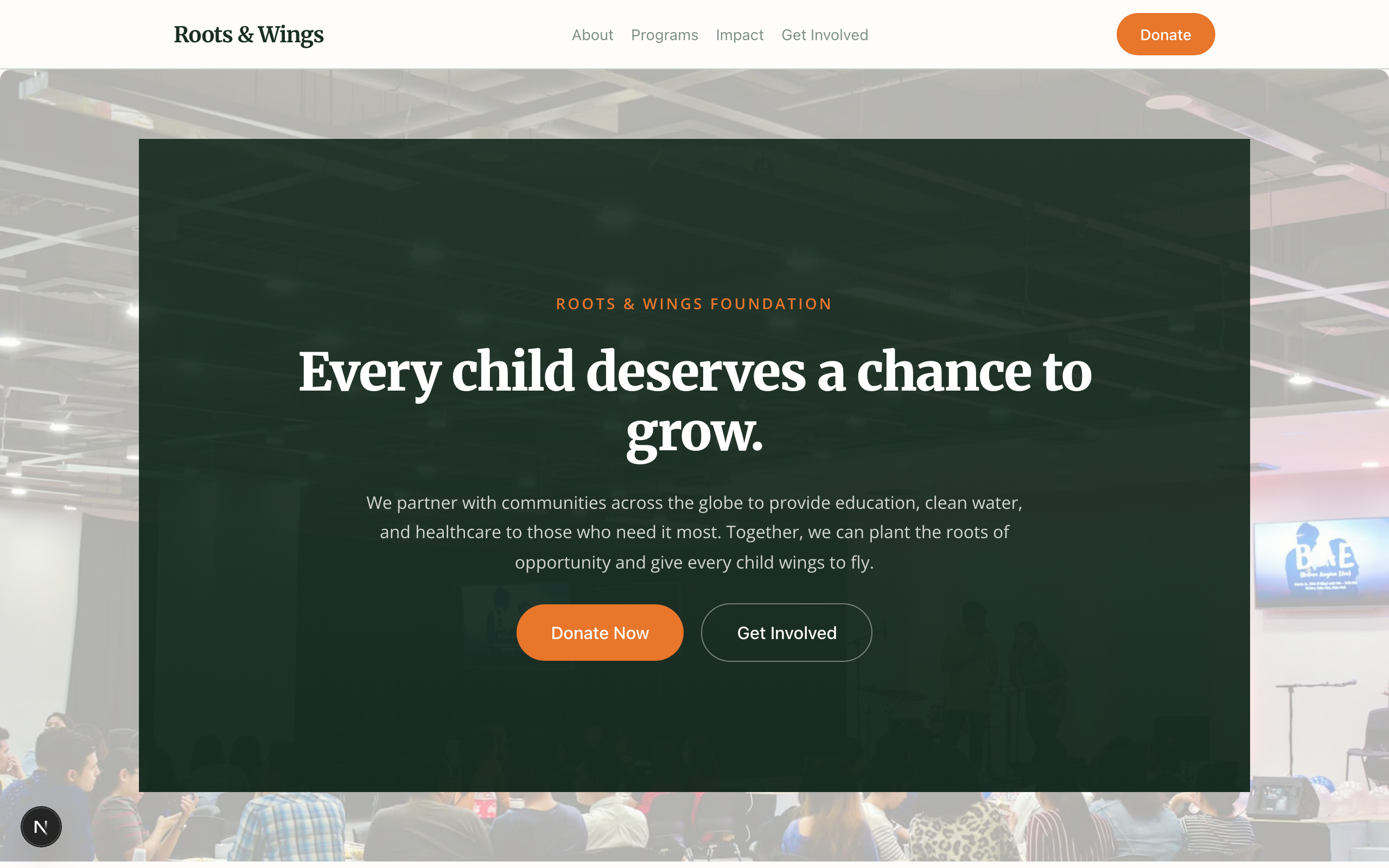
Faithful Charis-parity port. Oxblood + warm peach cream + gold accent + Playfair Display bold serif. Layered hero image stack with curved oxblood blob, white cause cards with gold goal badges, Lucide-icon decorative marks over emotive photos, gold pill newsletter panel, dark-square buttons with trailing arrow icons. Multi-page (Home / Causes / Get Involved / About).

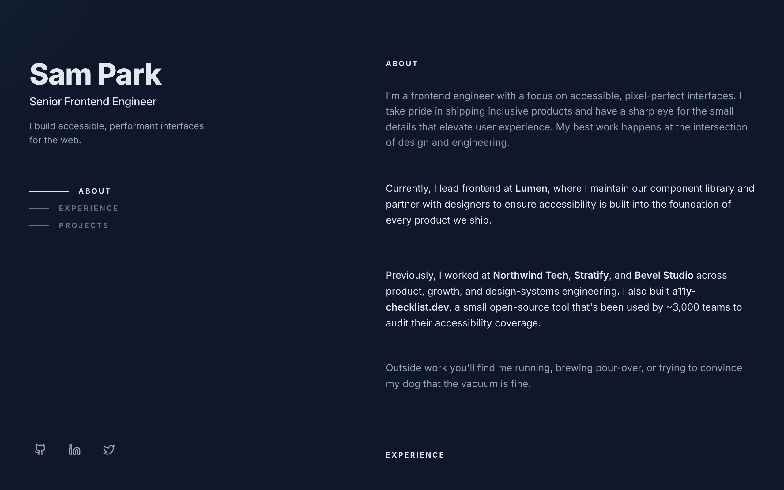
Sticky two-column dark dev portfolio. Slate-900 background with teal accent. Sticky left identity card (name, title, tagline, anchor nav, socials); scrolling right column with about, experience, and project sections. Inter throughout. Tech-precise register for senior IC engineers and developer-leaning solo experts.

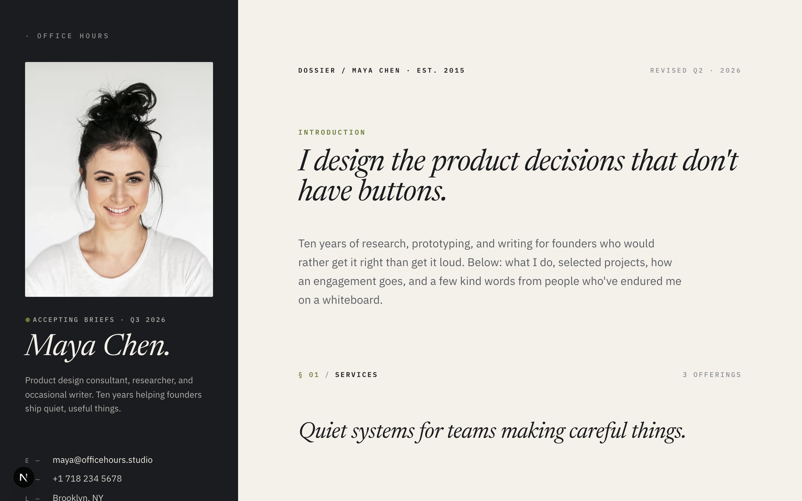
Sticky editorial split-screen. Deep ink identity card on the left, warm-paper scrolling memo on the right. Newsreader italic display with IBM Plex Sans + Mono.

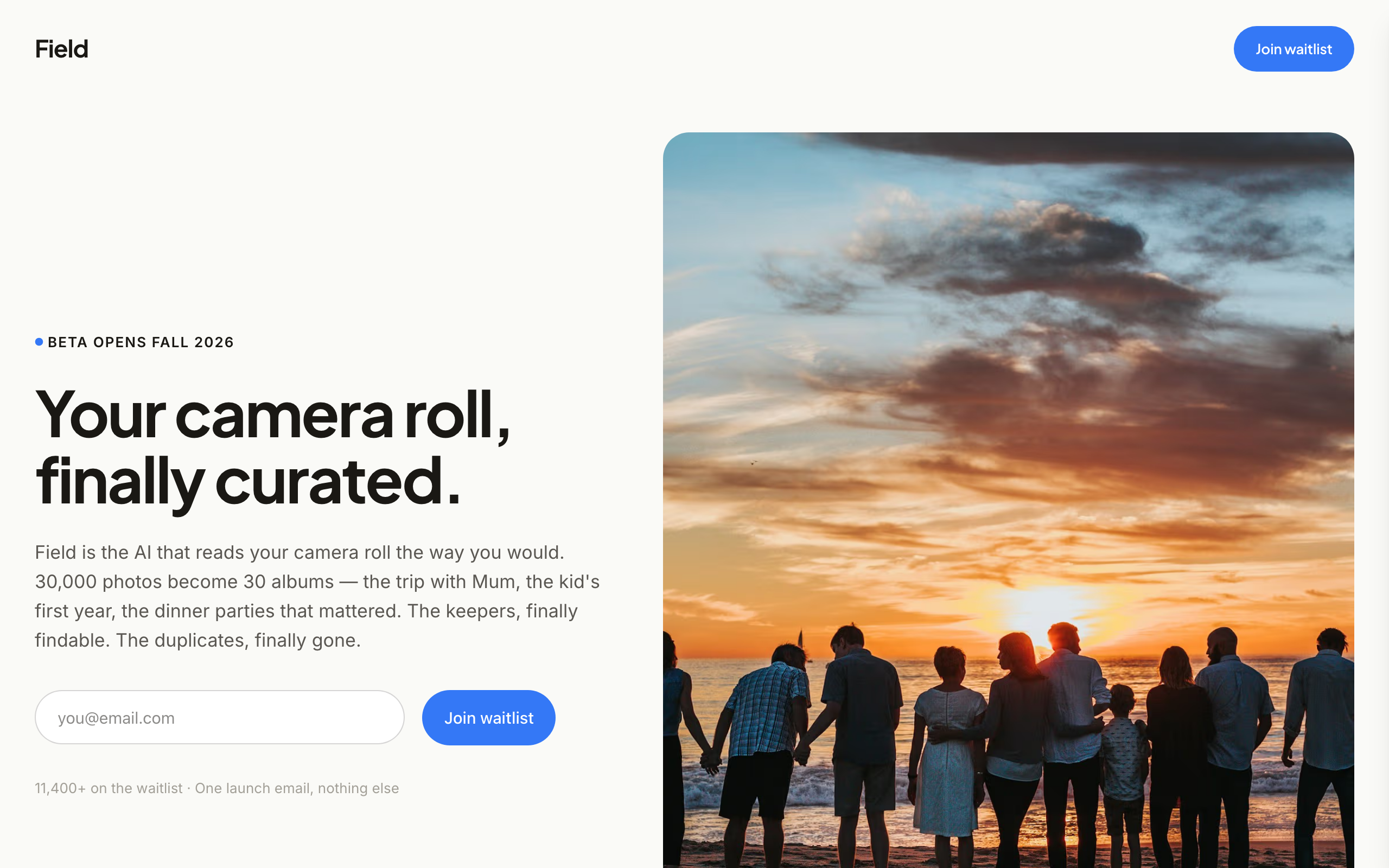
Image-led consumer-AI waitlist for founders WITH real visual assets. Warm-white surface, pacific-blue accent, Plus Jakarta Sans + Inter — modern lifestyle register. Eight sections: split hero with REAL Unsplash photography (designed for founder swap with real product/lifestyle images), as-seen-in strip, three-step 'How it works' band with image cards, animated counter stats, two-card testimonial pair with portrait avatars, privacy strip, FAQ accordion, dark final CTA band, footer. Conversion goal newsletter-signup. Distinct from text-led trio: SLATE / TALLY / GLAZE all use hand-rendered cards; FIELD is the image-LED variant for founders building consumer apps where lifestyle photography carries the pitch (photo apps, travel, fitness, wellness, consumer-AI).

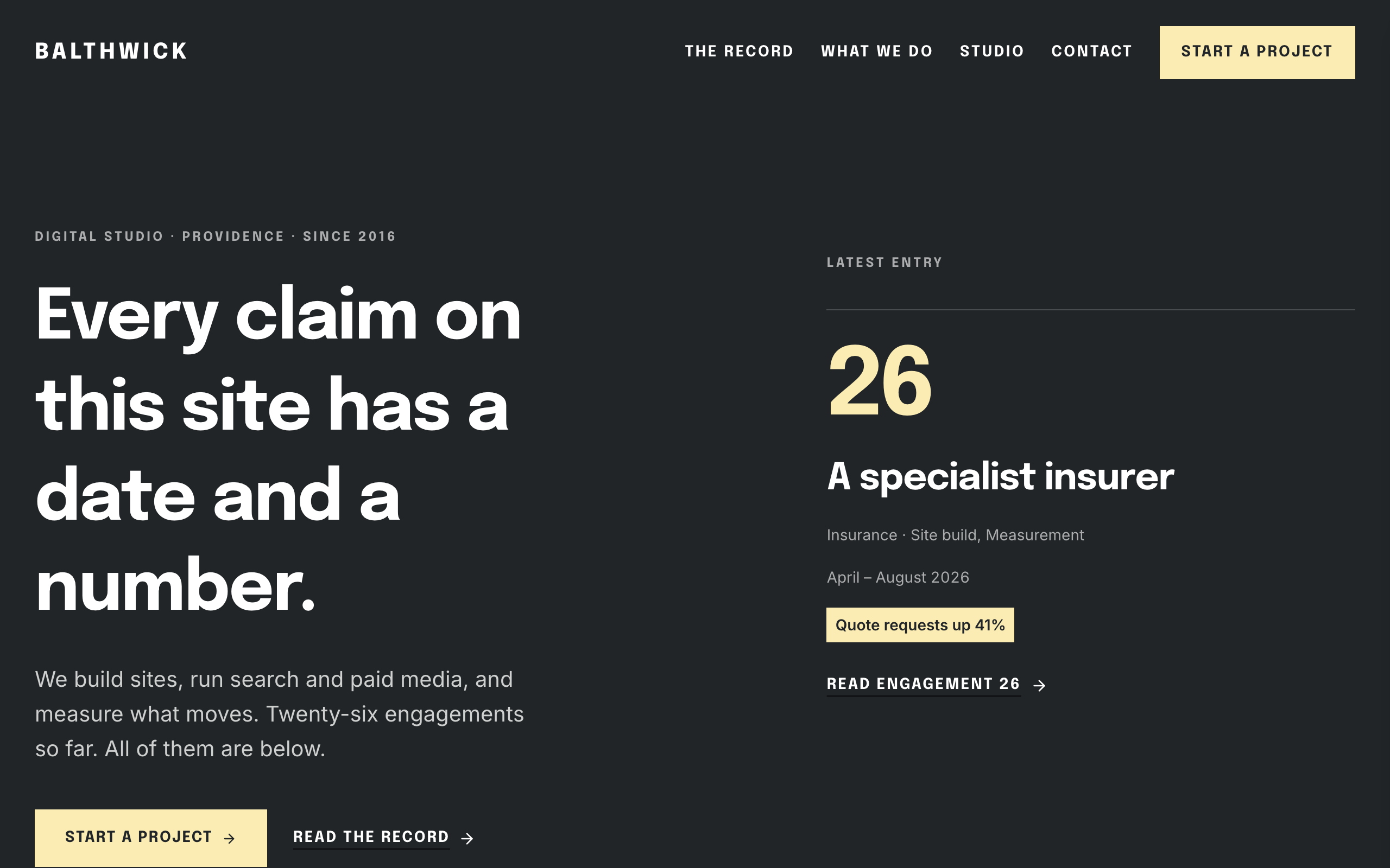
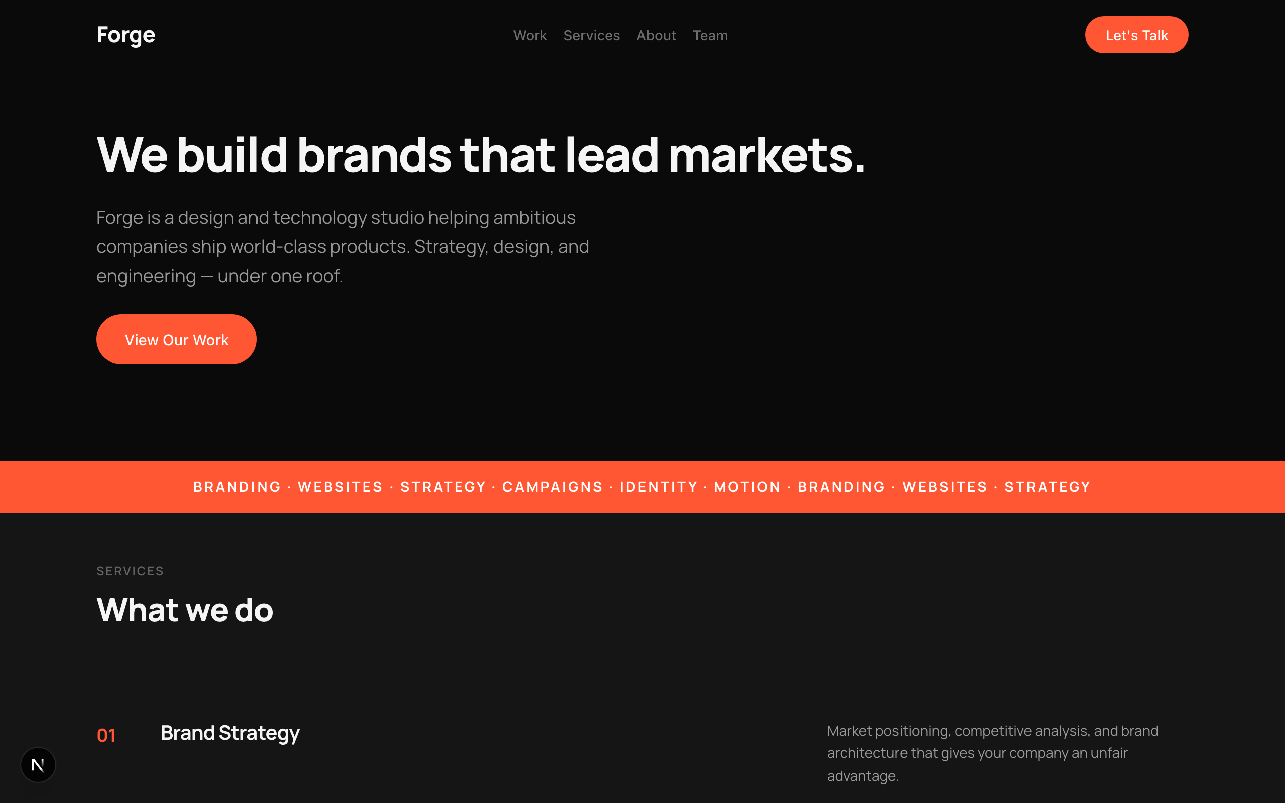
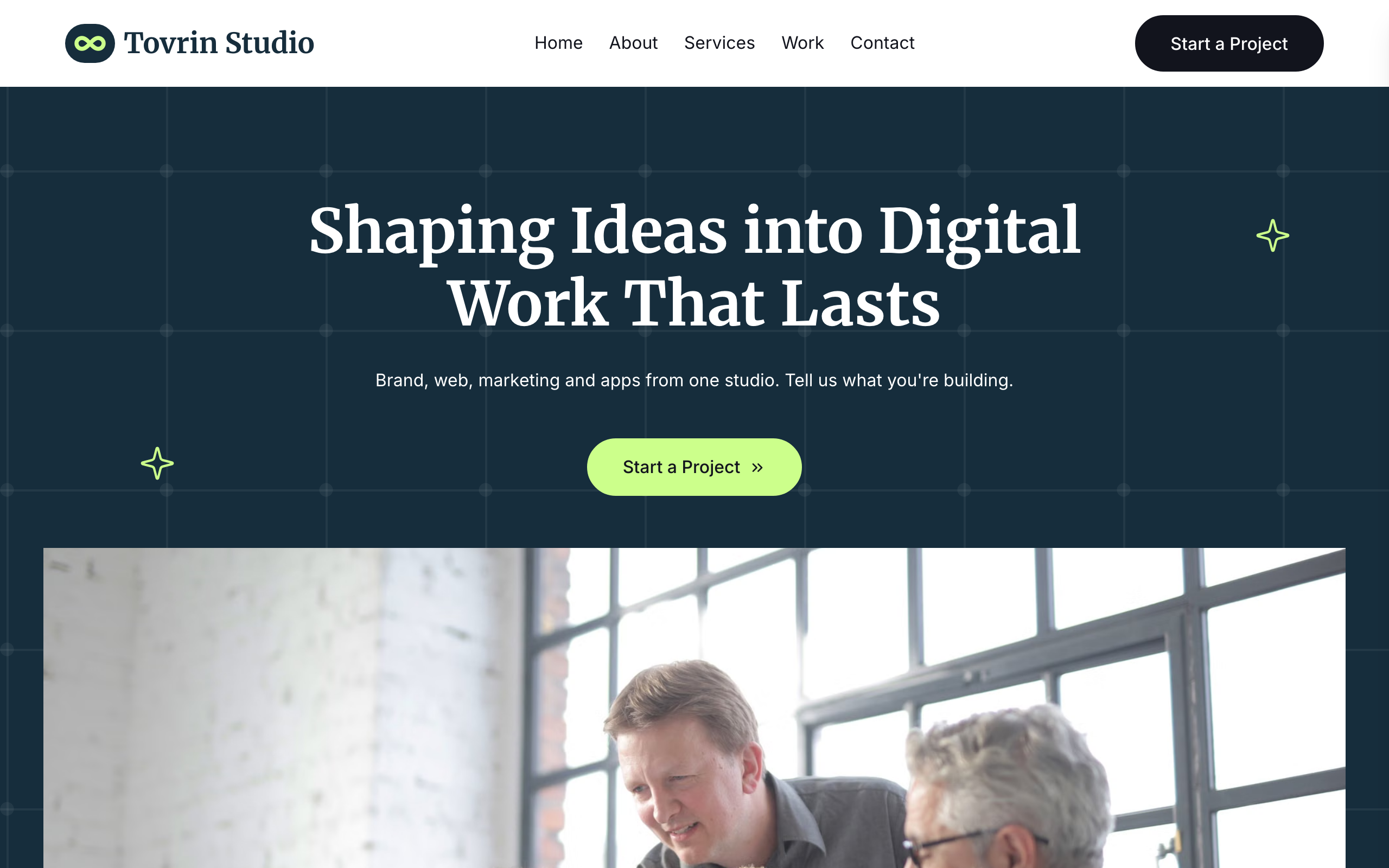
A full-width section-stack layout with alternating backgrounds, numbered service list, staggered project grid, and bold typographic hero. The classic modern agency pattern.

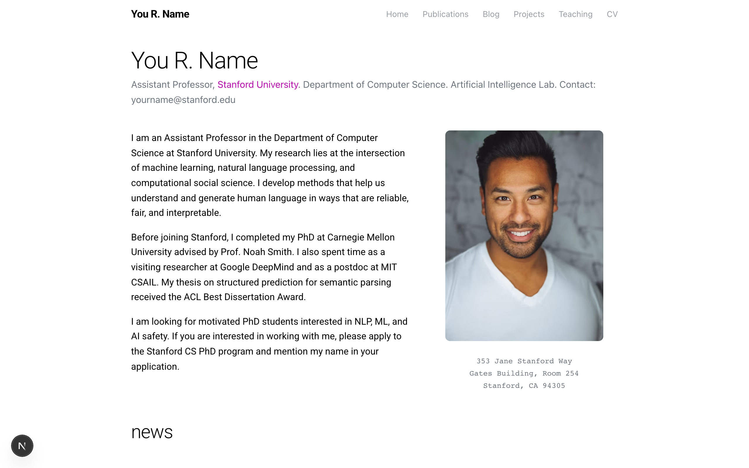
A clean, minimal academic portfolio inspired by al-folio — centered single-column layout with lightweight typography, magenta accent links, news feed, publication listings, and social links.

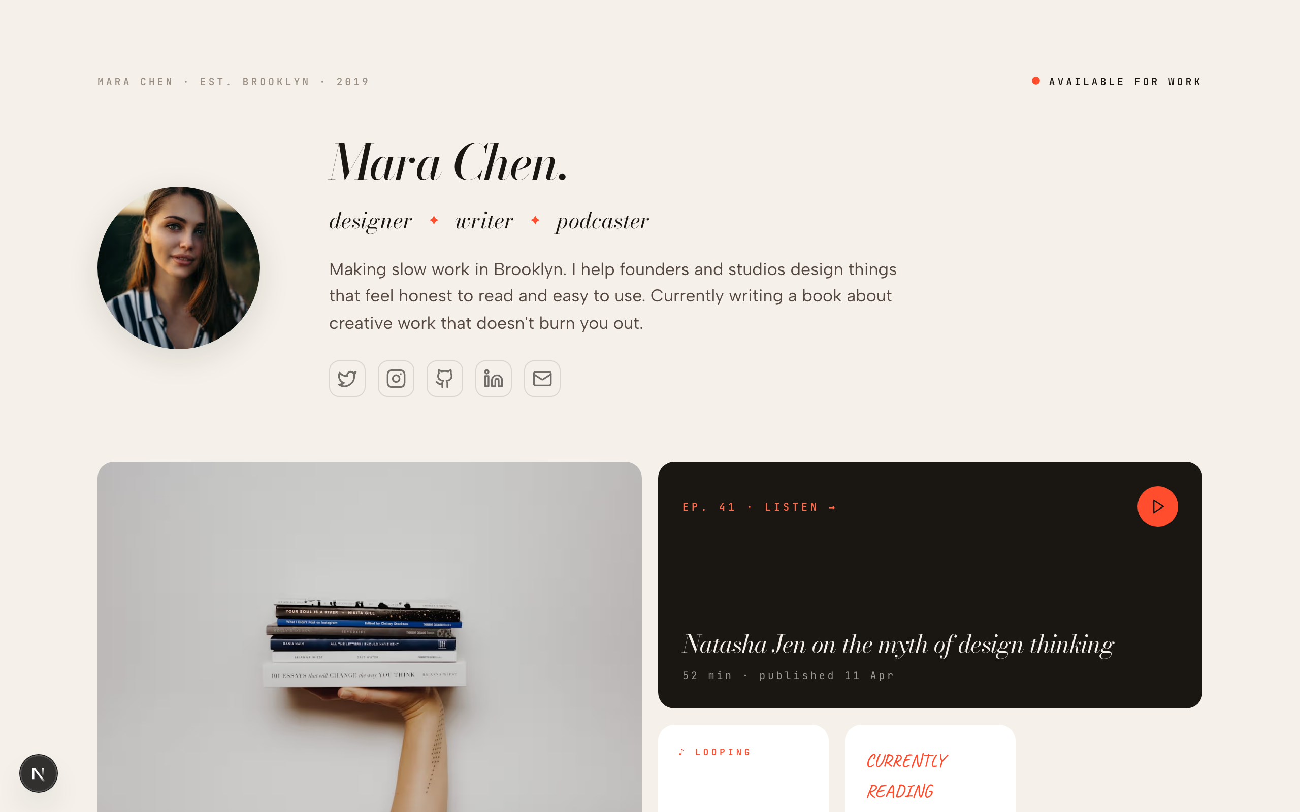
A confident, editorial personal portfolio — warm paper palette, italic serif headlines, and a numbered work index with client/year/role metadata. The default template for designers, developers, writers, and studios.

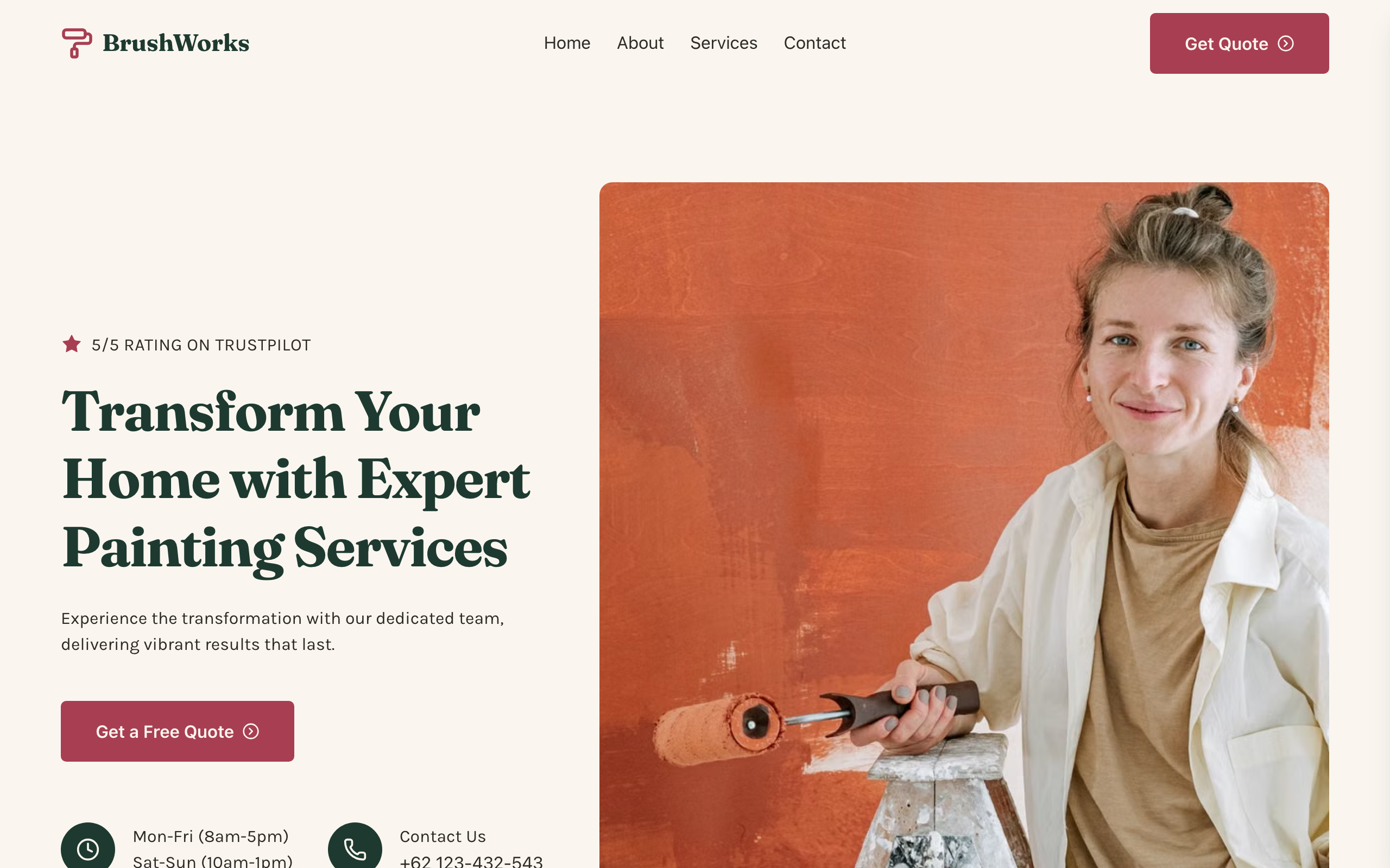
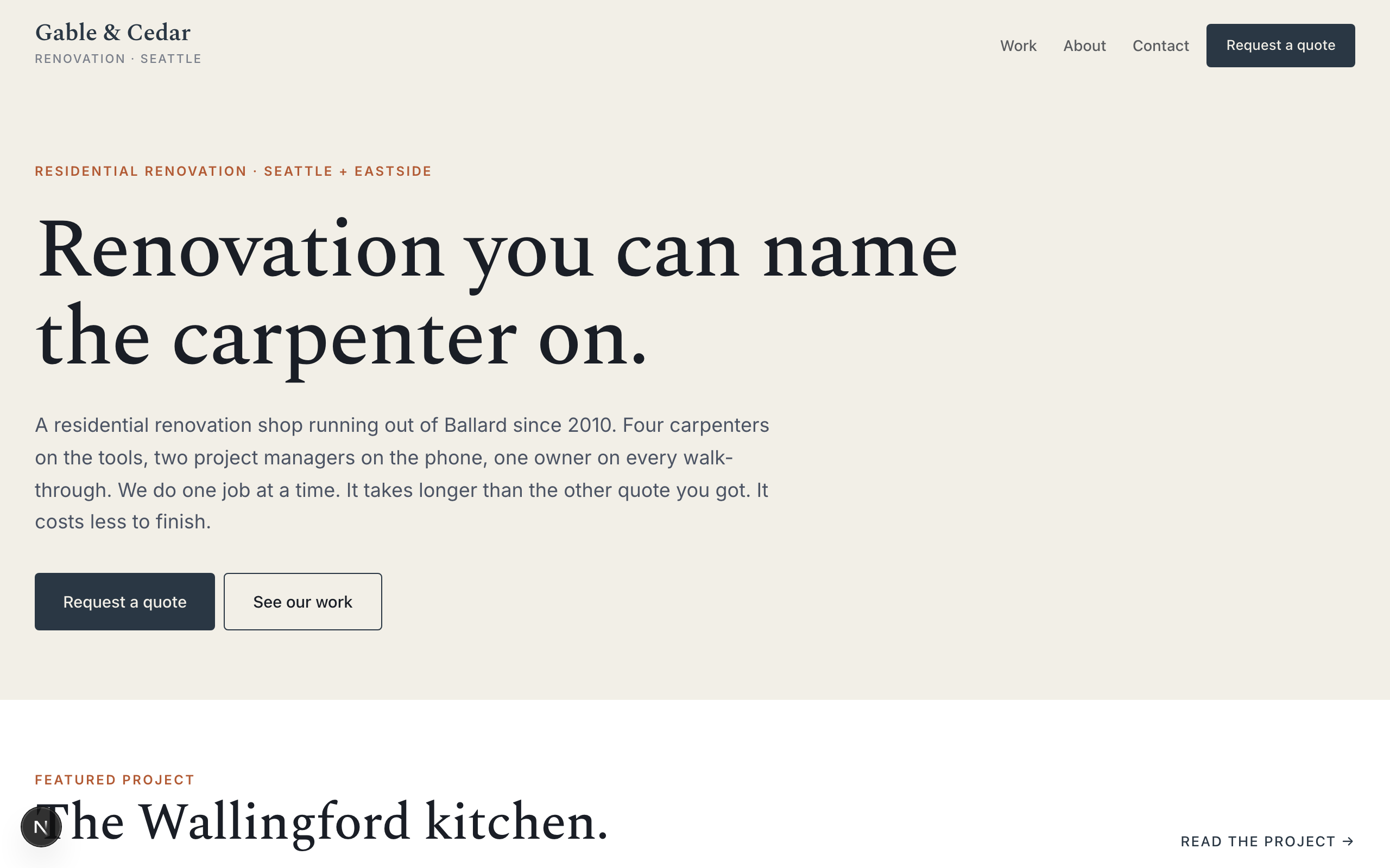
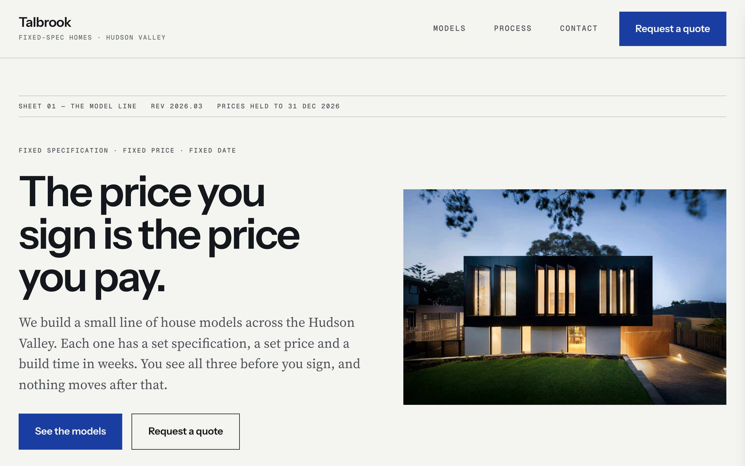
Residential renovation contractor template. Spectral contemporary slab-serif display + Inter body, cool slate blue with oxidized rust accent on warm bone — craftsmanship-forward without rustic cliché. Introduces the before/after project-portfolio pattern: a featured before/after split image on the home page plus six before/after project pairs on /work. Small-caps metadata strips (year · SF · duration · neighborhood). No commerce. Quote-intake contact form instead of booking. Generalizes across the trades-with-portfolio archetype: general contractors, custom home builders, remodelers, interior designers, landscape architects, millwork and cabinetry shops.

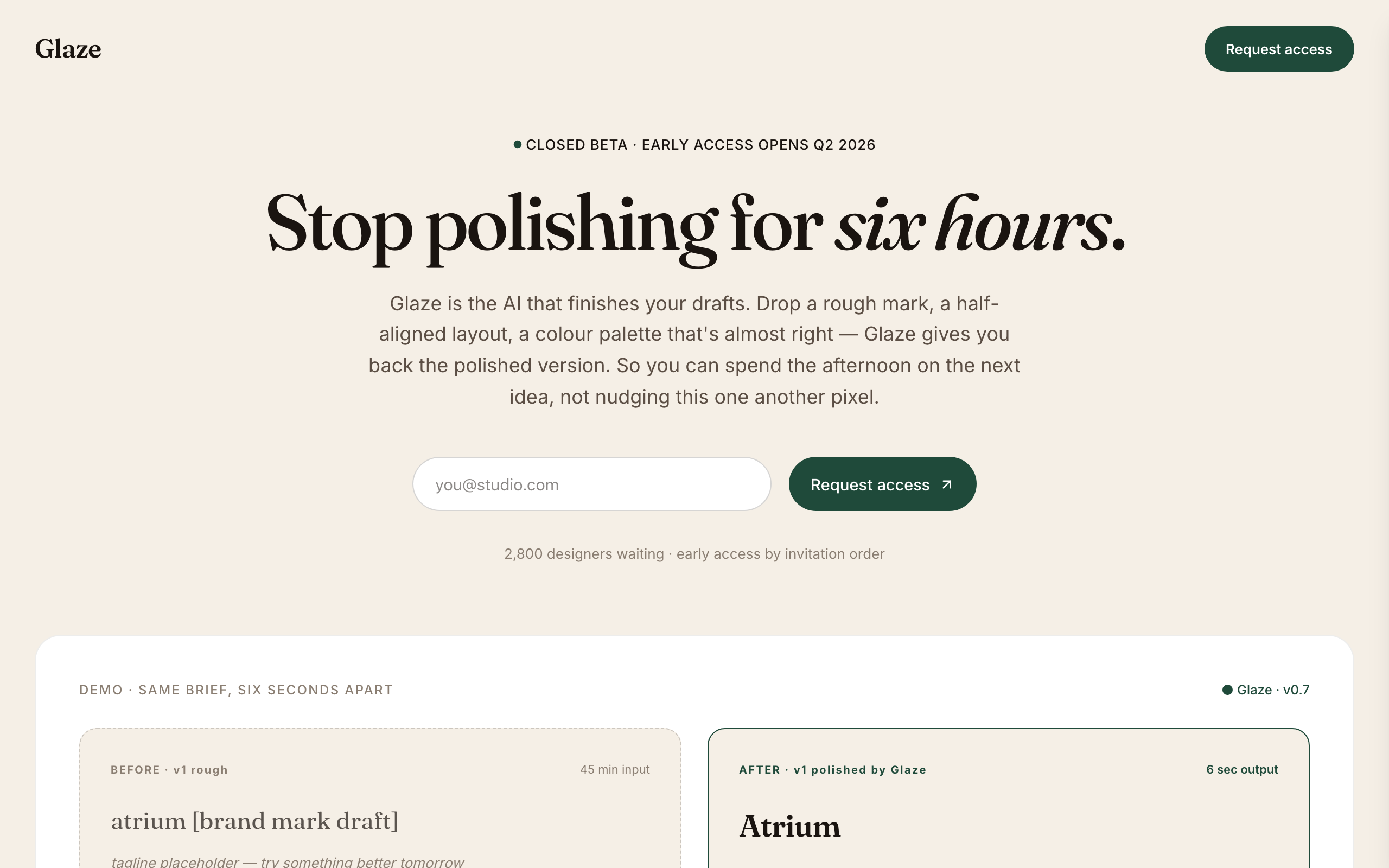
Editorial-modern AI design tool pre-launch waitlist. Warm cream surface, deep forest accent, Fraunces serif display + Inter body — the creative-pro register. Eleven sections: centered hero with eyebrow + italic-accented serif headline + form, hand-rendered BEFORE/AFTER demo card (two columns showing rough draft vs Glaze-polished), as-seen-in press strip, animated counter stats band, three-card 'Why Glaze' grid with forest numerals, testimonial pair with concrete designer quotes, privacy/IP strip (your work stays yours), FAQ accordion, dark forest-green final CTA band, minimal footer. Distinct from slate (dark / mono / dev-tools) and tally (stark BW / fintech) — glaze is the WARM / SERIF / designer-audience pre-launch register.

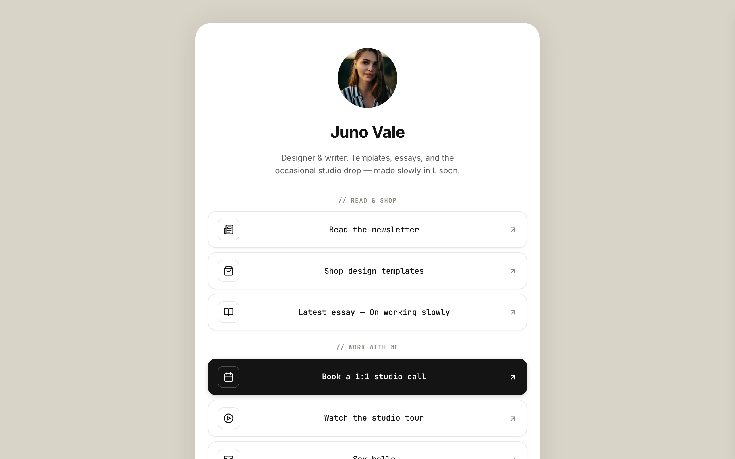
Modernist-minimal link-in-bio for multidisciplinary creators — a faithful Linktree profile-card. A warm-grey page gutter with one elevated, fully-rounded ~600px centered card that holds everything; no header, no footer. White card, ink type, a single muted-clay accent, Inter + JetBrains Mono. Inside the card, top to bottom: circular avatar → name → one-line bio → vertical stack of outlined link buttons (leading icon tile + trailing arrow) → social-icon row, then a stacked shop strip with Stripe buy buttons, a short about block, and the inline newsletter capture the card ends on. The link buttons ARE the conversion (subscribe-platform).

Company careers page for funded tech / AI startups (Series A–C, 20–80 person teams). Deep slate navy + warm cream + coral accent, Fraunces serif on Inter — modern-tech-company register that reads as confident-but-human. Three pages plus role-detail (collection-driven): Home / Open roles / Life at Hatch / per-role detail with apply form. Conversion is candidate application (formType `application`, submissions land in your inbox, with optional webhook forwarding). Distinct from `whitford` (law firm authority-formal) and `flagship` (agency / B2B sell) — this is a hiring page, not a sales page or a recruiting agency.

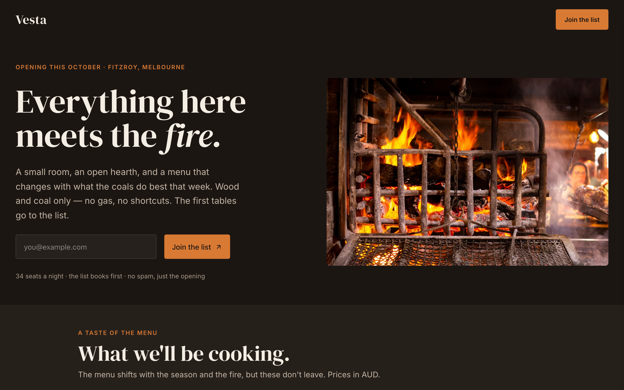
'Opening soon' / join-the-list waitlist for a new hospitality VENUE — the first restaurant-opening waitlist in the catalog. Warm-atmospheric ember register: charcoal near-black, cream, a single ember accent, DM Serif Display against Inter — image-led and moody, distinct from the light food templates (beacon / latte) and from fine-dining juniper. Venue-native signatures no product waitlist has: an opening-date + location eyebrow, a menu preview of signature dishes, a 'the place' details block (opening / address / room / kitchen), an atmosphere photograph band, a chef credit, and a 'join the list for the first tables' form. Single-page: split hero (join-the-list form + a wood-fire photograph) → a taste of the menu → the place details → an atmosphere image band → who's cooking → the-list momentum → FAQ → join CTA → footer. Conversion is newsletter-signup (join the opening list). Demo persona is 'Vesta', a wood-fire neighbourhood restaurant opening in Fitzroy, Melbourne, but the design suits any café / bar / restaurant / studio opening. Distinct from every software / product / real-estate / course waitlist, and from reyes/juniper/beacon.

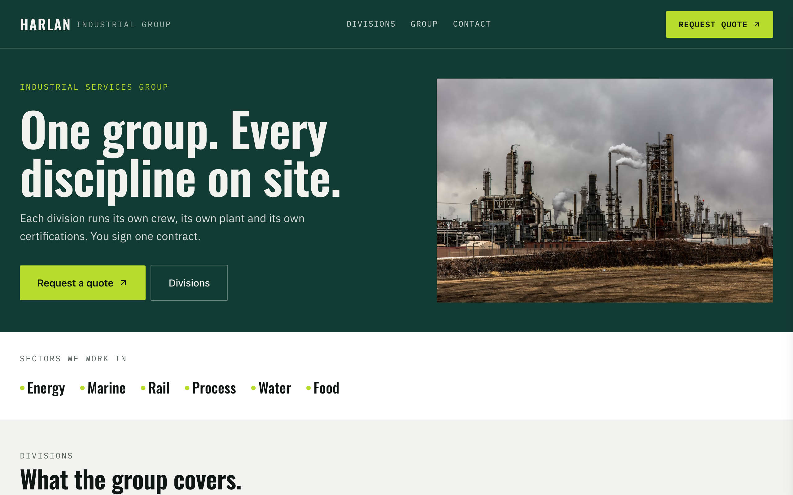
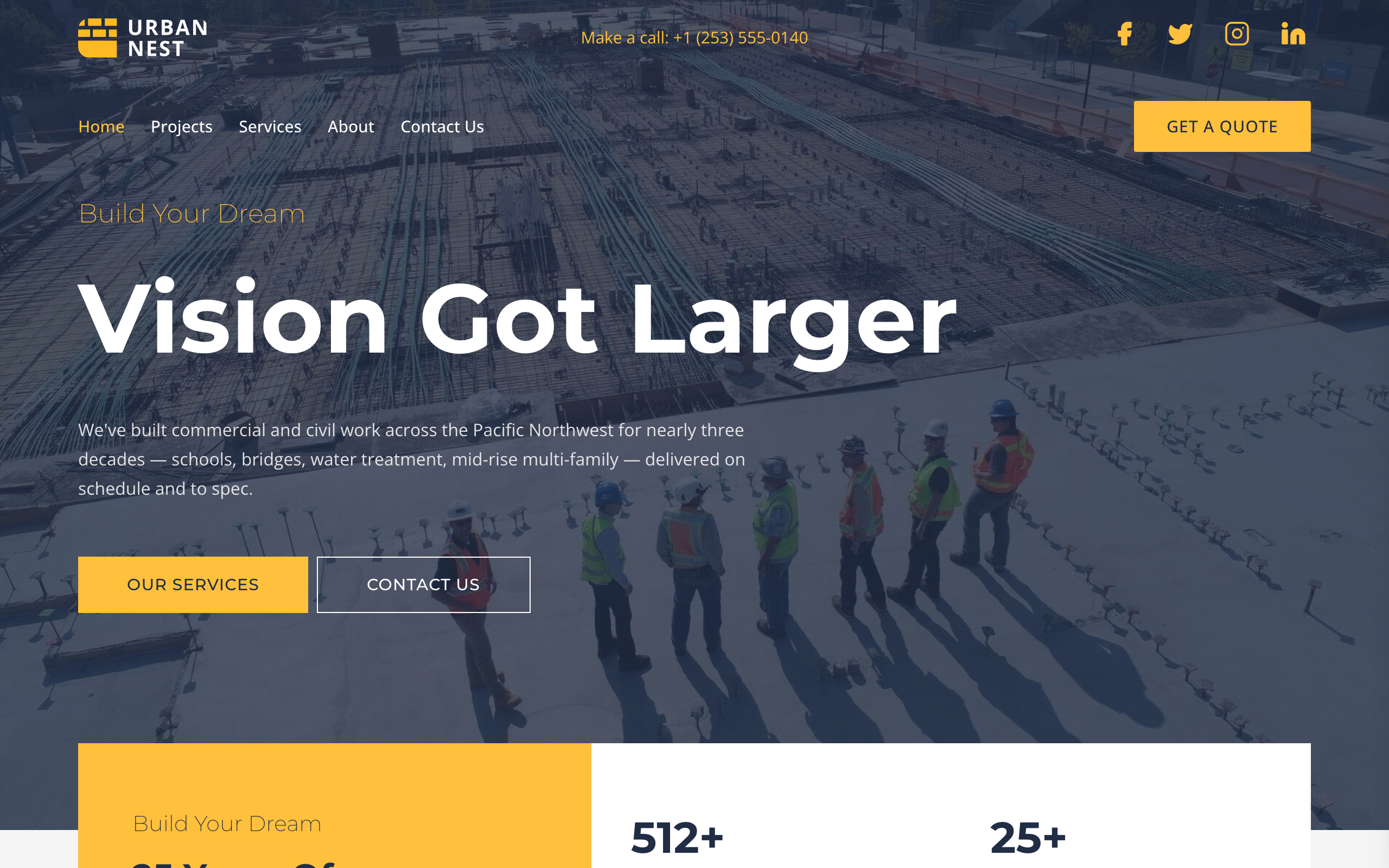
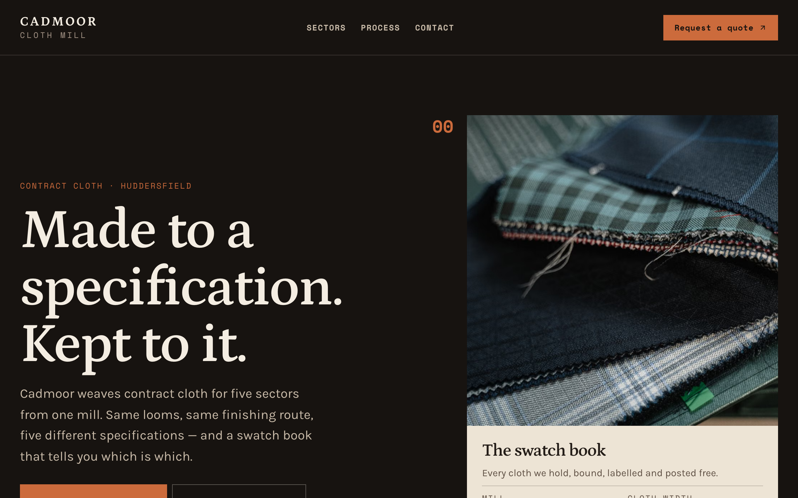
Utilitarian-trustworthy construction GC template — Urban Nest persona. Deep slate navy + industrial yellow + sharp 0/2-radius buttons. Transparent absolute header (logo / phone / socials over hero divider, then nav + Get a Quote pill). Full-bleed dark hero with 90px Montserrat 700 headline, yellow stats card overlapping the hero/services boundary, six-tile services grid on a 1200px container, two-tone sustainability split with image overlays, three-location row + Transform Communities CTA, asymmetric founders strip with bottom-fade meta + ABOUT US CTA, four-project full-bleed work strip, dark 2x2 testimonial grid with yellow bottom borders, quote form + FAQ split. Multi-page (Home / Projects / Services / About / Contact). Montserrat 200/500/700 on Open Sans.

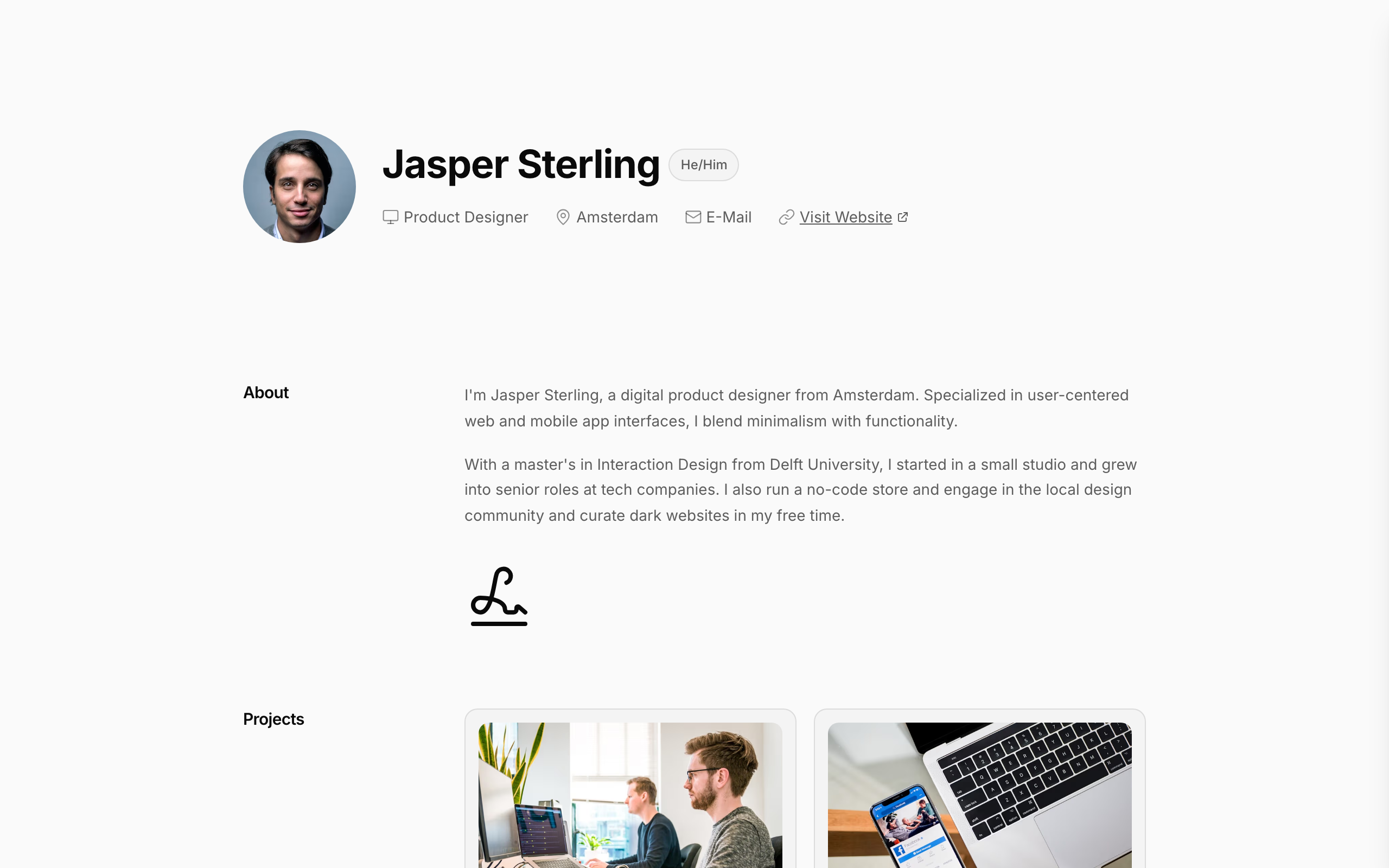
Single-page professional profile with a label-rail layout — section labels on the left, content cards on the right. Monochrome palette: warm-white background, near-black type, near-zero chroma. Inter throughout. Profile block at top with circular portrait + name + pronoun pill + meta chips (role, city, email, website). Sections beneath: About (paragraphs + handwritten signature), Projects (2-card grid with image + title + category), Experience (bordered cards: role pill, company, date range, description), Education (same card shape), Awards (rows with dotted leader to year), Contact (key-value link rows). Footer: build credit. Designed for product designers, freelance creatives, and anyone who wants a personal profile page that reads cleanly and renders as a website.

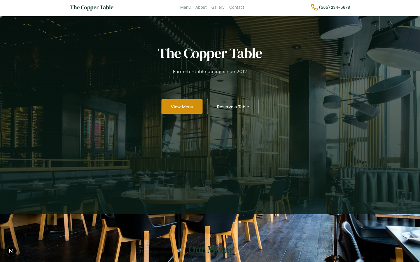
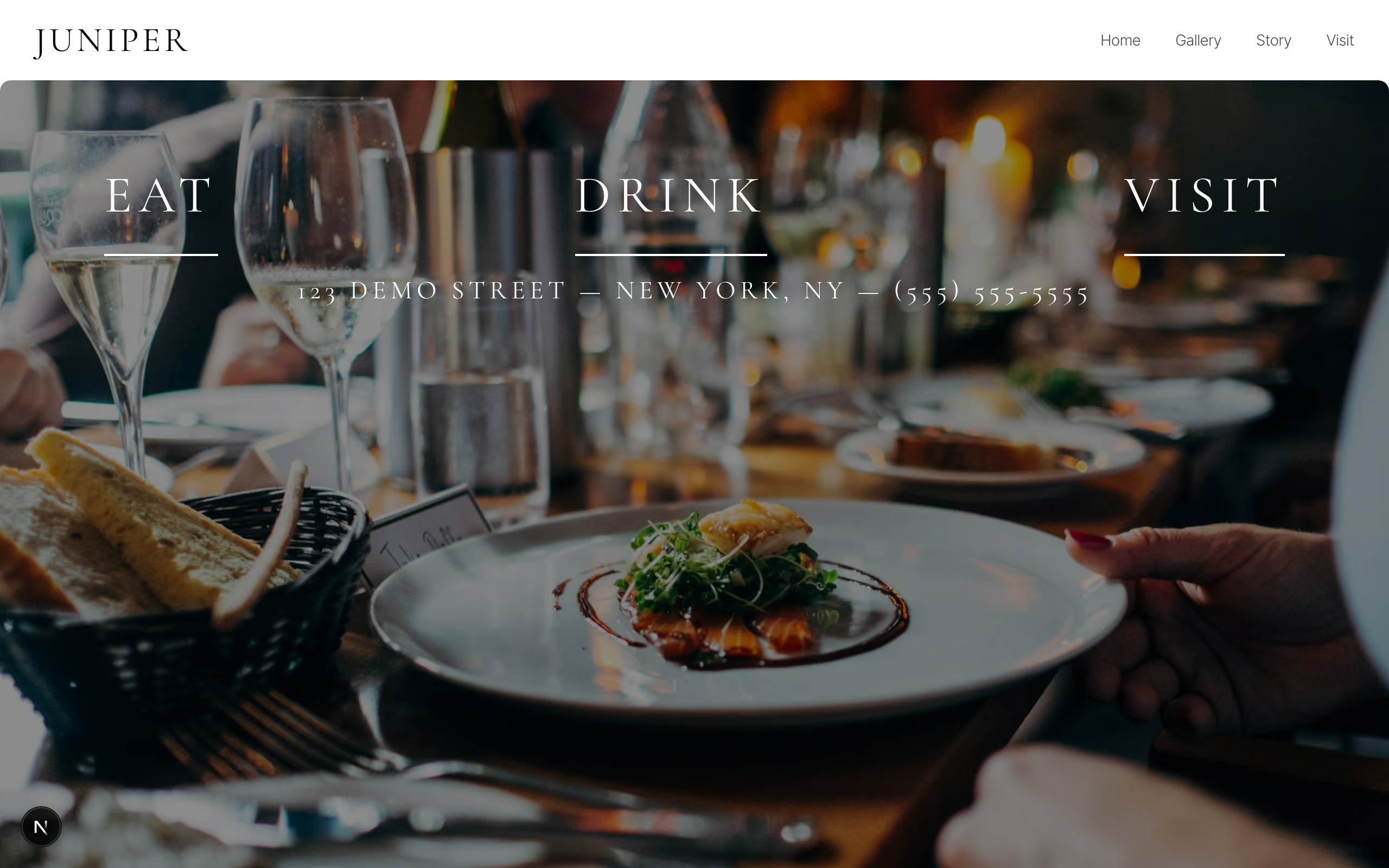
A dark, elegant restaurant template with thin serif typography, full-screen hero, categorized menu pages, photo gallery, story page, and reservation form — perfect for upscale dining.

Single-page dark-mode professional profile with a sticky avatar card, stat strip, experience timeline, project grid, education list, stack grid, and contact form — built for designers, engineers, and creative freelancers shopping their craft.

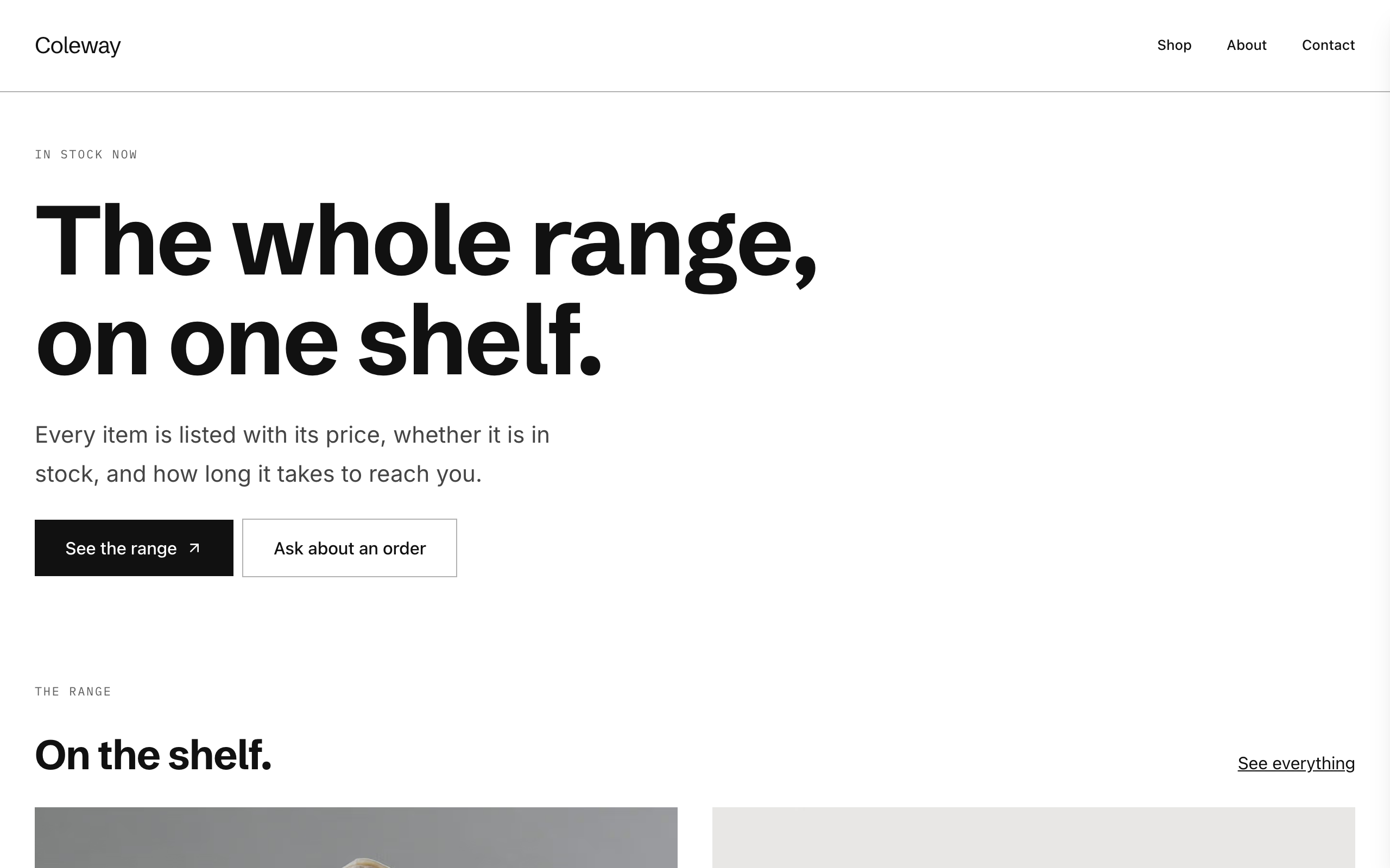
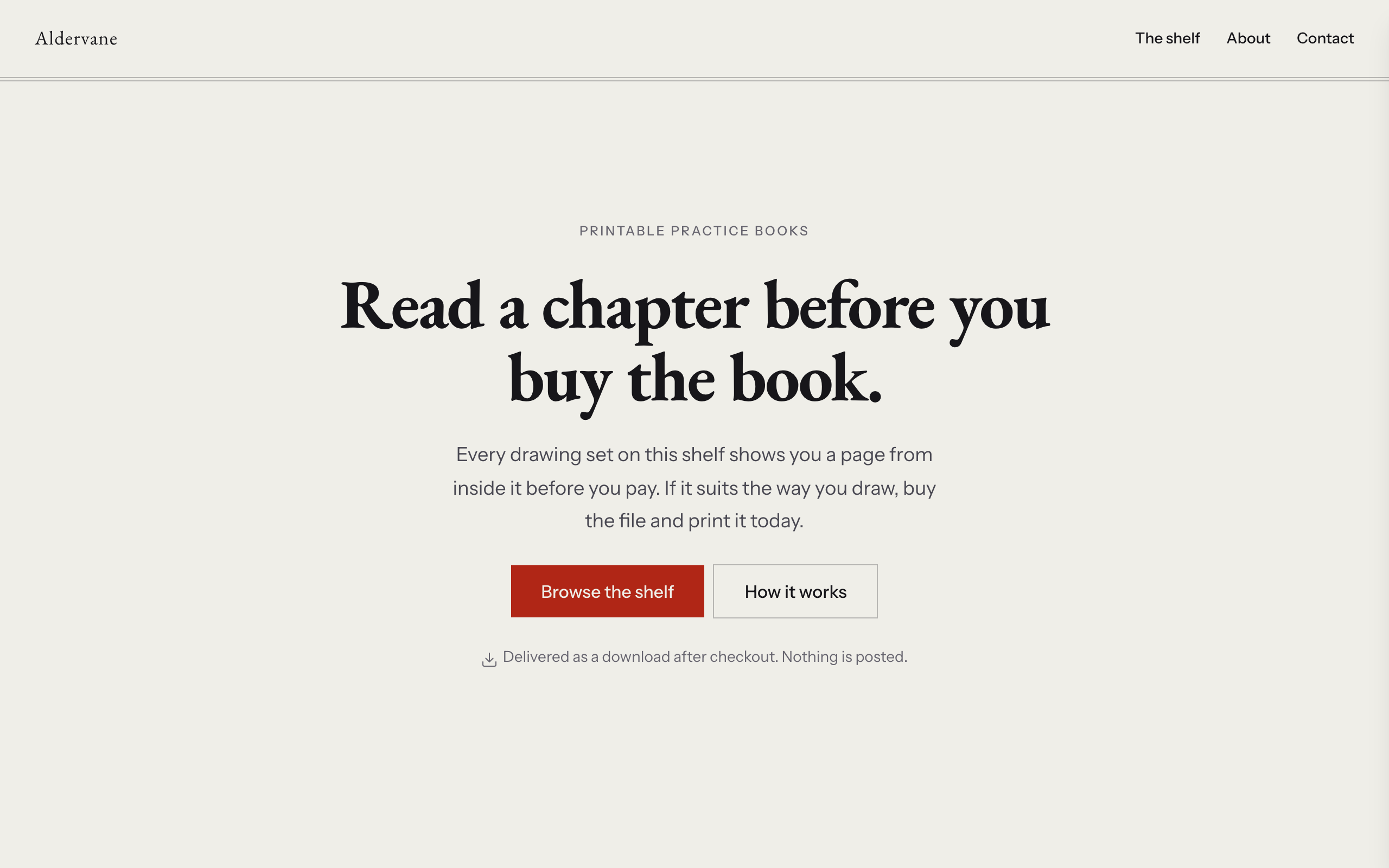
Catalogue-first shop for a maker who sells physical work — ceramics, jewellery, candles, small-batch food. Warm clay palette on oatmeal, Young Serif display over Inter. A product collection with one Stripe payment link per item drives the shop; a separate commissions page carries the made-to-order enquiry form. Built for the maker who has a stocked range AND takes custom orders, which is the shape most small studios actually trade in. Distinct from cami and pazari (portfolios where the work is the pitch and the conversion is an enquiry) — here the conversion is a purchase.

A warm, inviting cafe website with a cream palette, full menu layout with alternating image-text sections, blog cards, and an about section — perfect for coffee shops and bakeries.

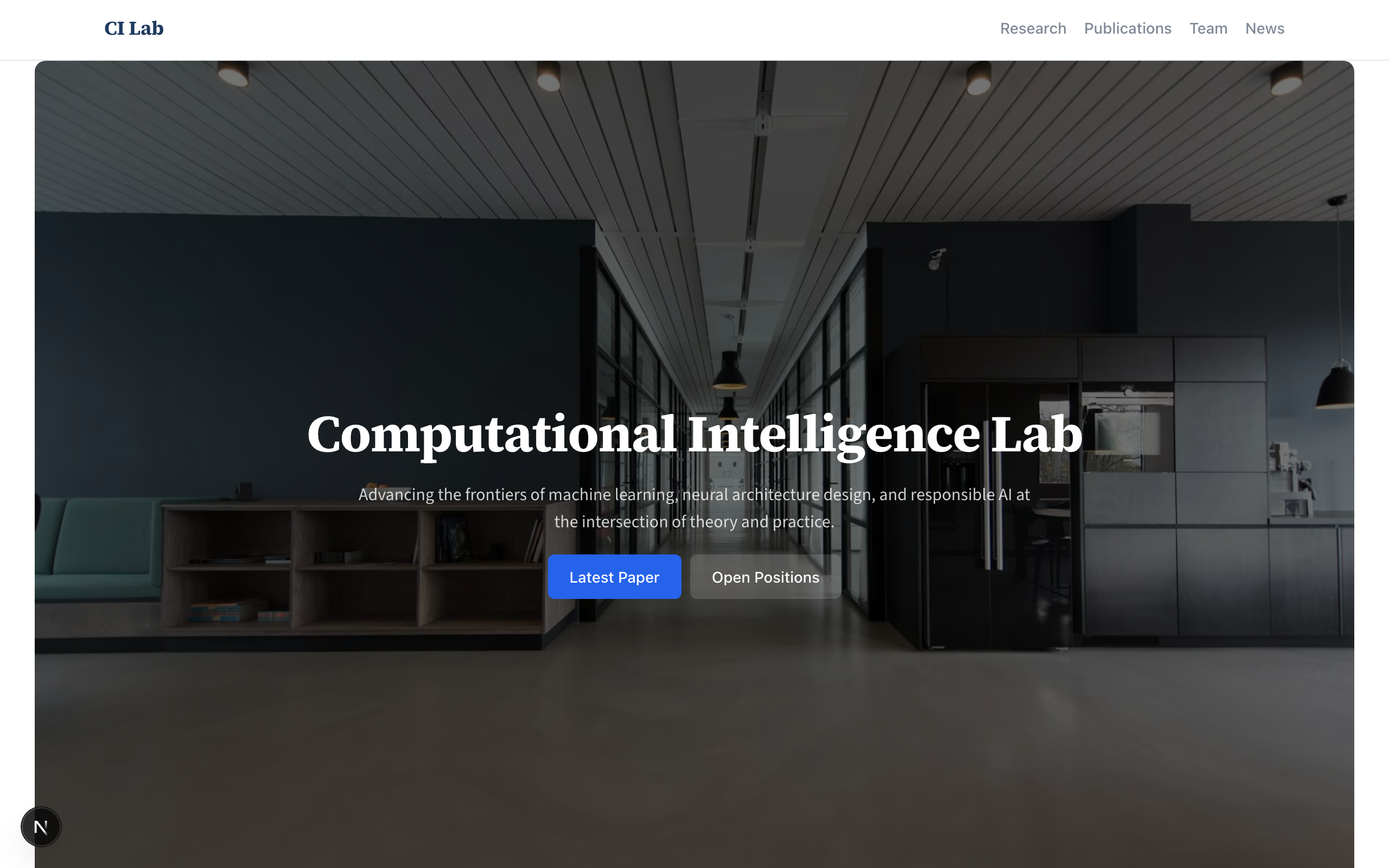
A dense, scholarly layout for academic labs, research groups, and institutional pages. Structured sections for publications, team bios, research areas, and news — designed to present serious work with clarity.

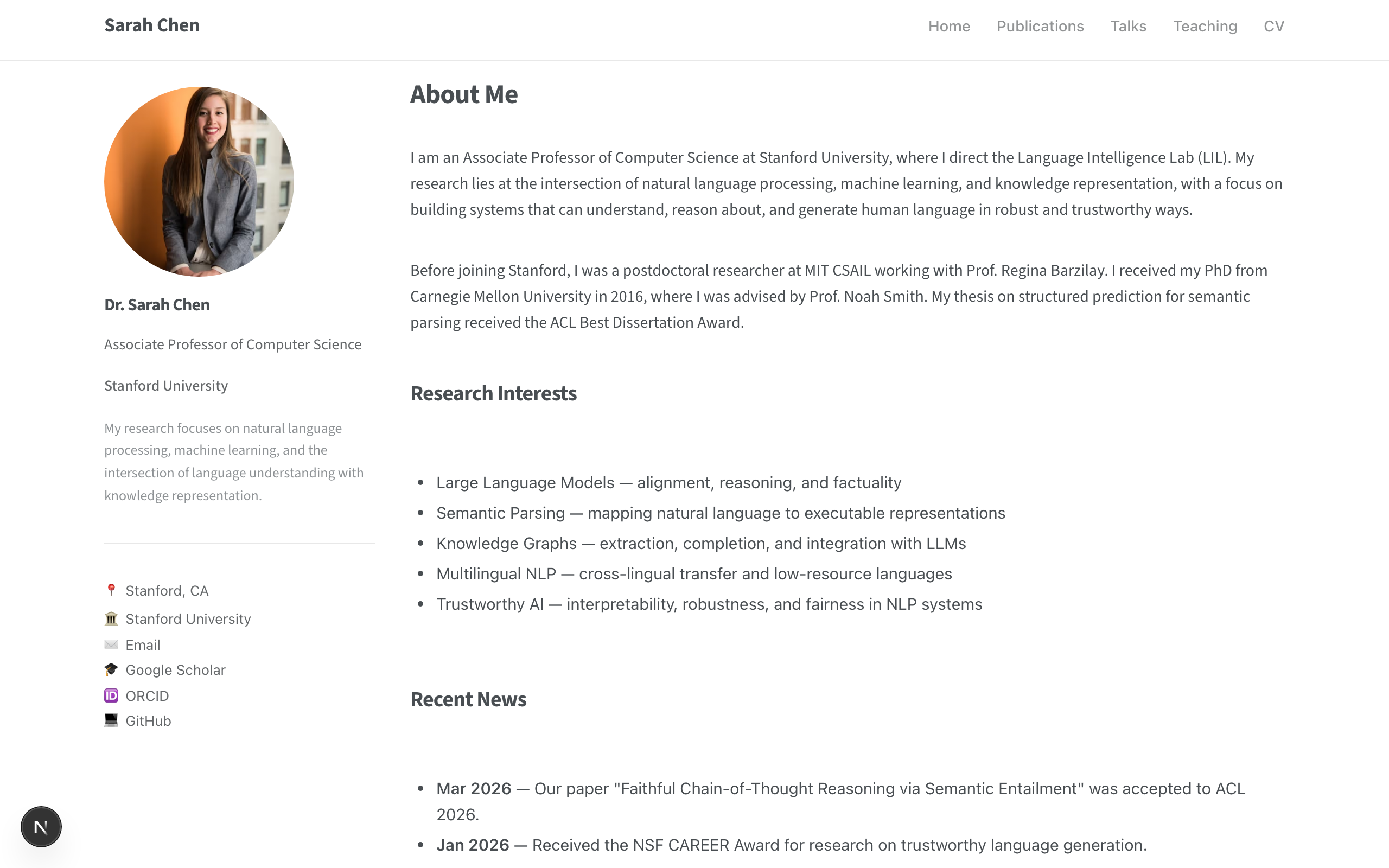
A personal academic homepage inspired by academicpages.github.io — left sidebar with profile photo, bio, and links alongside a clean main content area. Includes pages for publications, talks, teaching, and CV.

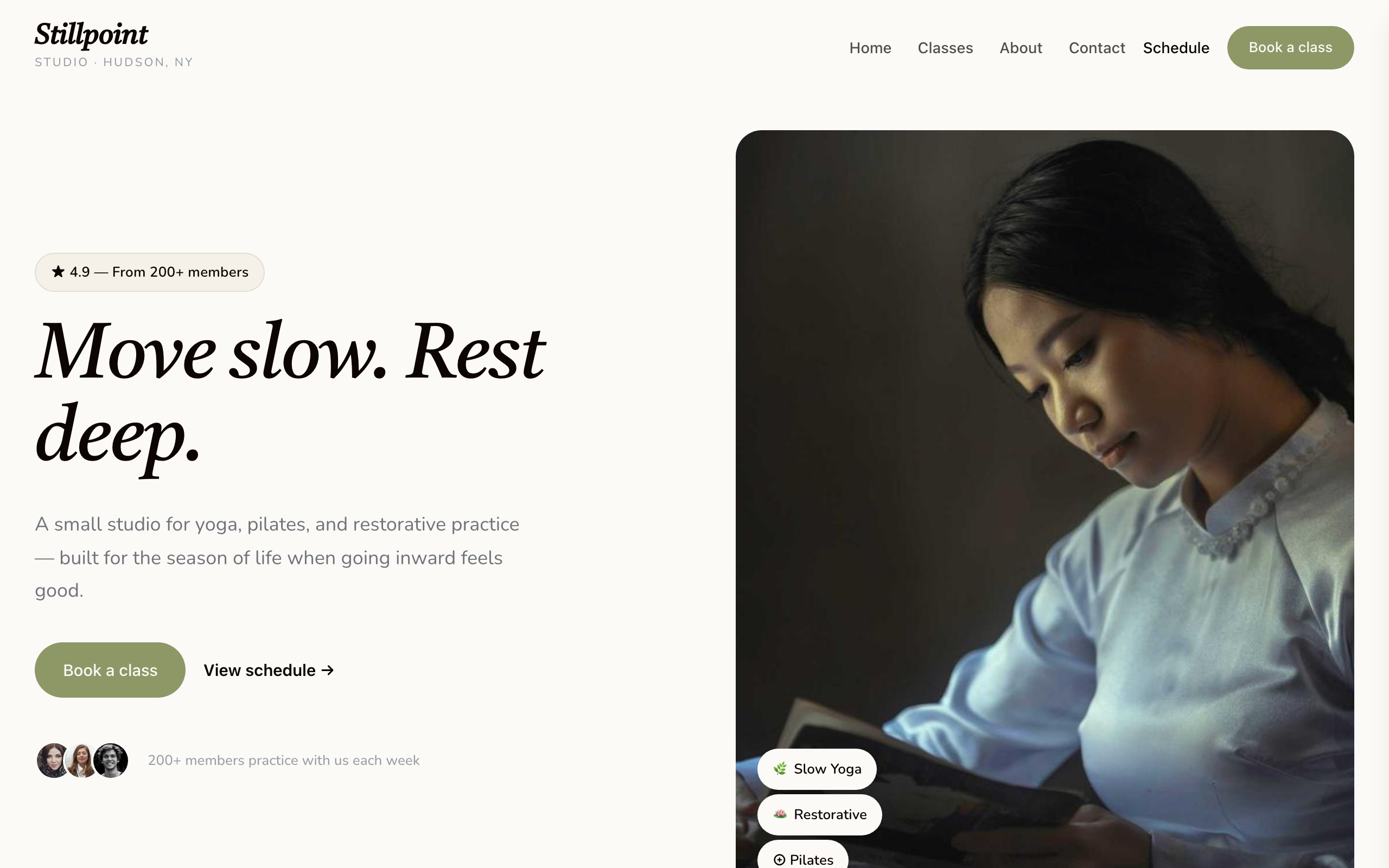
Calm-professional wellness studio. Warm cream background with sage and coral accents, Castoro serif display + Nunito body. Designed for yoga / pilates / restorative-movement studios with a small-studio feel — soft photography, image-led hero, services-list class menu, simple membership tiers, and a booking-form conversion. Multi-page with home + classes + about + contact.

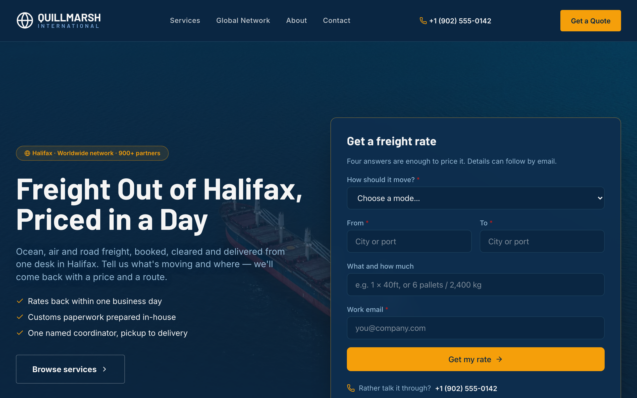
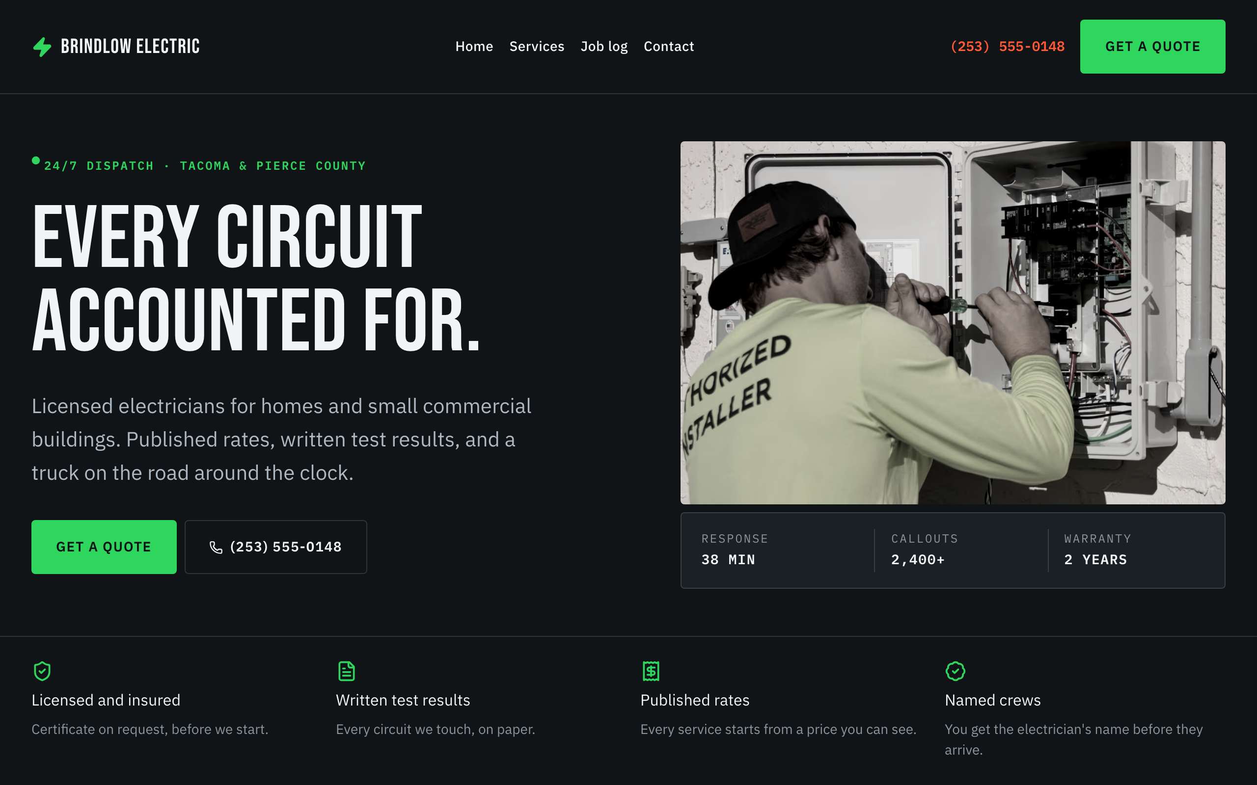
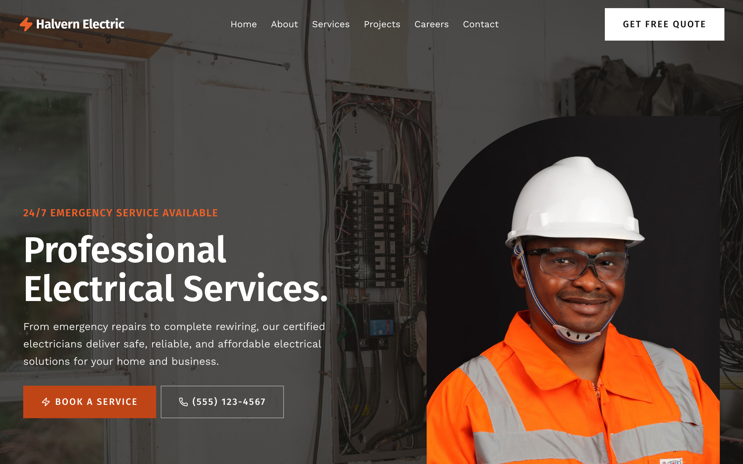
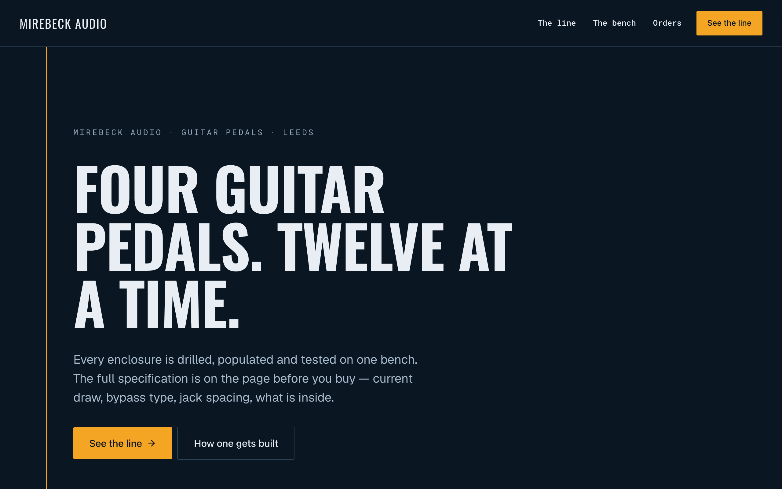
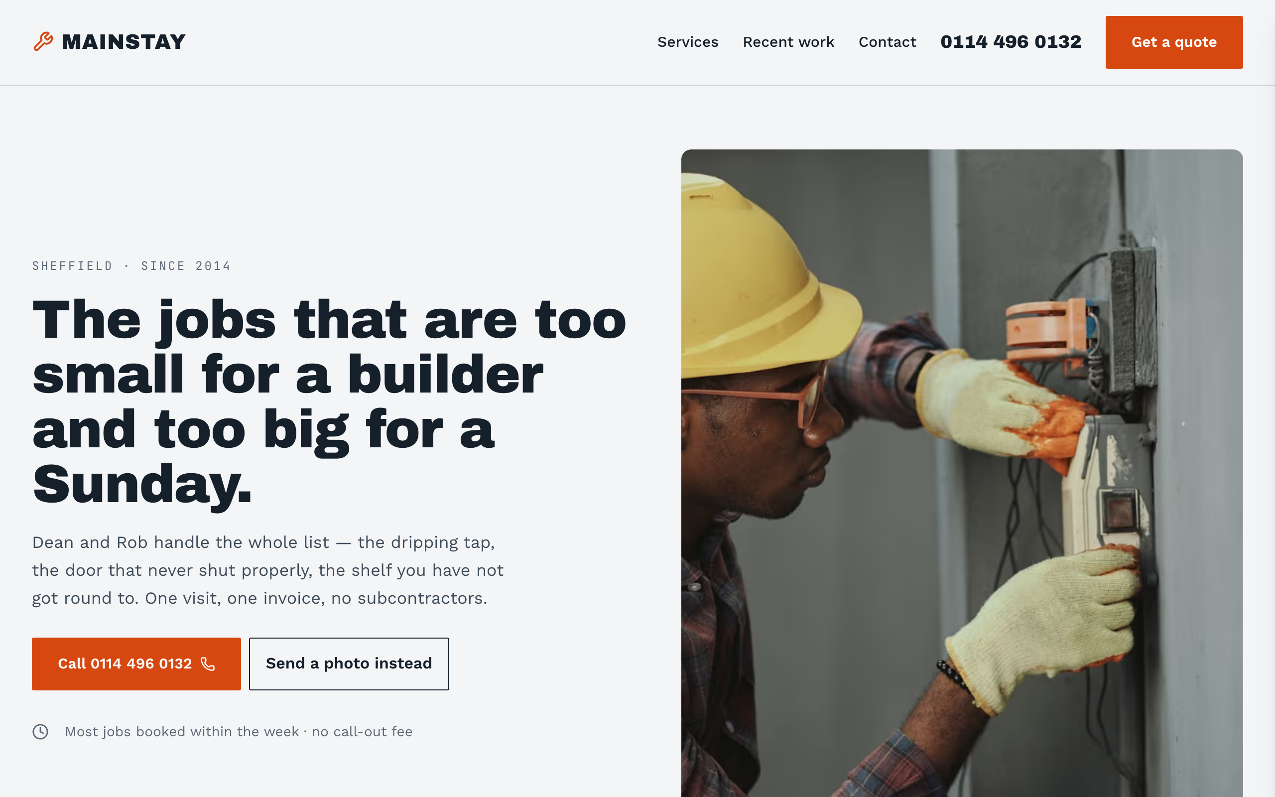
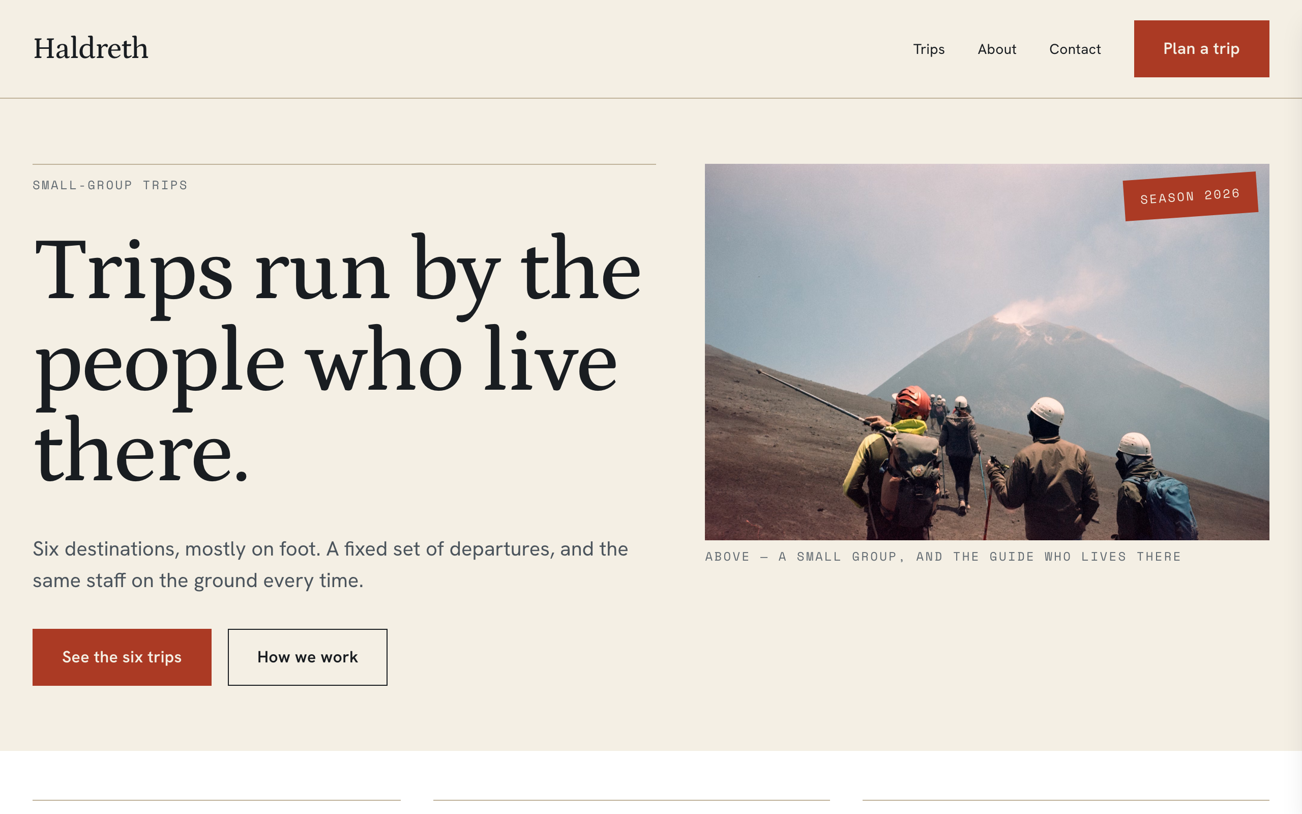
Phone-first site for a local multi-trade — handyman, property maintenance, small works. Slate and utility-orange on cool grey, Archivo Black over Work Sans. The phone number is the primary affordance: it sits in the header, both hero CTAs and the closing band as a real tel: link. Trust strip (DBS, insurance, fixed quotes, availability), six-trade service grid, named service area, a recent-jobs collection with the price actually charged, and a quote form that asks for a postcode and a photo. Distinct from ironclad (a workshop with a portfolio of craft) — this one sells availability and a straight price, not provenance.

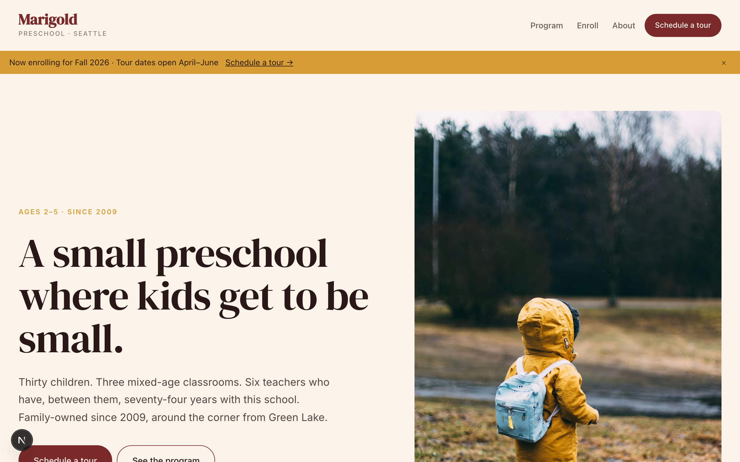
Preschool / early childhood template. DM Serif Display warm Didone + Inter body, deep brick terracotta with marigold-yellow accents on warm cream — picture-book palette that respects both kids and parents. Multi-step enrollment flow (tour → apply → waitlist), three mixed-age classrooms with named teachers, a daily-rhythm narrative that describes what a child's day actually looks like, lead-teacher credential cards, tour-booking form as primary CTA. No commerce. Generalizes across preschool, daycare, private K-8, Montessori, music school, tutoring service, summer camp, and any kids-serving organization with enrollment.

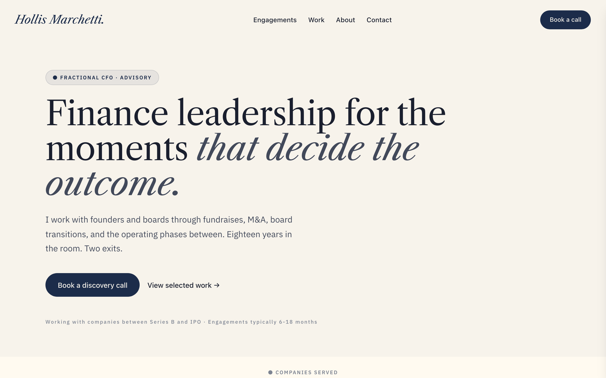
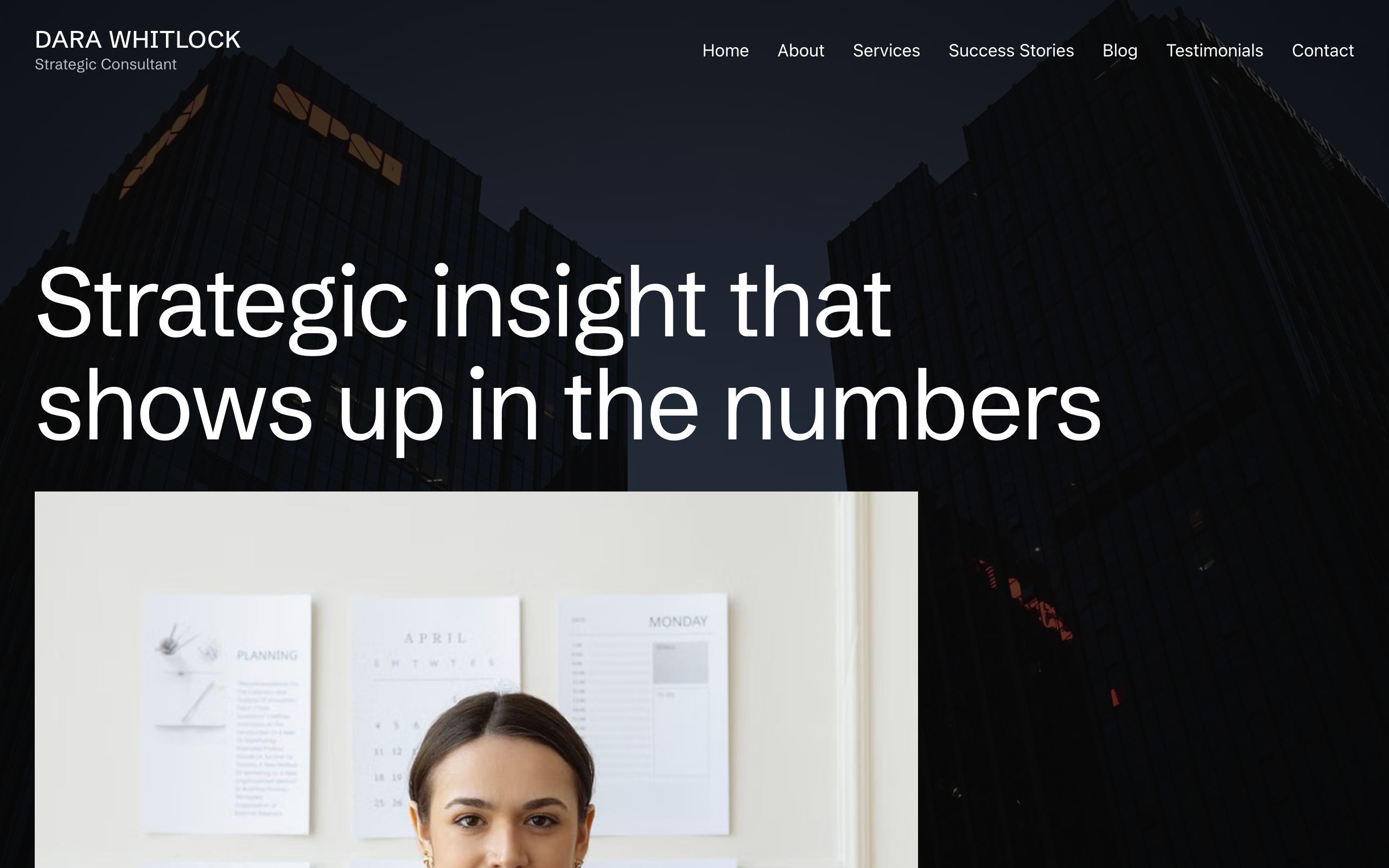
Authority-formal solo-expert site for fractional executives, strategic advisors, and management consultants. Oxford navy on warm ivory, italic Libre Caslon Text display + IBM Plex Sans body, restrained typography-led layouts. Multi-page (Home / Engagements / Work / About / Contact). Conversion is a discovery call. Distinct from Park (modernist solo consultant) — Meridian is monograph-feel, signature-typography, senior-fee positioning. Distinct from Whitford (b2b-firm law) — Meridian is solo, not a firm.

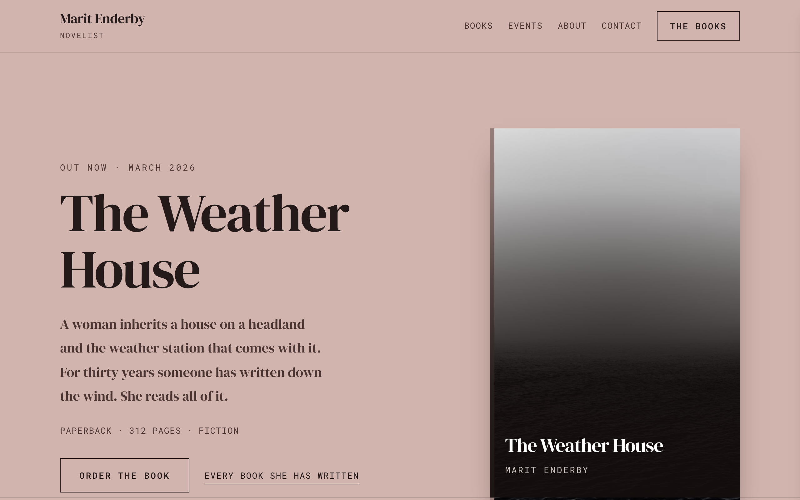
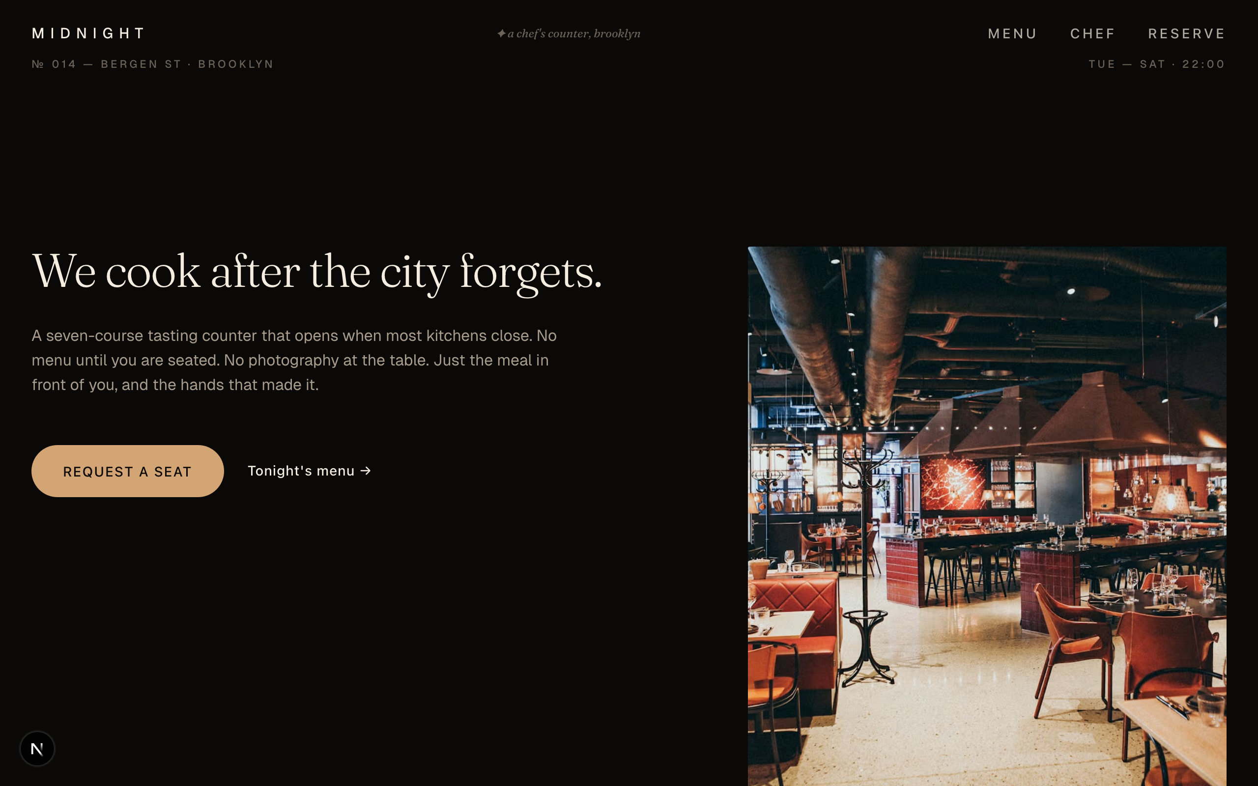
An editorial, after-dark restaurant template for chef's counters, tasting menus, and late-night dining rooms. Moody warm-dark palette, variable serif typography, and asymmetric magazine-style layouts.

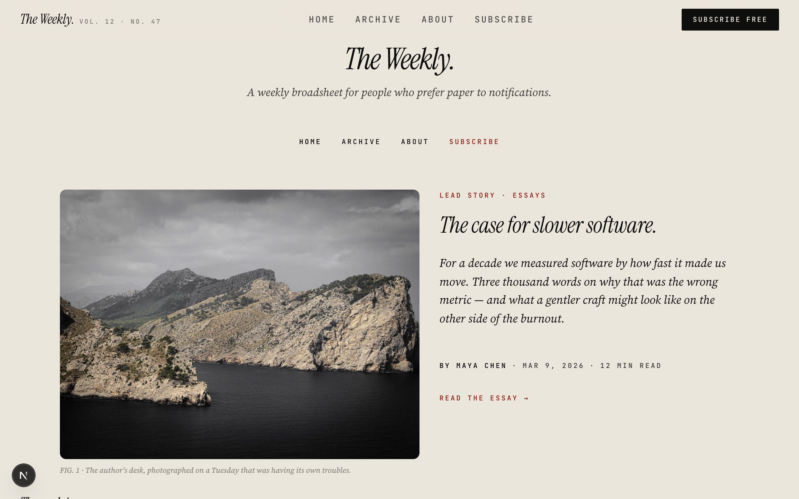
Editorial blog styled like a weekly broadsheet. Newsprint background, ink black body, ox-blood accent. Instrument Serif italic masthead, Source Serif body, JetBrains Mono bylines.

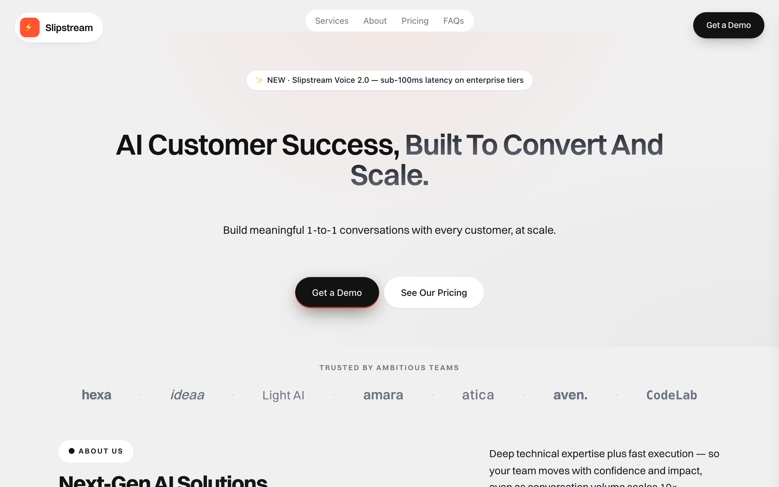
Modern SaaS marketing landing for AI products, dev tools, and customer-success platforms. Bold Manrope display + light gray surface + vivid orange-red accent — agency-dramatic register tuned for B2B-product audiences. Single-page scroll: floating-pill hero with 3 stacked feature chips + dual CTAs, logo strip, marquee feature pills, about with mission card + stats, 4-up services grid, 3-tier pricing, 3-card testimonials, 4-up trust grid, accordion FAQ, dark final CTA. Conversion goal is lead-form (book a demo). Nimbus is the SELL surface, not the read surface.

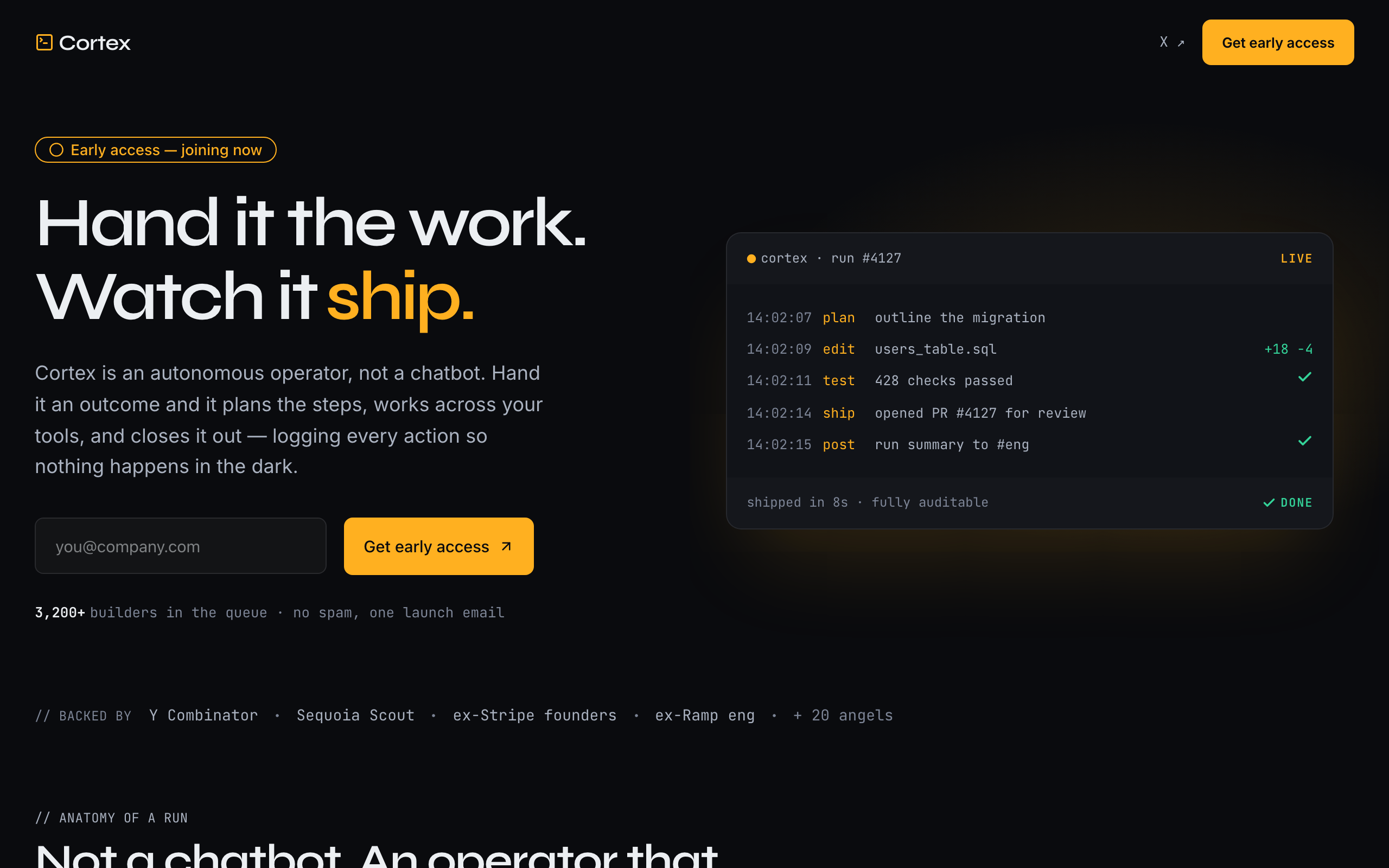
Agency-dramatic dark AI pre-launch waitlist with an operator's-console identity. The signature is a live run-log: a monospace execution trace of the agent planning, acting across tools, and closing out work with a ✓ and a diff — the 'shows its work / audit trail' promise made literal, so no product photography is needed. Ink near-black + a single amber signal accent (green reserved strictly for the done state), Syne display against JetBrains Mono as a co-lead (the machine's voice). Single-page: split hero (human headline + email capture beside the live console), backed-by strip, a four-phase run timeline (Plan · Act · Verify · Log), a bold manifesto band, an ordered 01/02/03 early-access sequence, a one-line ledger of momentum stats, an accordion FAQ, and a console-echo final CTA. Conversion goal is newsletter-signup. Distinct from slate (restrained dev-tool), tally/field (minimal consumer), glaze (warm editorial), and nimbus (live SaaS landing).

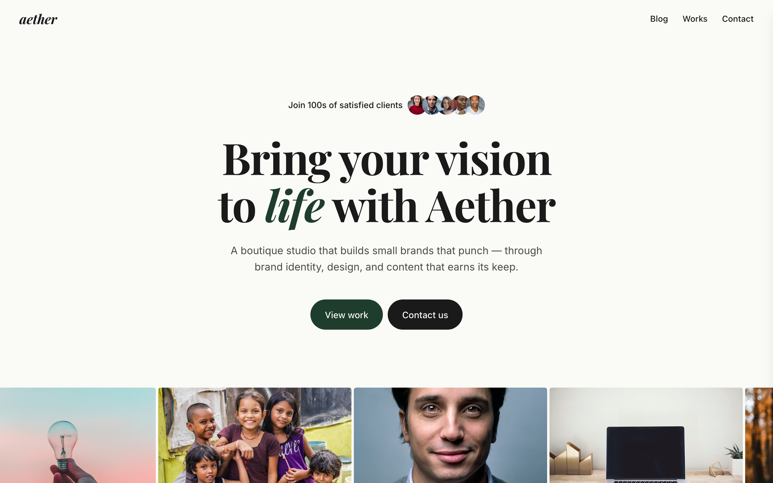
Light editorial agency portfolio with deep forest-green accents and bold Playfair Display headlines. Italic-accent typography (one word per headline italicized) on cream paper background. Six-service grid + dark testimonial spotlight + 3-tier pricing + FAQ accordion. For boutique creative agencies, freelance studios, and solo agency owners.

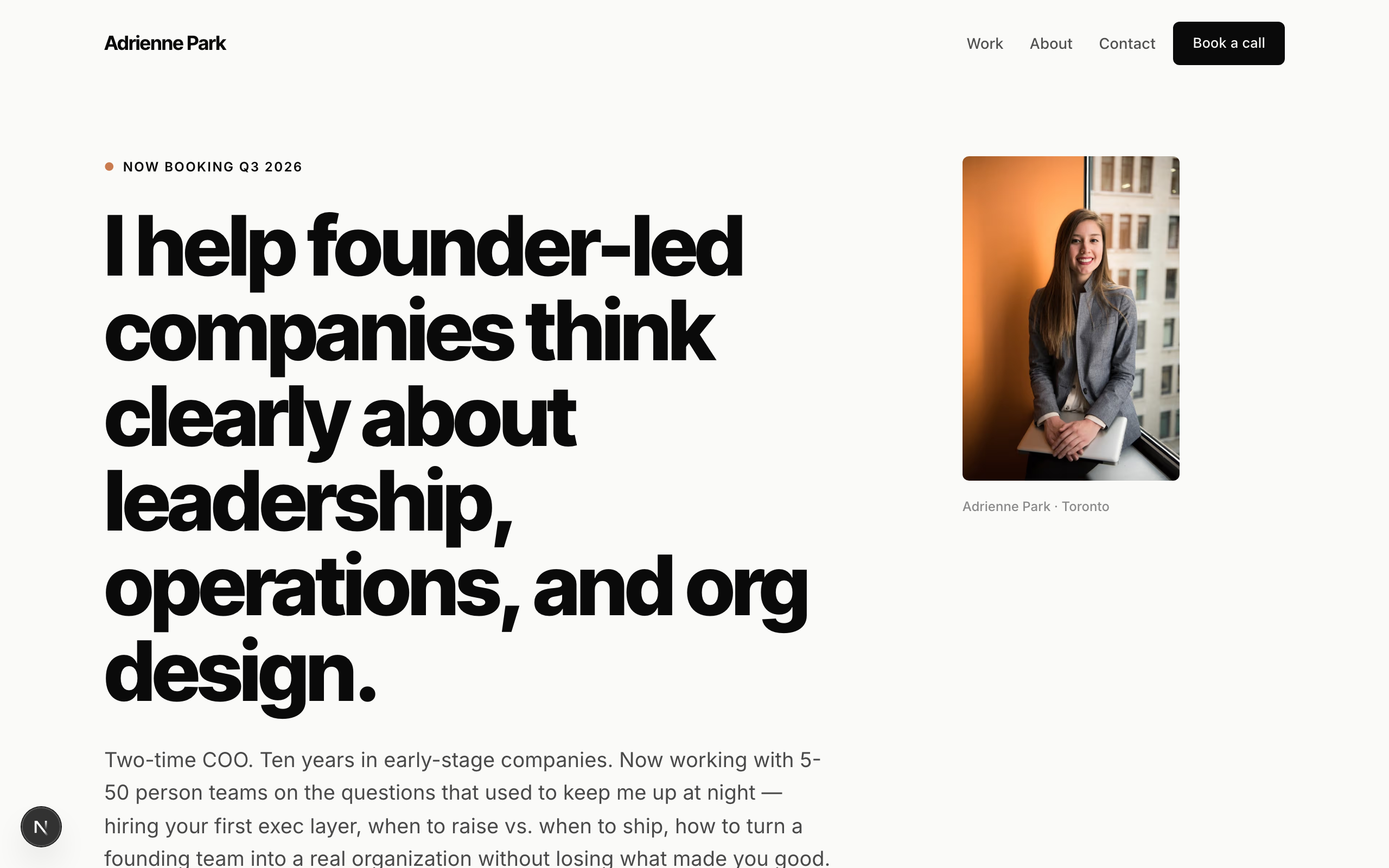
Solo-consultant template. Modernist minimal — the first all-sans fixture in the catalog. Inter Tight heavy display + Inter body, near-monochrome charcoal on barely-warm white with a single burnt-coral accent. Typography-dominant hero (no full-bleed image), client-name strip in place of fake logos, case-study cards with outcome metrics, booking-form for discovery calls. No commerce. Generalizes across the solo-expert archetype: business coach, leadership consultant, fractional CFO/CTO, career coach, executive coach, private-practice therapist, tutor.

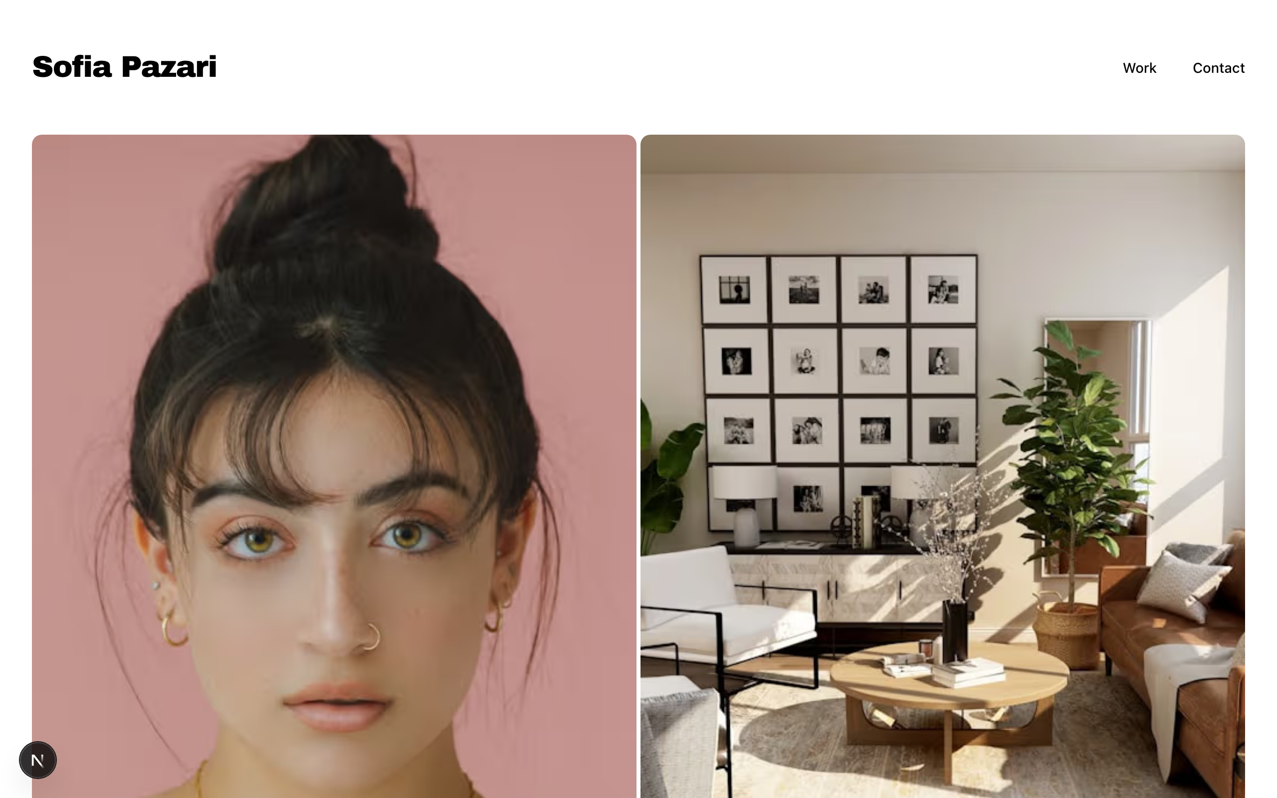
A minimal photography portfolio with a 2x2 category grid, gallery pages, and clean contact layout — inspired by magazine-style visual storytelling.

Playful-warm link-in-bio for lifestyle / travel creators — a faithful Linktree profile-card. A plain peach page gutter with one elevated, fully-rounded ~600px centered card that itself carries the signature peach→coral gradient: peach across the content, warming to a coral sunset at the card's base. No header, no footer. Deep-plum type, warm-coral accent, Fraunces + Poppins. Inside the card: circular avatar → name → one-line bio → vertical stack of filled cream pill buttons (round leading icon tile + trailing arrow; the priority button filled coral) → social-icon row, then a stacked shop strip with Stripe buy buttons, a short about block, and the inline newsletter capture the card ends on. The pill buttons ARE the conversion (subscribe-platform).

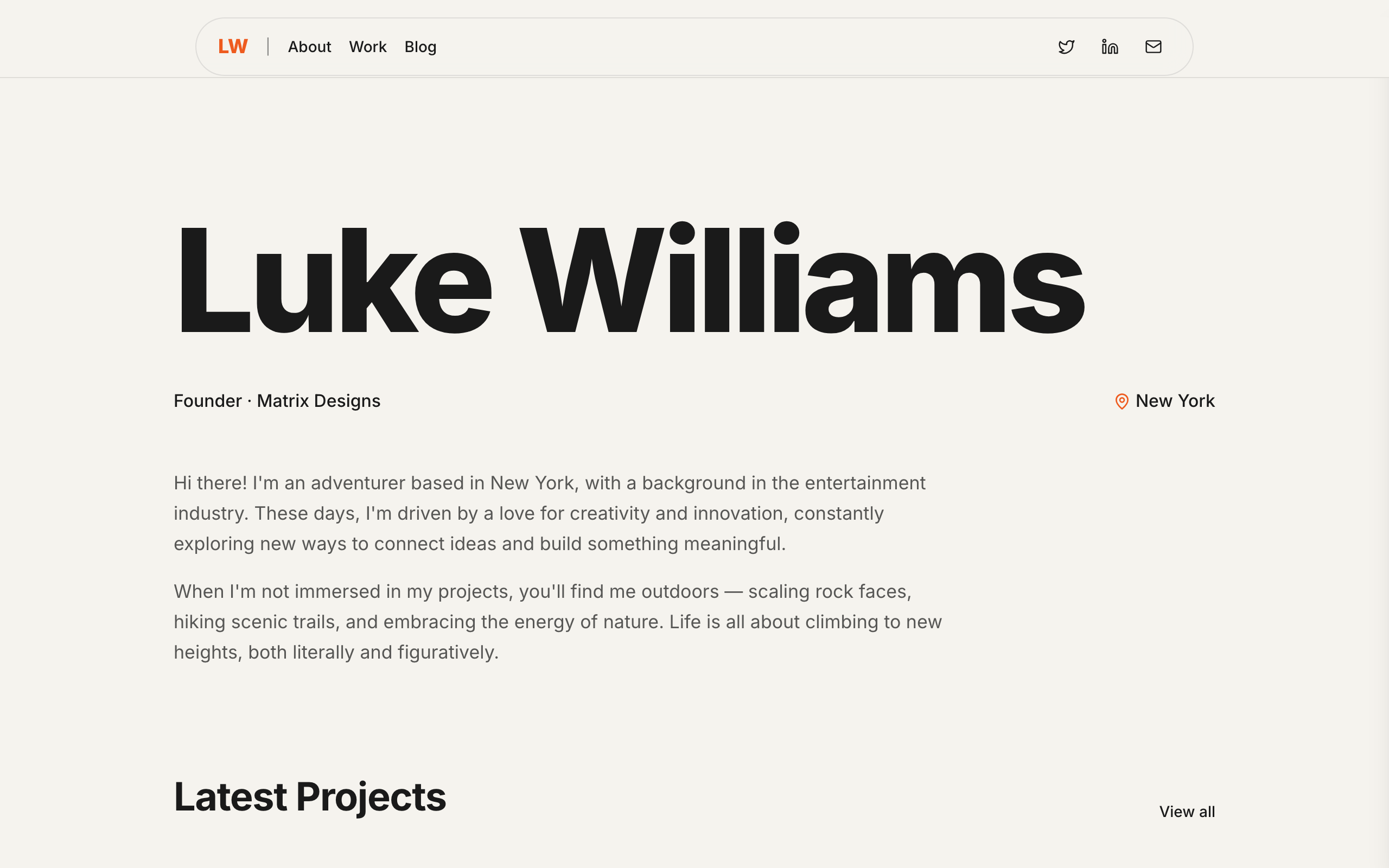
Warm-cream personal site for creator-founders — adventurer-creative-director archetype. Massive sans-serif name as the hero, single accent orange used sparingly (logo, active nav, hyperlinks), centered single-column layout with light pill nav floating at top. Four pages — Home, About, Work, Blog — plus three blog detail pages. Home leads with the name, drops into a two-paragraph bio, then runs three latest-project cards with year overlays, four latest-post rows with dates, and a newsletter subscribe panel. About is a tight single-screen story with a feature image. Work shows a richer project archive. Blog has a welcome essay and three detail posts.

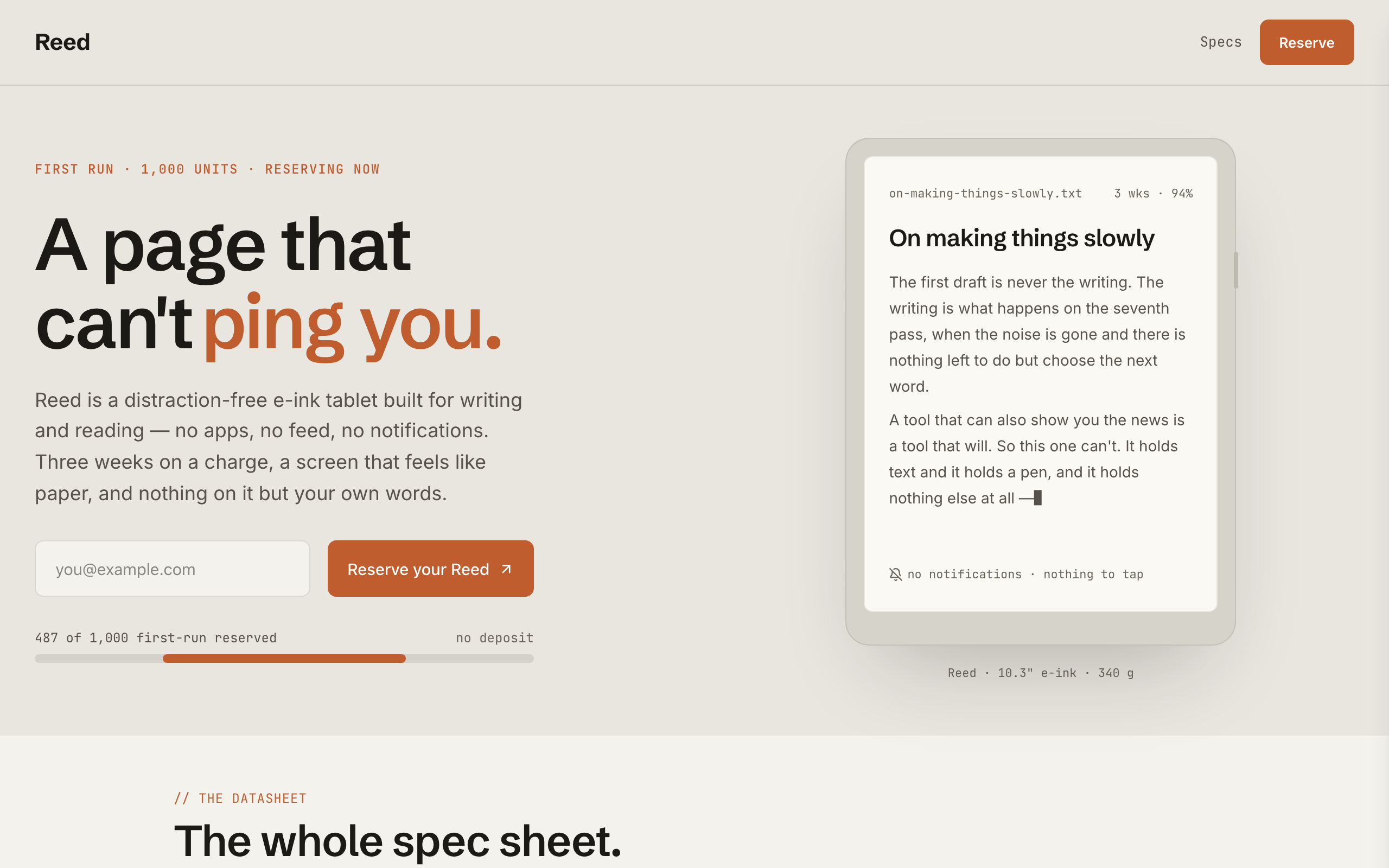
Pre-order / reserve waitlist for a PHYSICAL hardware product — the first non-software waitlist in the catalog. Modernist-minimal industrial-product register: cool paper-grey, ink, one warm-amber signal accent, Schibsted Grotesk + JetBrains Mono. Signatures no software waitlist has: a primitive-built device mockup (an e-ink tablet showing a page), a reserve counter with a scarcity progress bar ('487 of 1,000 first-run reserved'), and a mono spec datasheet. Single-page: split hero (headline + reserve form + reserve counter beside the device) → spec datasheet → three-reason strip → slow-craft manifesto → reserve-momentum band → FAQ → reserve CTA → footer. Conversion is newsletter-signup (reserve your place). Demo persona is 'Reed', a distraction-free e-ink writing tablet, but the design suits any premium physical product pre-launch. Distinct from slate/nova/tally/field/glaze — all software.

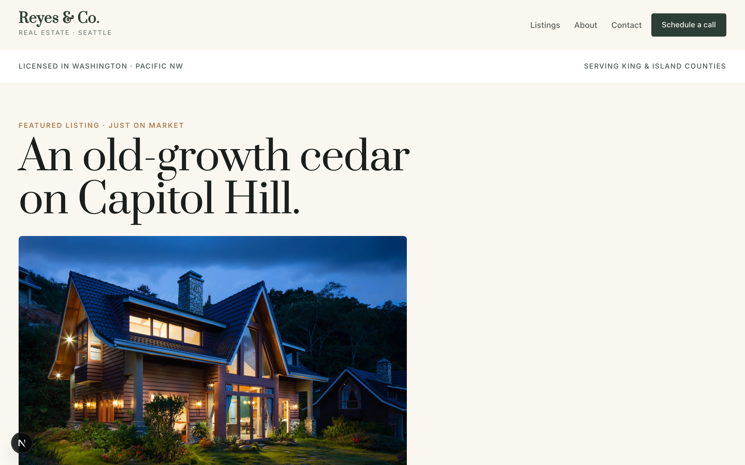
Real estate broker template. Deep forest green with warm ochre accents on warm off-white — grounded-luxury, not breathless. Prata display (high-contrast Didone) paired with Inter body. Introduces the listings-as-catalog pattern: a featured-listing hero with price / address / beds / baths / sqft, a listing grid with status chips (For Sale / Pending / Sold) and price labels, a client-testimonial block tied to specific transactions. No commerce primitives — real estate intake is qualitative, handled via contact form. This fixture unlocks adjacent archetypes: boutique hotel, vacation rental, car dealership — anywhere the site sells a catalog of high-value individual items.

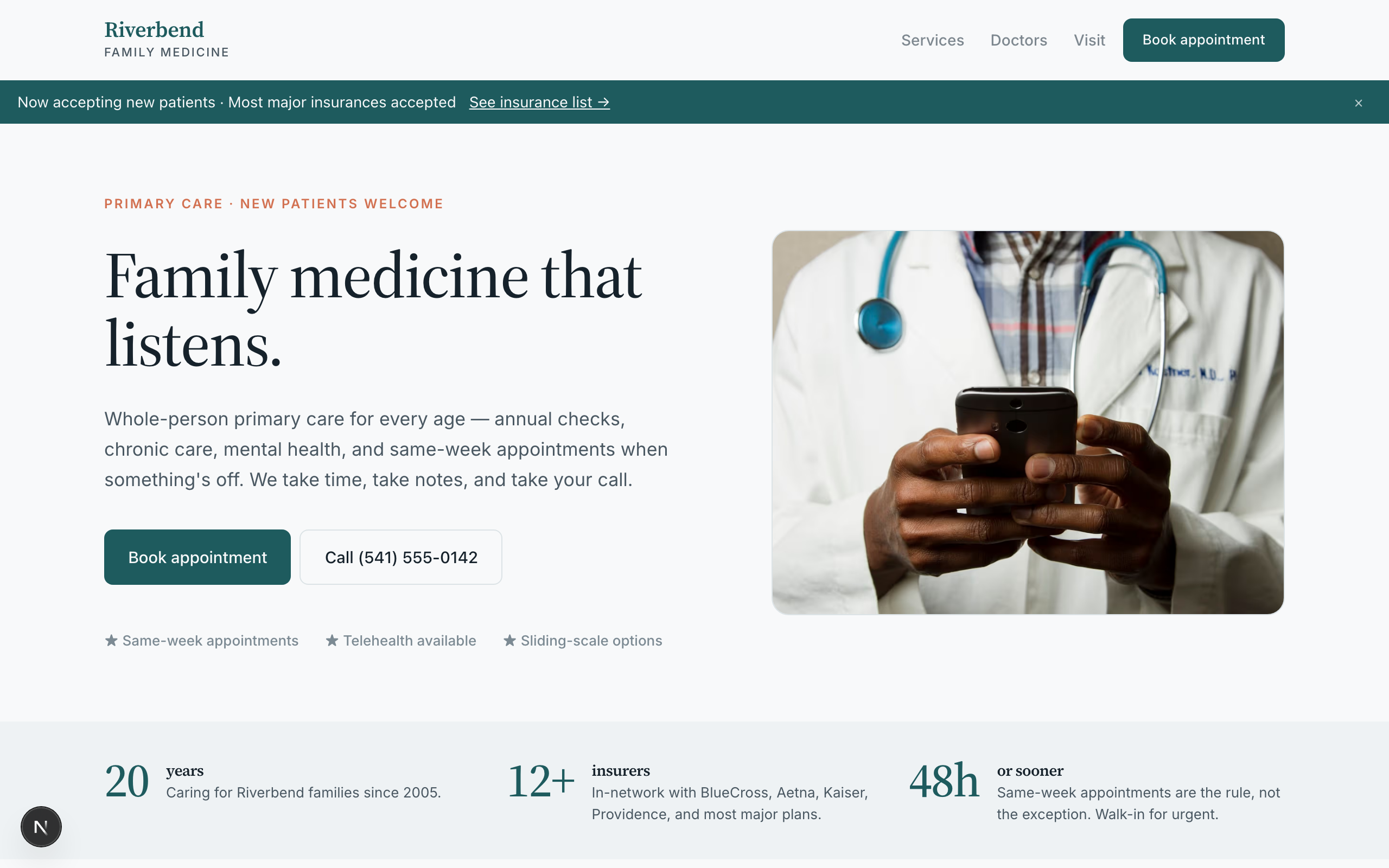
Family medicine clinic template. Deep teal + warm coral on bone — clinical trust with humanity. Source Serif 4 display, Inter body. Composes a hero with framed portrait, a 6-tile services grid, a 3-doctor care team, a booking-form for new-patient appointments, and a hours/insurance/visit triple-column. No commerce — pure service business. Header uses solid background with hide-on-scroll for a calm, distraction-free read.

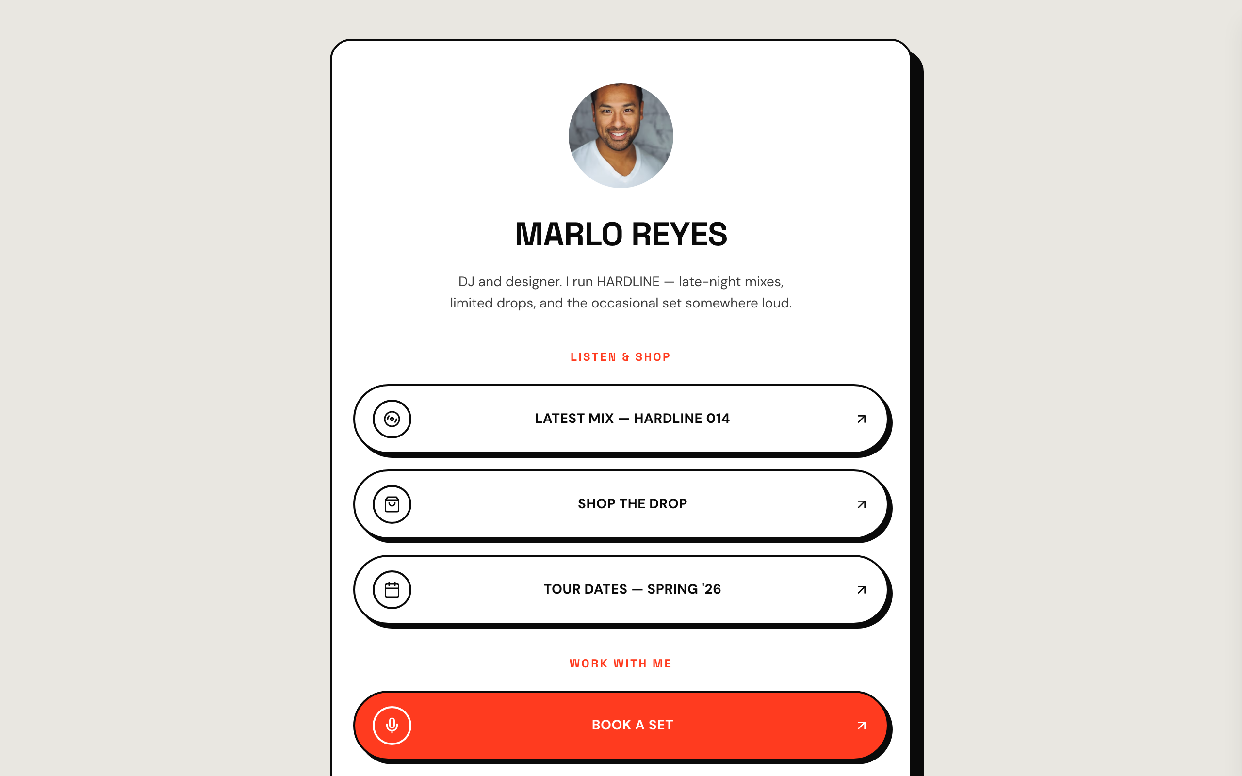
Neo-brutalist link-in-bio for high-energy creators — a faithful Linktree profile-card. A flat grey page gutter with one elevated, fully-rounded ~600px centered white card carrying a 2px ink border and a hard offset block-shadow. No header, no footer. Ink type, a hot vermilion accent, Space Grotesk + DM Sans. Inside the card: circular avatar → bold uppercase name → one-line bio → vertical stack of hard-shadow pill buttons (2px ink border, circular icon tile, trailing arrow; the priority button filled vermilion) → social-icon row, then a stacked drop strip with Stripe buy buttons, a short about block, and the inline list capture the card ends on. The buttons ARE the conversion (subscribe-platform).

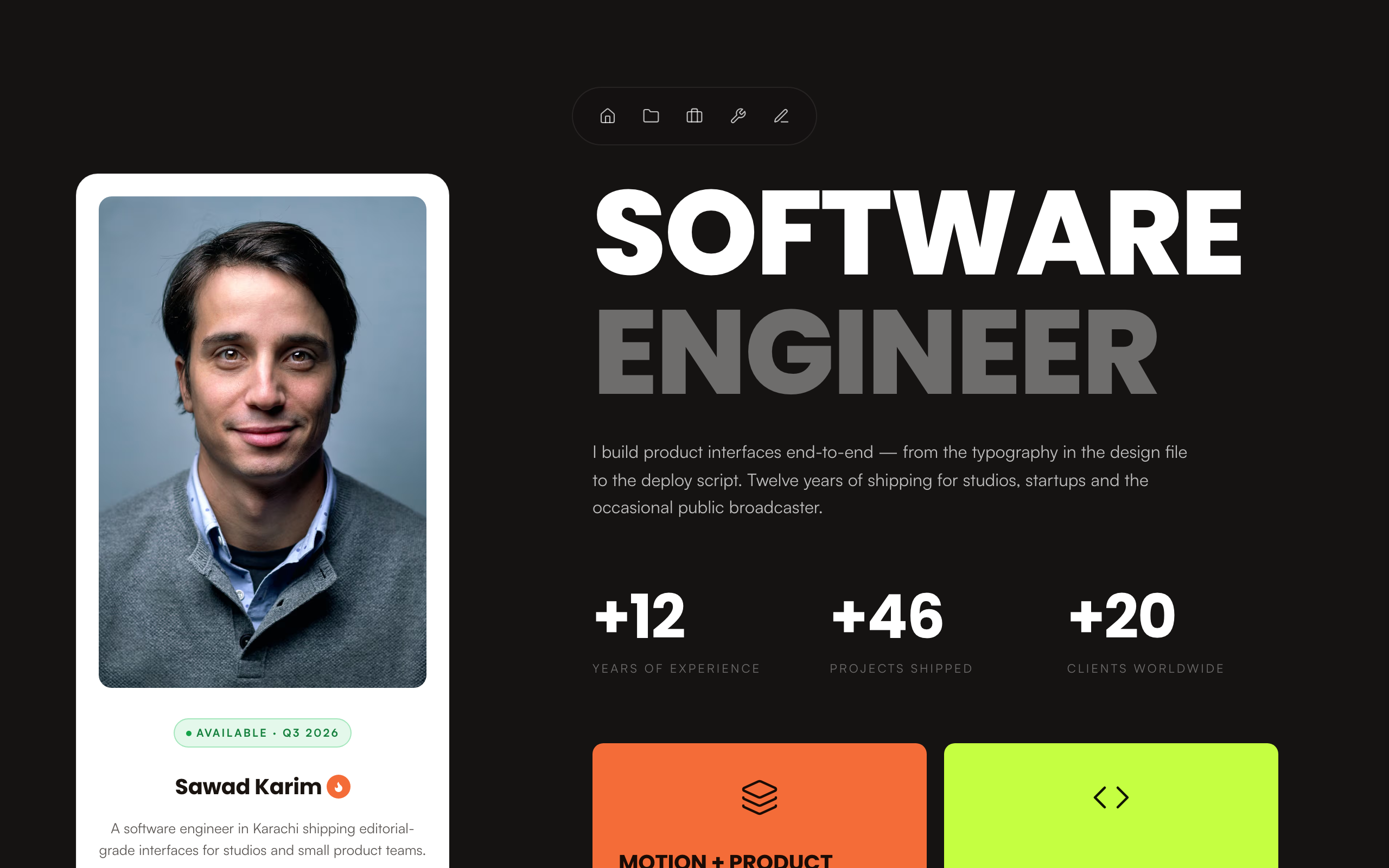
Sticky-sidebar dark portfolio for software engineers and product designers. Left rail holds a portrait card with name, status badge, tagline and socials. Right rail scrolls through hero, stats, two oversized skill cards, recent projects, experience timeline, premium tools grid, blog previews and a contact form. Five-page narrative — Home, Projects, Experience, Tools, Thoughts — plus blog detail pages. Poppins display for the two-tone uppercase heads, Manrope body, warm-black background with a single orange accent and a lime second card.

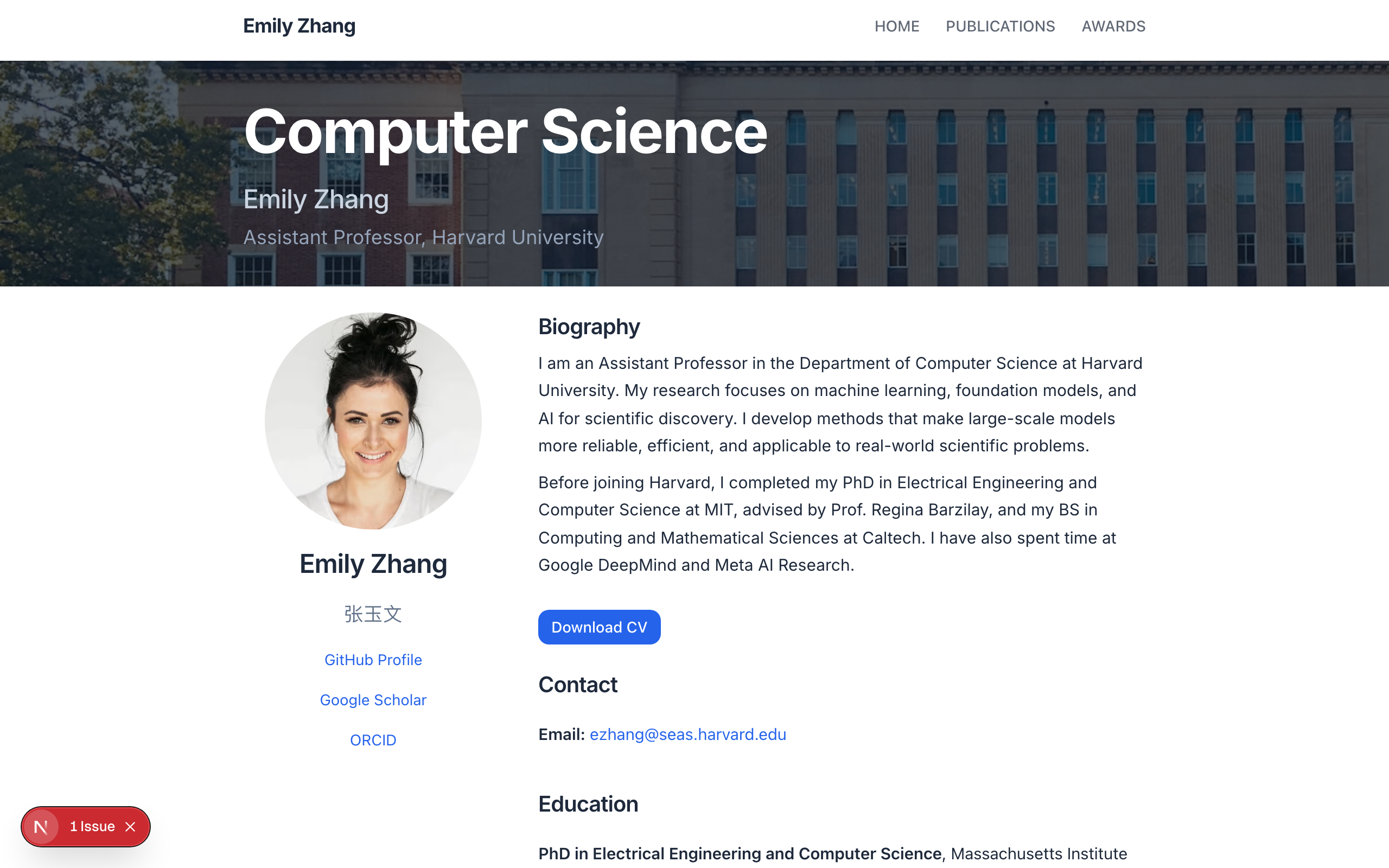
A clean, single-page academic homepage inspired by senli1073's template — dark navy banner, profile with photo and bio, publications grouped by status with full citations, awards list, and minimal footer.

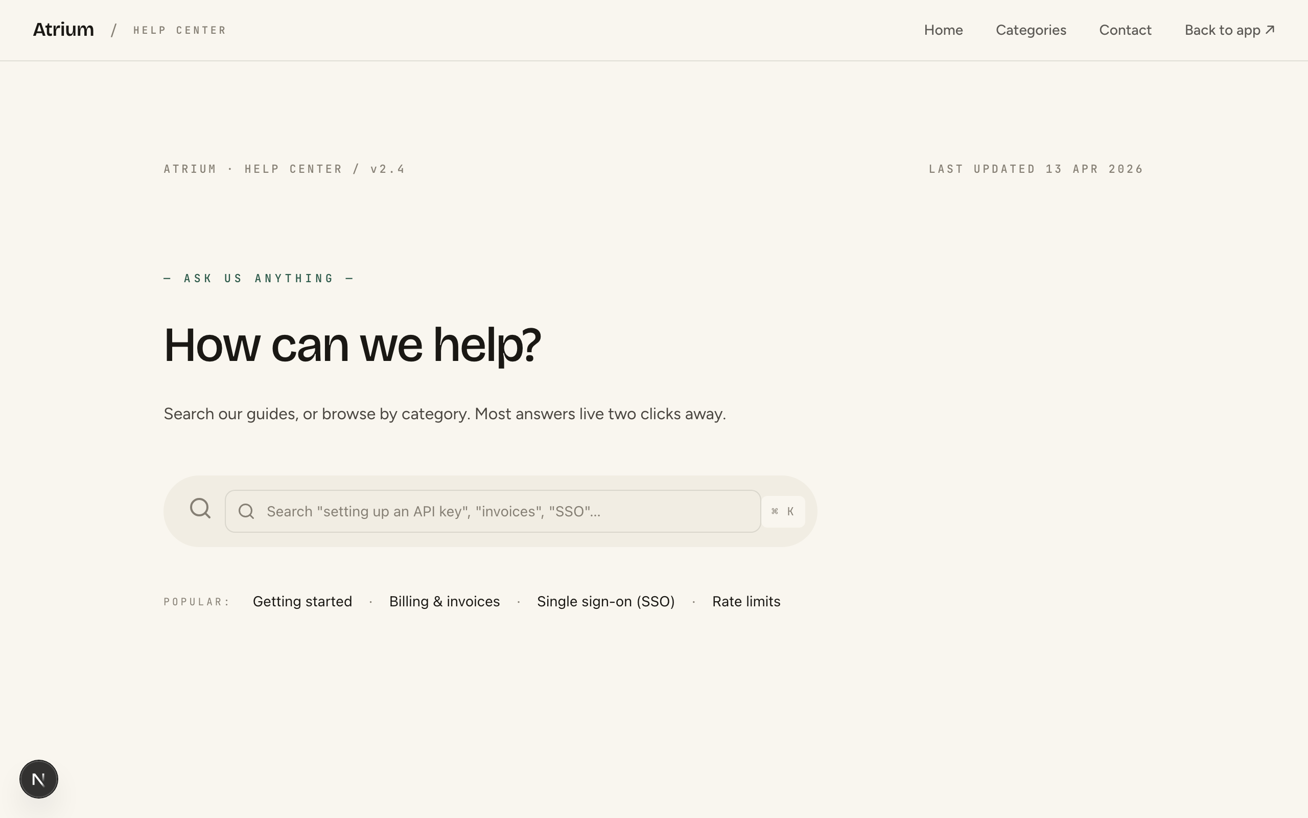
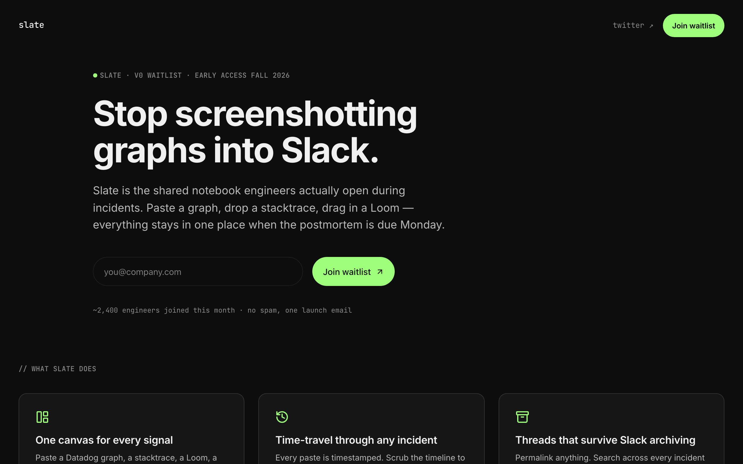
Tech-precise indie-SaaS pre-launch waitlist. Near-black surface, single mint accent, Inter body + JetBrains Mono eyebrow labels — Linear / Plain / Cron / Cursor energy. Single-page broadsheet: monospaced version-eyebrow → restrained two-line headline → one-line pitch → inline email signup → 3-up feature trio → backed-by strip → minimal footer. Conversion goal is newsletter-signup (email-only waitlist form). Distinct from nimbus (full SaaS marketing landing) and flagship (live-product landing) — slate is the PRE-LAUNCH surface that captures interest in <30 seconds.

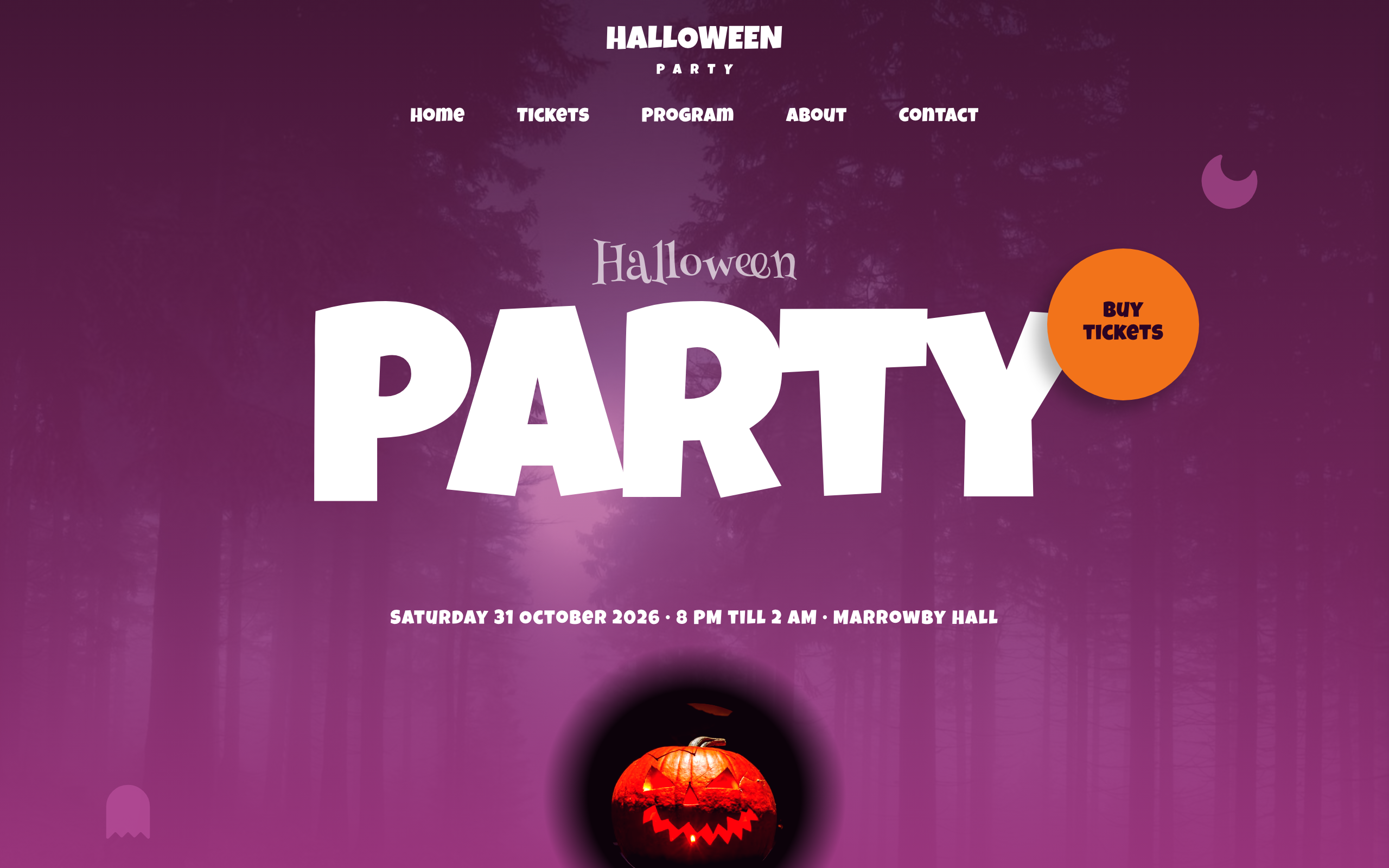
A bold event and conference landing page with countdown, speaker grid, schedule timeline, venue details, and tiered sponsors — designed to drive ticket sales and build anticipation.

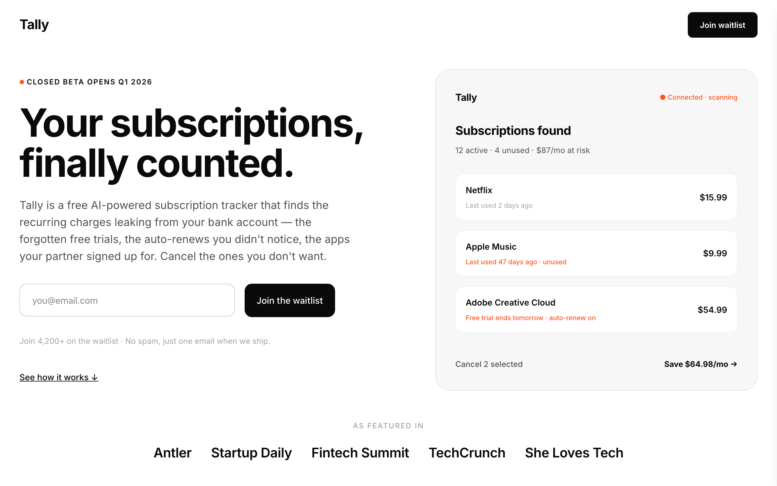
Mobile-app pre-launch waitlist cloned from the Simply Zibra (simplyzibra.com.au) structural pattern. Stark black-on-white minimalism, Inter throughout, single-page broadsheet with 8 sections: split hero (text-left + phone-in-hand image right) → featured-in text-badge strip → 'how it works' 3-step → 'why' 3-benefit grid → 3-icon security strip → FAQ accordion → closing CTA band → minimal footer. Conversion goal newsletter-signup; integrations form. Distinct from slate (dark / mono / dev-tools) — tally is the LIGHT / consumer-mobile-app waitlist register for fintech-adjacent or personal-finance pre-launch products.

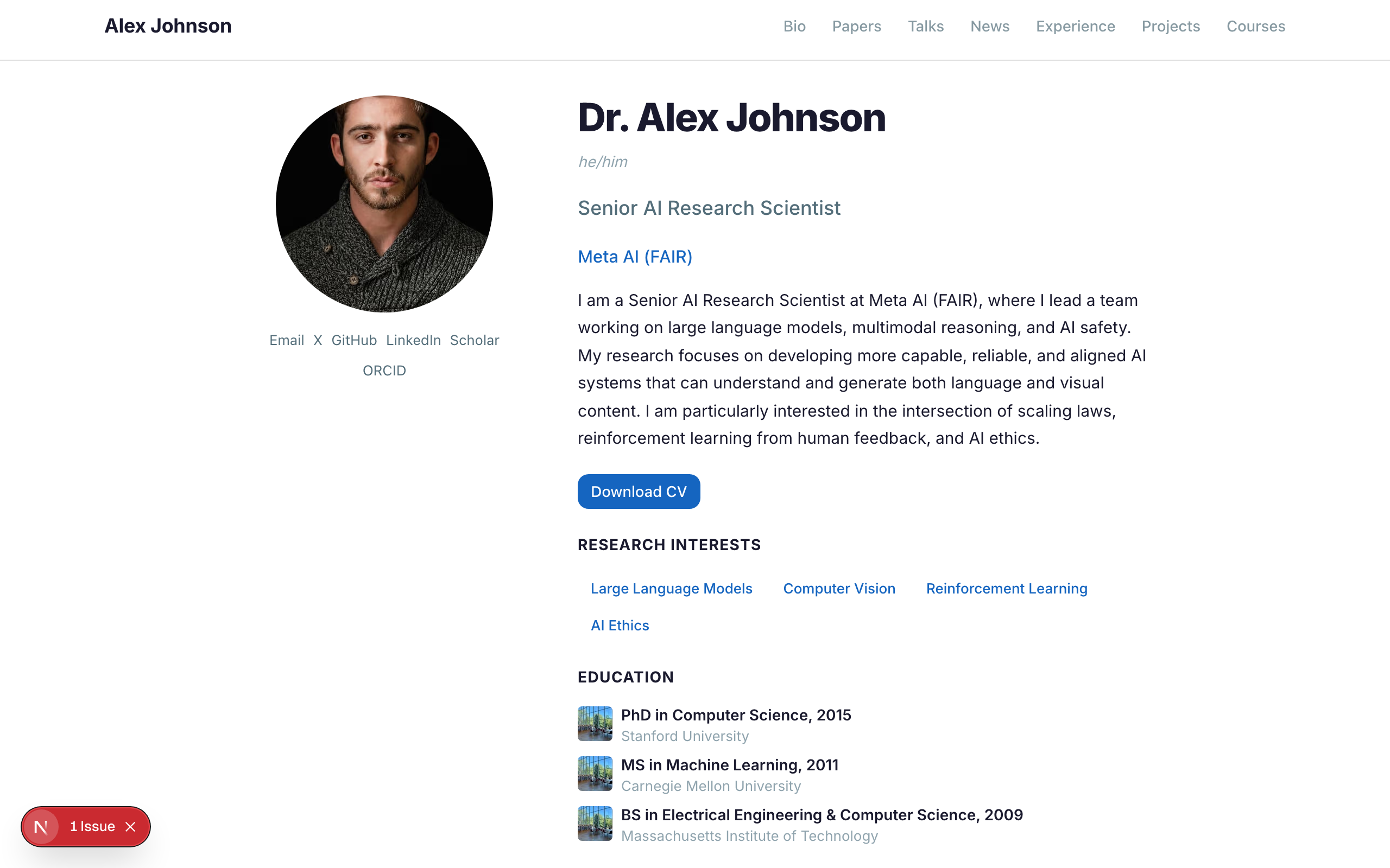
A multi-page academic CV and portfolio inspired by HugoBlox Academic CV — centered bio with profile photo, social links, education timeline, research interests, featured publications, recent talks, and blog posts. Includes dedicated pages for experience, publications, projects, courses, and blog.

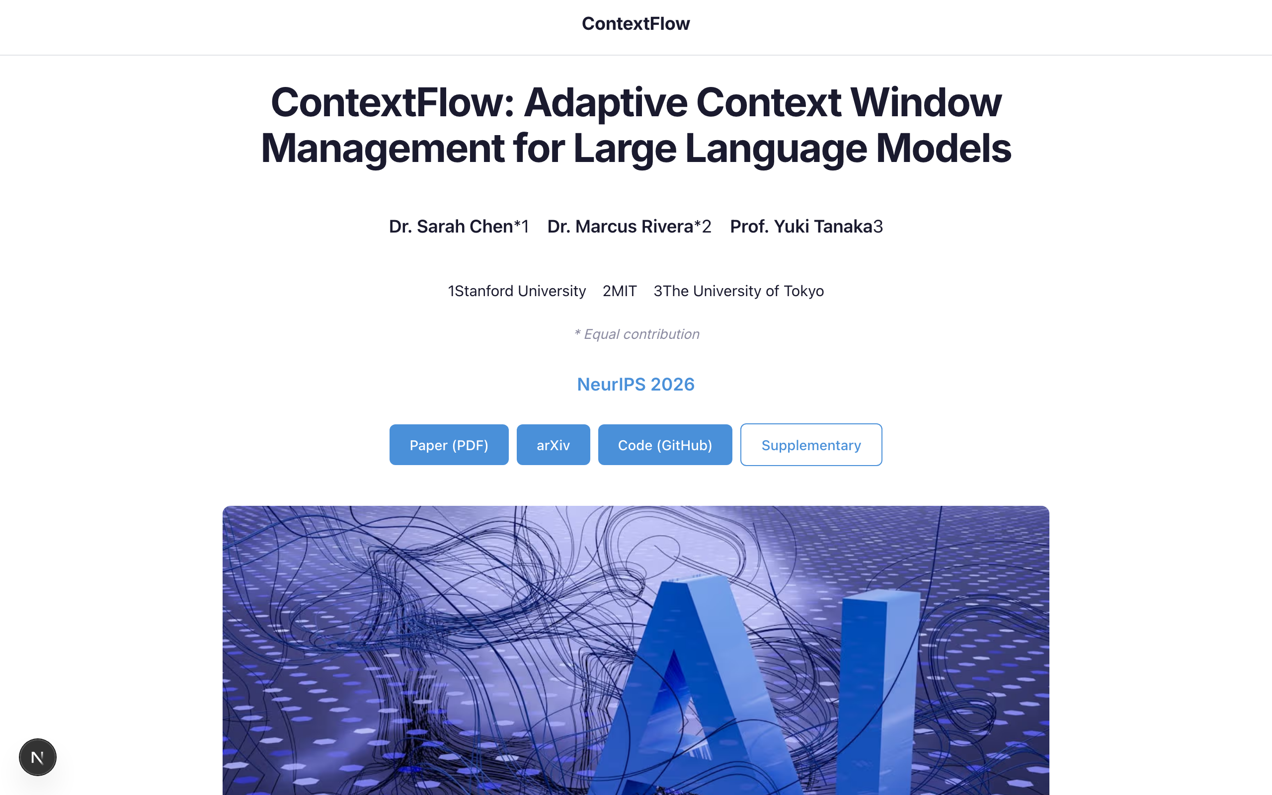
A single-page research project site inspired by the popular Academic Project Page template — perfect for showcasing a paper with title, authors, abstract, results, video, and BibTeX citation.

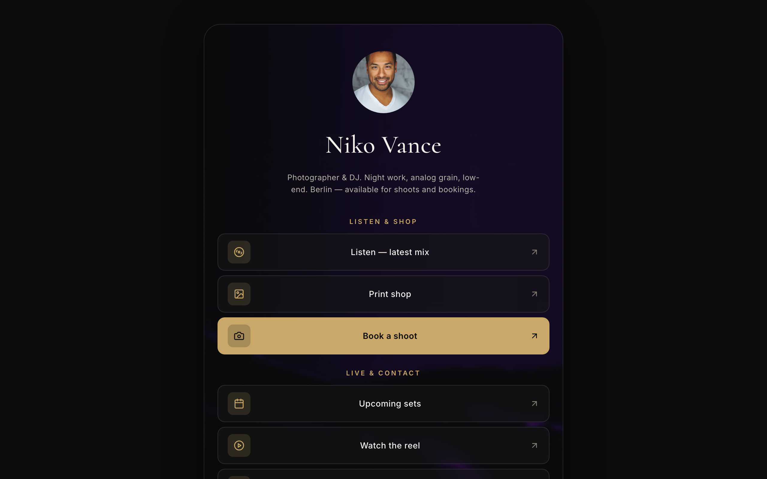
Fine-dining-dark, photo-editorial link-in-bio for visual creators — a faithful Linktree profile-card. A plain near-black page gutter with one elevated, fully-rounded ~600px centered card; the darkened photo backdrop lives INSIDE the card. No header, no footer. Off-white type, muted-gold accent, Cormorant + Inter. Inside the card over the photo: circular avatar → name → one-line bio → vertical stack of translucent glass buttons (leading icon tile + trailing arrow; the priority button filled gold) → social-icon row, then a stacked print/sound shop with Stripe buy buttons, a short about block, and the inline drop-list capture the card ends on. The glass buttons ARE the conversion (subscribe-platform).

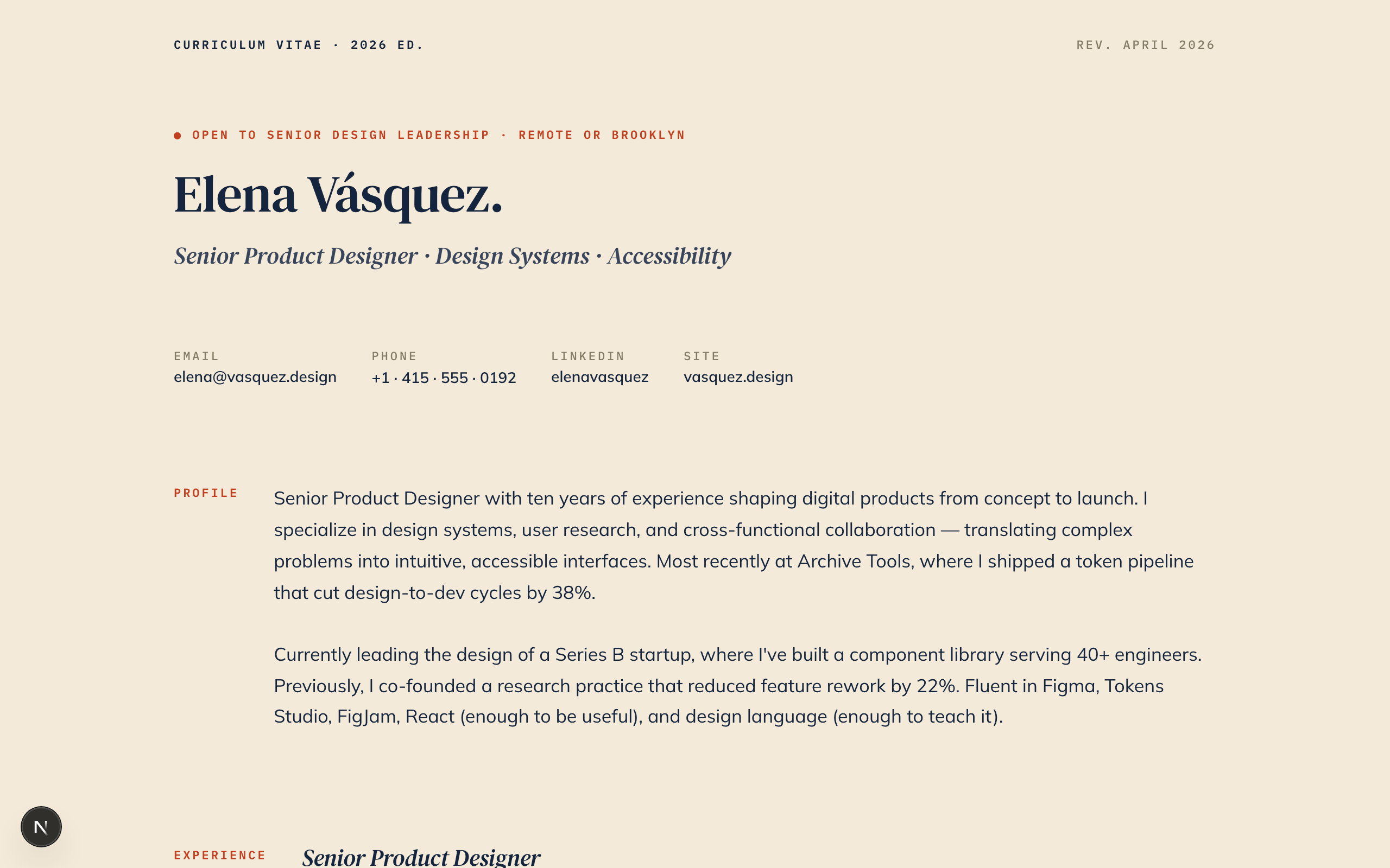
Printable professional profile styled as a personal pamphlet. Cream paper + navy ink + rust accent. DM Serif Text italic headings, Mulish body, IBM Plex Mono for dates and credentials.

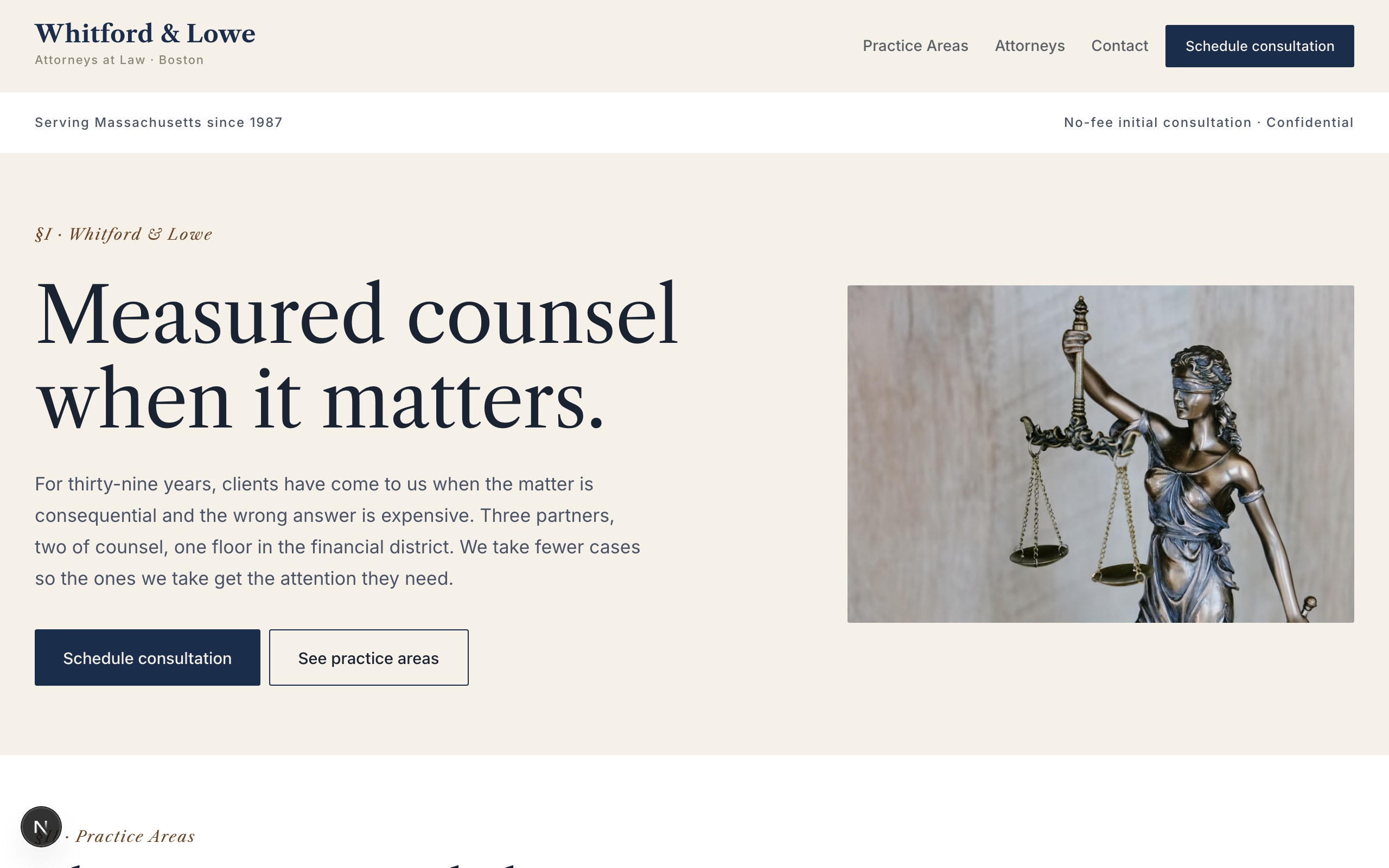
Boutique law firm template. Oxford navy with walnut accent on aged cream — authority without BigLaw gloss. Libre Caslon Text display, Inter body, small-caps for section labels. Roman numerals (§I / §II / §III) segment the home page. No commerce primitives — pure professional services: contact form (not booking-form) with confidentiality notice, practice-area grid, attorney partner headshots, outcomes strip. Proves the SMB stack bends to authority-archetype work without needing its transactional primitives.