

Keel
A website template for an open-source framework, runtime or library home page
Keel is shaped for software that is given away rather than sold. There is no pricing table and no sales funnel, because the conversion an open-source project wants is adoption: read the docs, copy the install line, ship something. The home page is organised around that one path.
Who Keel is for
Built for these, and tested against them.
- Open-source frameworks, runtimes and libraries
- Developer SDKs and API clients that need docs, releases and adopters in one place
- Internal platform teams publishing a tool to the rest of the company
- Any technical project whose conversion is 'read the docs', not 'buy now'
- Maintainers who want a changelog and a showcase that grow without touching the layout
What’s included
Everything below ships with the template, already filled in.
- Pages
- 5 pages, written and laid out
- Grows with you
- 4 showcase entries at /showcase/, 3 changelog entries at /changelog/ — add one and its index and detail page both update
- Enquiries
- A working form — messages land in your Sitelas inbox
- Type
- Geist · light theme
- Everywhere
- Built and checked at phone, tablet and desktop widths
- Yours to change
- Every colour, word and photograph — in the editor or by asking an AI agent
About This Template
A project site, not a product page
The rules are the design
Every band is bracketed top and bottom by a dashed hairline that runs the full width of the measure. Content sits inside the rules; nothing floats outside them. On a phone the brackets close into a grid — two vertical rules down the gutters — so the page reads as a ruled sheet at every width. The palette is white, one tonal grey, and near-black ink. Colour appears in exactly two jobs: a hairline on each foundation card, and the focus ring. Even the category chips are neutral.
Two archives that grow
The showcase and the changelog are real collections, not hand-authored pages. Add a release or a case entry and its detail route exists immediately, with breadcrumbs and reading time already wired. The showcase entries are anonymised by design — 'a 4.1M-row clinical registry', not a client's name — which is honest before you edit a word of it, and is what a maintainer under NDA would write anyway.
When to pick something else
Keel is the wrong template for these. Where there is a better one, it is linked.
Free to use · No credit card required
- 1Opens in the editor with the starter content in place
- 2Change the words and pictures to yours
- 3Publish to a sitelas.com address, or your own domain
Key Highlights
Questions about Keel
Can I change how Keel looks?
All of it. Colours, type, spacing, photographs and every word are yours to edit — in the visual editor, or by asking an AI agent to do it for you. Nothing is locked.
Do I need to know how to code to use Keel?
No. You edit the page by clicking the thing you want to change. There is no code to write and nothing to install.
Can I add more showcase entries later?
Yes — that is what the showcase collection is for. Adding one from the editor creates its own page at /showcase/ and updates the index automatically. You are not editing a list by hand.
What does Keel cost?
Nothing to start, and there is no trial clock. A free site runs on a sitelas.com address; Pro is $9 a month per site when you want your own domain, analytics and more room.
Can I use my own domain?
Yes, on Pro. Point your domain at the site and SSL is issued automatically — there is no certificate to buy or renew.
Make Keel yours
It opens in the editor with every page already written. Change what you want, publish when it reads like you.
Free to use · No credit card required
Related Templates
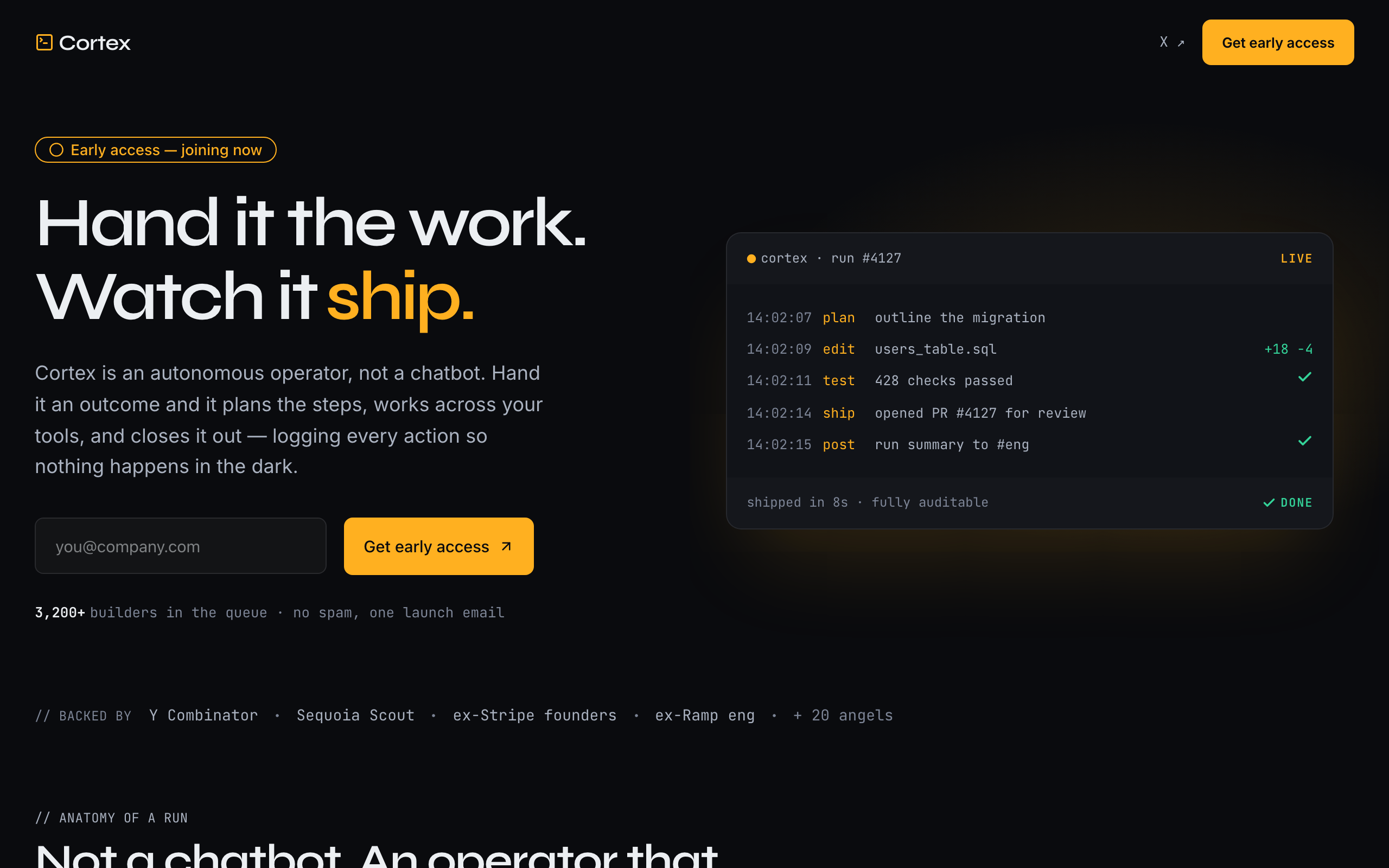
Nova
Agency-dramatic dark AI pre-launch waitlist with an operator's-console identity. The signature is a live run-log: a monospace execution trace of the agent planning, acting across tools, and closing out work with a ✓ and a diff — the 'shows its work / audit trail' promise made literal, so no product photography is needed. Ink near-black + a single amber signal accent (green reserved strictly for the done state), Syne display against JetBrains Mono as a co-lead (the machine's voice). Single-page: split hero (human headline + email capture beside the live console), backed-by strip, a four-phase run timeline (Plan · Act · Verify · Log), a bold manifesto band, an ordered 01/02/03 early-access sequence, a one-line ledger of momentum stats, an accordion FAQ, and a console-echo final CTA. Conversion goal is newsletter-signup. Distinct from slate (restrained dev-tool), tally/field (minimal consumer), glaze (warm editorial), and nimbus (live SaaS landing).
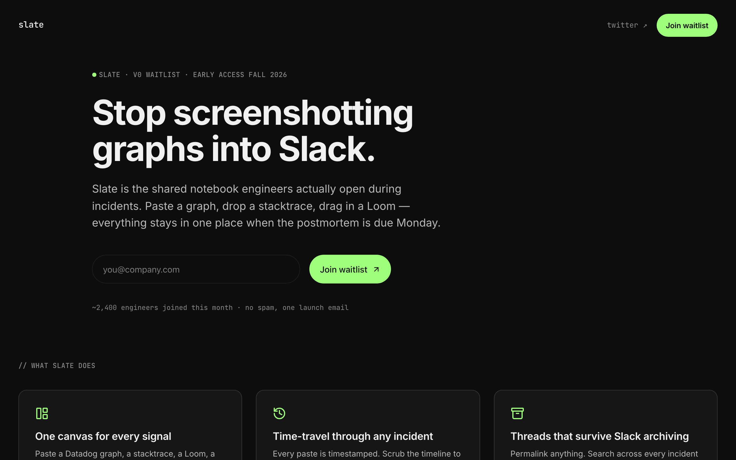
Slate
Tech-precise indie-SaaS pre-launch waitlist. Near-black surface, single mint accent, Inter body + JetBrains Mono eyebrow labels. Single-page: monospaced version-eyebrow -> restrained headline -> one-line pitch -> waitlist form, beside a small type-and-icon product mock; then a 3-up feature trio, a text-only backed-by strip, a closing CTA with a second form, and a minimal footer. Conversion goal is newsletter-signup (email-only waitlist form). Distinct from nimbus (full SaaS marketing landing), flagship (live-product landing) and nova (the loud, amber, agency-dramatic take on the same pre-launch brief) — slate is the RESTRAINED pre-launch surface that captures interest in under 30 seconds.
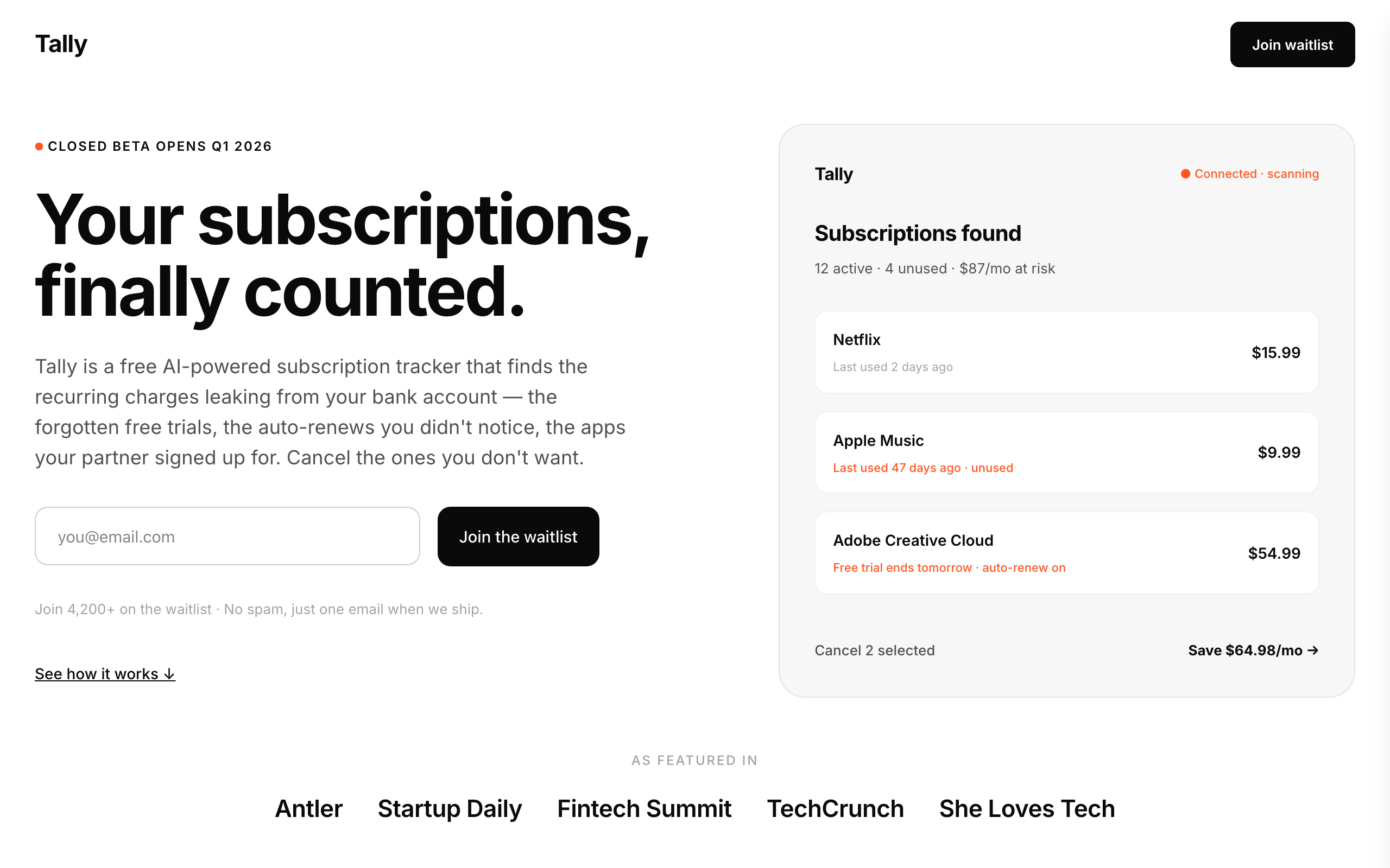
Tally
Mobile-app pre-launch waitlist built on the Simply Zibra (simplyzibra.com.au) structural pattern. Stark black-on-white minimalism, Inter throughout, single-page broadsheet with 9 sections: split hero (text + form left, a PHONE MOCKUP BUILT FROM PRIMITIVES right — no screenshot needed) → featured-in text-badge strip → 'how it works' 3-step → black counter-stats band → 'why' 3-benefit grid → two pilot testimonials → 3-icon security strip → FAQ accordion → closing CTA band → minimal footer, plus editable Privacy and Terms pages behind the footer links. Conversion goal newsletter-signup; integrations form. Distinct from slate (dark / mono / dev-tools) and field (image-led, for founders who already have photography) — tally is the LIGHT / consumer-mobile-app waitlist register for fintech and personal-finance pre-launch products, and its every concrete surface (bank connection, transaction rows, read-only access) is financial.