
About This Template
Built for events that sell out
Summit is a single-page conference site that builds anticipation from the first scroll. A countdown hero, speaker lineup, and detailed schedule give attendees everything they need to commit.
Dark, electric, energetic
Navy backgrounds with lime-green accents create a high-energy tech-conference feel. Space Grotesk headings and generous whitespace keep the dense schedule information scannable.
Every section a conference needs
Countdown, speakers, schedule, venue, sponsors, and a bold early-bird CTA — structured in the order that converts browsers into badge-holders.
Launch in 6 Steps
Update event name, date, and location
Add speaker photos and bios
Fill in your schedule sessions
Add venue details and directions
Place sponsor logos and tiers
Set ticket pricing and CTA links
Summit
A bold event and conference landing page with countdown, speaker grid, schedule timeline, venue details, and tiered sponsors — designed to drive ticket sales and build anticipation.
Free to use · No credit card required
Key Highlights
Perfect For
Related Templates
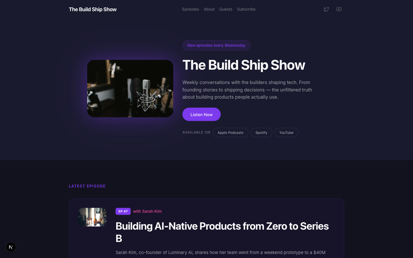
Airwave
A bold podcast and creator page with dark charcoal tones, electric purple accents, episode listings, guest spotlights, and platform subscription links — designed for shows that want to look as good as they sound.
Amber
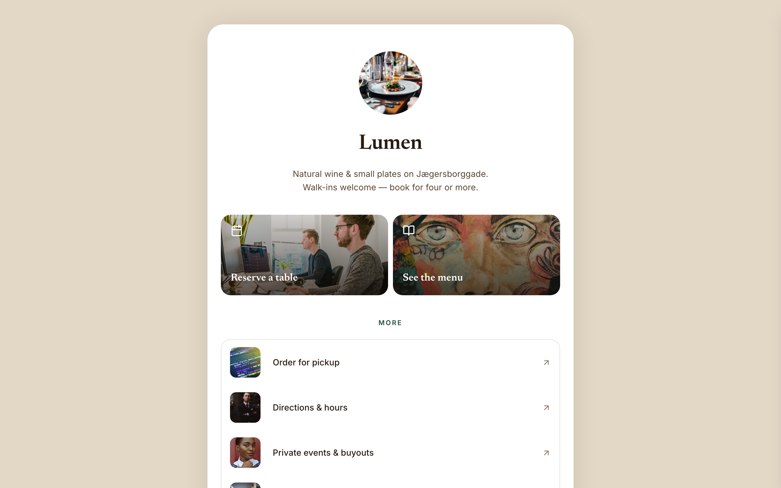
Warm hospitality link-in-bio for a café, wine bar, or restaurant — a faithful Linktree profile-card. A warm-sand page gutter with one elevated, fully-rounded ~600px centered white card; no header, no footer, and no email-capture section (a venue converts on reserve/menu/call). Ink-brown type, a bottle-green accent, Newsreader + Inter. Inside the card: circular logo → serif name → one-line bio → a 2-up photo-backed action pair (Reserve · Menu) → a grouped flat list panel with photo thumbnails → a social/contact row with a real tap-to-call link, then a horizontal 'on now' shelf of 3 Stripe items, and a short about block the card ends on. The action tiles ARE the conversion (menu-reservation).
Arena
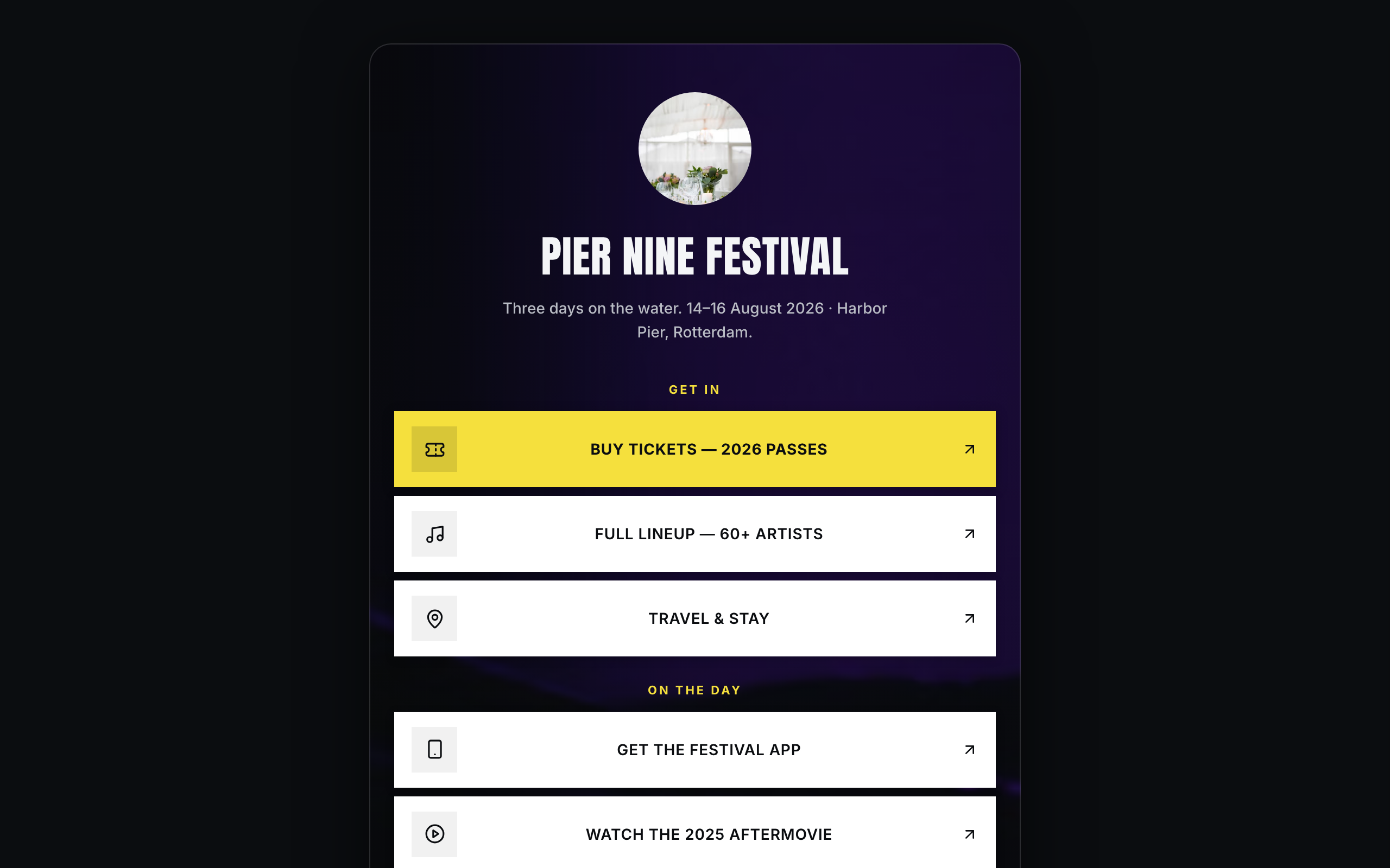
Brand/organization link-in-bio for festivals and live events — a faithful Linktree profile-card. A plain near-black page gutter with one elevated, fully-rounded ~600px centered card; the darkened event photo lives INSIDE the card. No header, no footer. Off-white type, festival-yellow accent, Anton + Inter. Inside the card over the photo: circular logo → bold condensed name → dates/location line → vertical stack of sharp white cards (square logo tile, 2-line label; the priority Buy-tickets card filled festival-yellow) → social-icon row, then a stacked passes strip with Stripe buy buttons, a short about block, and the inline presale-list capture the card ends on. The cards ARE the conversion (ticket-sale).