

Foundry Industrial company website template
Foundry is for a business with several named specialisms: an industrial services group, a multi-discipline contractor or a manufacturer serving different sectors. It answers the buyer's two questions straight away: can you cover everything we need, and are you certified?

Who Foundry is for
Built for these, and tested against them.
- Industrial services groups running several named divisions
- Multi-discipline contractors — coatings, mechanical, access, insulation
- Manufacturers serving distinct sectors under one brand
- Facilities and maintenance groups with specialist crews
- Any supplier whose pitch is breadth of capability plus accreditation
What’s included
Everything below ships with the template, already filled in.
- Pages
- 4 pages, written and laid out
- Grows with you
- 8 division entries at /divisions/ — add one and its index and detail page both update
- Enquiries
- A working form — messages land in your Sitelas inbox
- Fonts
- Oswald and IBM Plex Sans · light theme
- Everywhere
- Built and checked at phone, tablet and desktop widths
- Yours to change
- Every colour, word and photograph — in the editor or by asking an AI agent
Build Foundry by asking your AI agent
No editor required. The agent writes your copy, swaps the photos and publishes the site.
- 1Connect Sitelas to Claude, ChatGPT or another AI agent that supports MCP. How to connect
- 2Ask for it in plain words: “Build a website for an industrial services group running several named divisions using the Foundry template.”
- 3Open the preview link it sends back, ask for changes, and publish when it reads right.
Then keep changing it from the same chat
- Rewrite the copy“Rewrite every page in a warmer, friendlier voice.”
- Change the design“Make the colours earthier and use a serif for headings.”
- Add or remove pages“Add a Pricing page and remove the Blog.”
- Rearrange sections“Move the testimonials higher and add an FAQ.”
- Swap the photos“Replace the photos with ones that fit my business.”
- Run the site“Show me this week's form messages, then publish.”
Everything here can also be done by hand in the visual editor.
About the Foundry template
Built for a group with several specialisms
Procurement and maintenance buyers rarely want one trade; they want a supplier who can cover the job and prove they are certified. Foundry is laid out like a group line card, so breadth and accreditation are clear at a glance.
What's on the site
- Home with your divisions, certifications and a quote form
- Divisions, with a page for each one
- Group, telling the story behind the business
- Contact
Keeping it current
Divisions are a collection shown as a numbered list, so adding a ninth or a twentieth never breaks the layout. The copy is short and plain on purpose, which makes it easier to translate if you work across borders.
When to pick something else
Foundry is the wrong template for these. Where there is a better one, it is linked.
- One trade whose proof is a portfolio of finished projects — try Ironclad
- Sole trader or one-van operation led by service area — try Mainstay
- Professional-services firm selling credentialed people — try Whitford
- Boutique or high-craft residential contractor — try Gable
- Manufacturer whose pitch is the object itself — materials, weights, finish — rather than breadth plus accreditation — try Warp
- SaaS or developer product — try Nimbus, Slate or Reed
- Any business with a single service line — the register needs three or more
- Freight forwarder, 3PL or carrier selling lanes and transit times — try Bollard
Free to use · No credit card required
- 1Opens in the editor with the starter content in place
- 2Change the words and pictures to yours
- 3Publish to a sitelas.com address, or your own domain
Key Highlights
Questions about Foundry
How many divisions can I list?
As many as you have. Divisions are a collection shown as numbered rows, so adding one never breaks the layout.
Where do my certifications go?
They have their own section near the top, not a row of logos in the footer.
Who is Foundry for?
Foundry is built for an industrial services group running several named divisions, a multi-discipline contractor and a manufacturer serving several distinct sectors under one brand. Not built for one trade whose proof is a portfolio of finished projects — try Ironclad instead.
What pages come with Foundry?
4 pages, already written and laid out: Home, Divisions, Group and Contact. Add, rename or remove pages whenever you like.
Can Claude or ChatGPT build my site from Foundry?
Yes. Connect Sitelas to your AI agent and ask for a site that uses Foundry. It fills in your details, sends you a preview link, and publishes when you approve. The same chat can keep running the site afterwards.
Can I change Foundry without code?
Yes. Click any text, photo or colour to change it in the visual editor, or ask your AI agent to make the change. Nothing is locked.
What does it cost?
Nothing to start, with no trial clock. A free site runs on a sitelas.com address; Pro is $9 a month per site ($90 a year) for your own domain, analytics and more room.
Can I use my own domain?
Yes, on Pro. Point your domain at the site and the SSL certificate is issued and renewed for you.
Make Foundry yours
It opens in the editor with every page already written. Change what you want, publish when it reads like you.
Free to use · No credit card required
Related templates
All agencies & firms templates →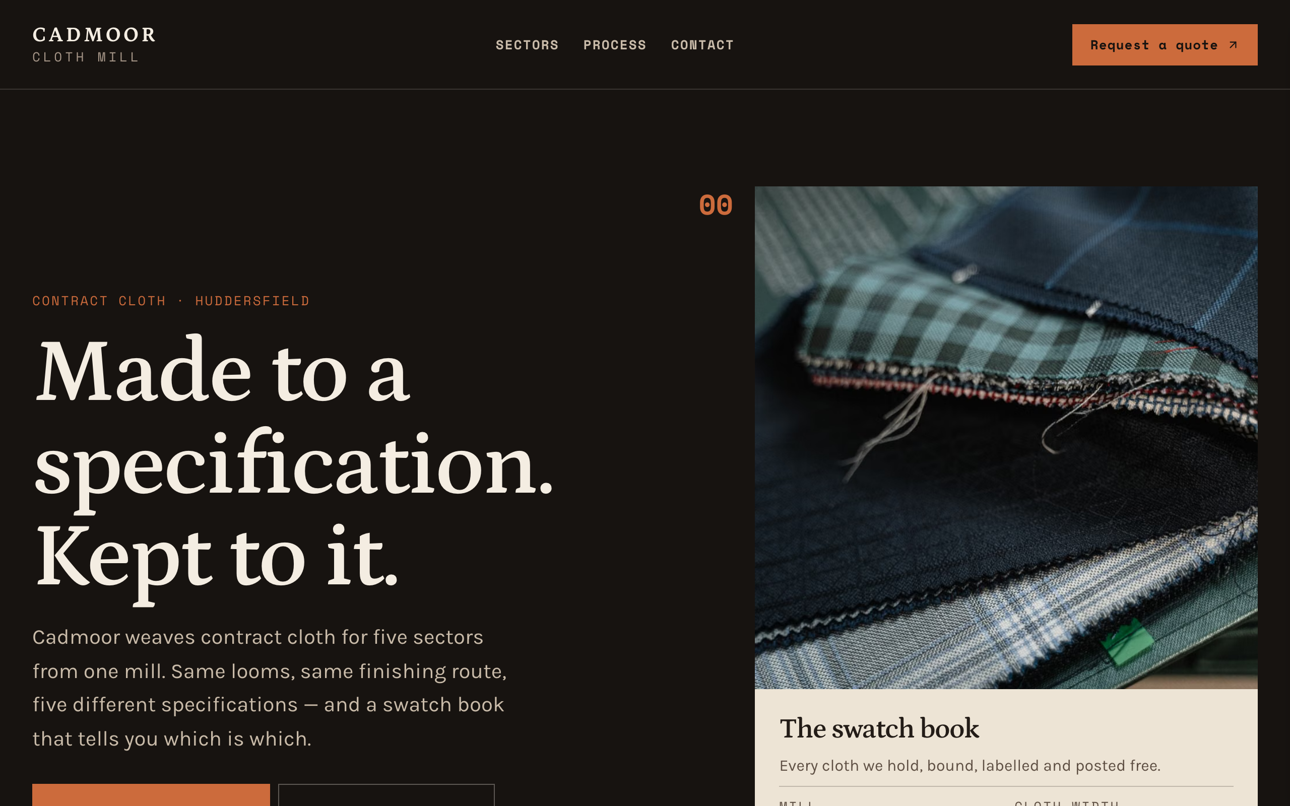
Warp
For manufacturers selling to specifiers: products by specification, sectors and a quote form.
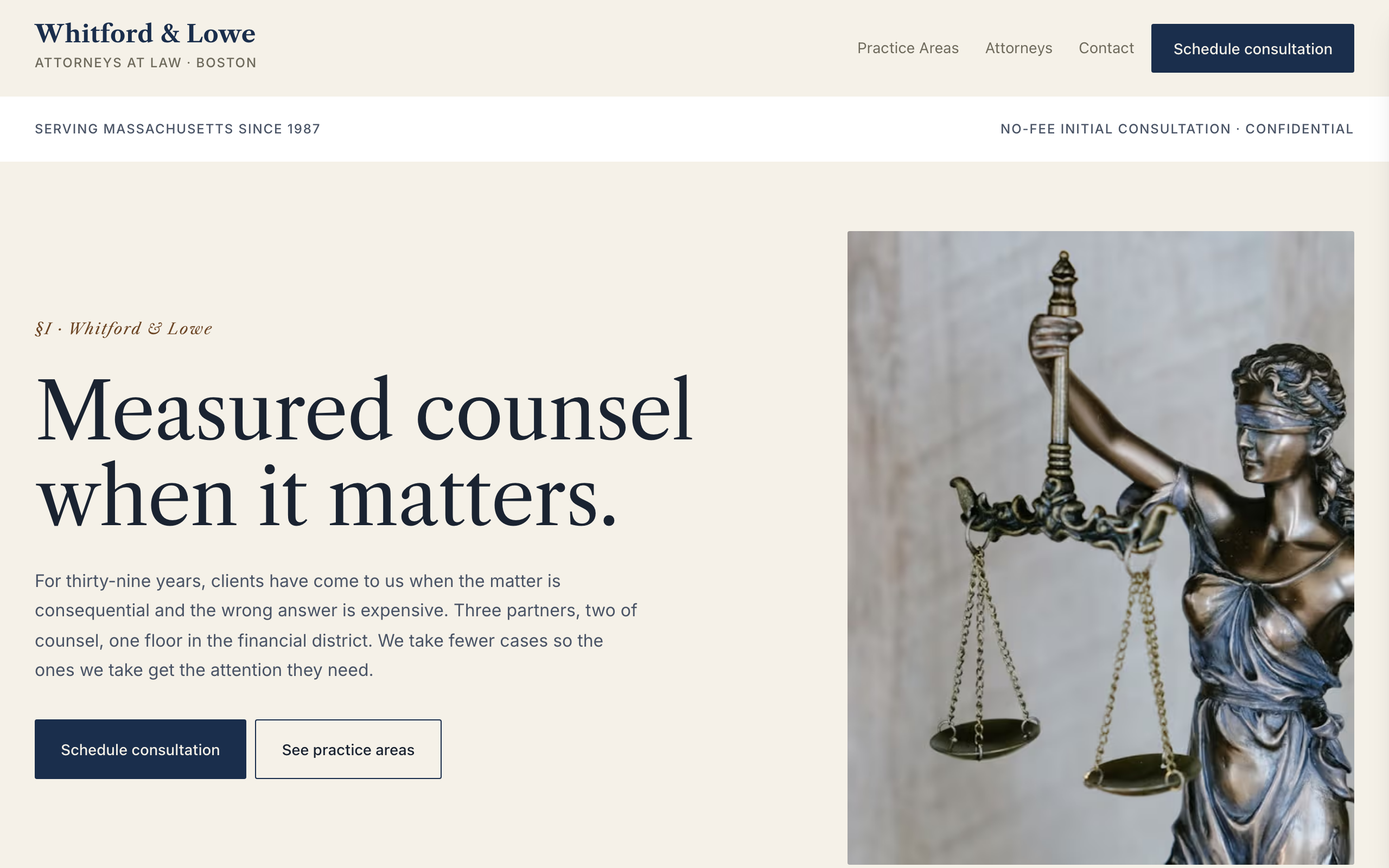
Whitford
An understated site for boutique law firms and partnerships: practice areas, attorney bios and contact.
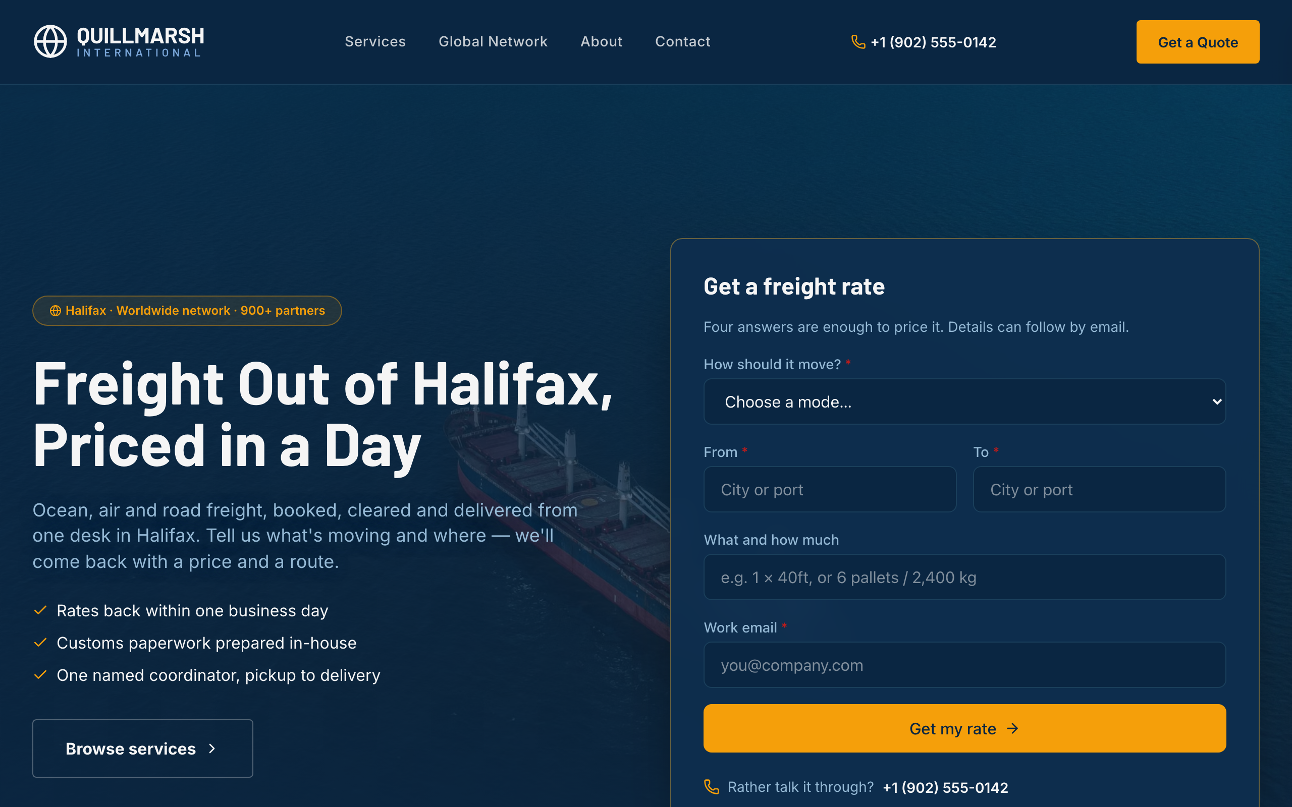
Bollard
For freight forwarders and logistics firms: a rate form up front, lanes and transit times, and service pages.
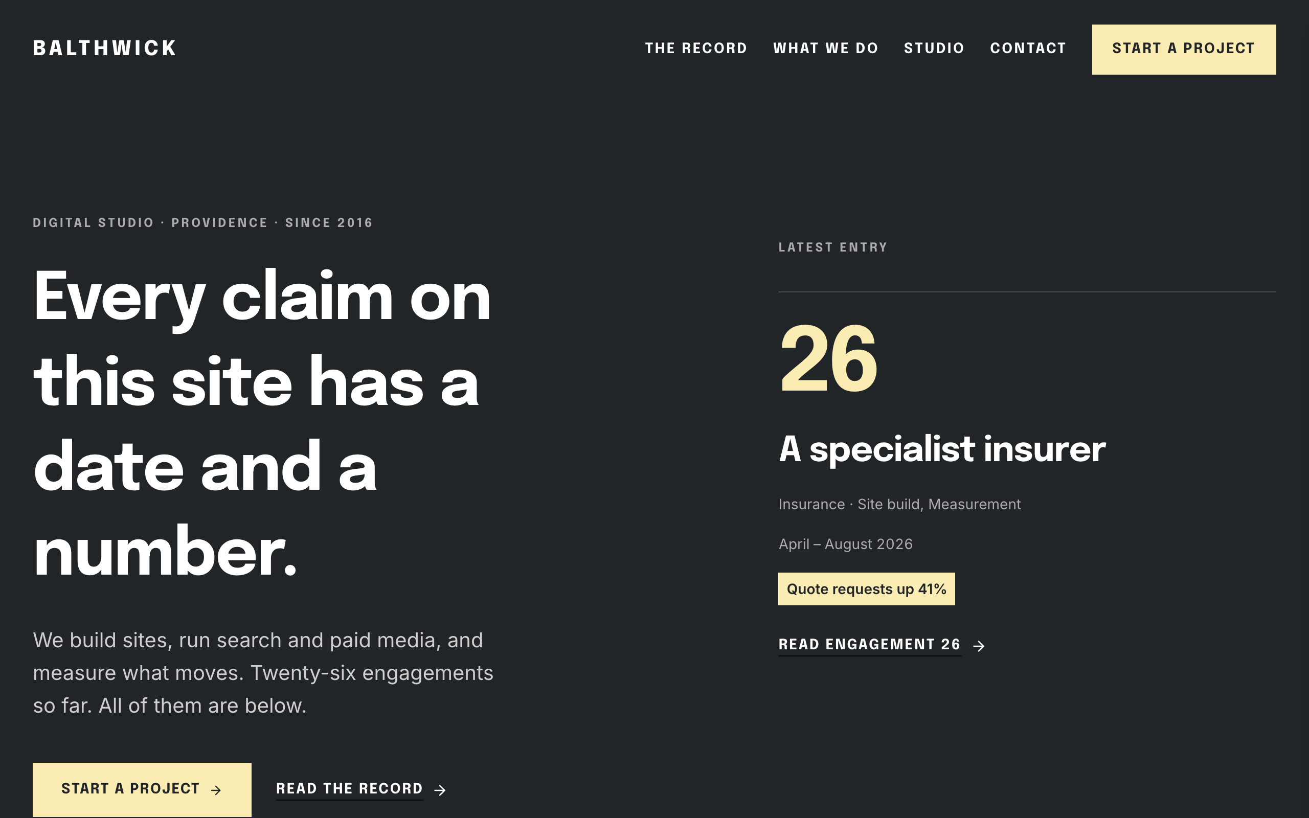
Daybook
For agencies hired on results: a dated record of engagements, each with the number it moved.
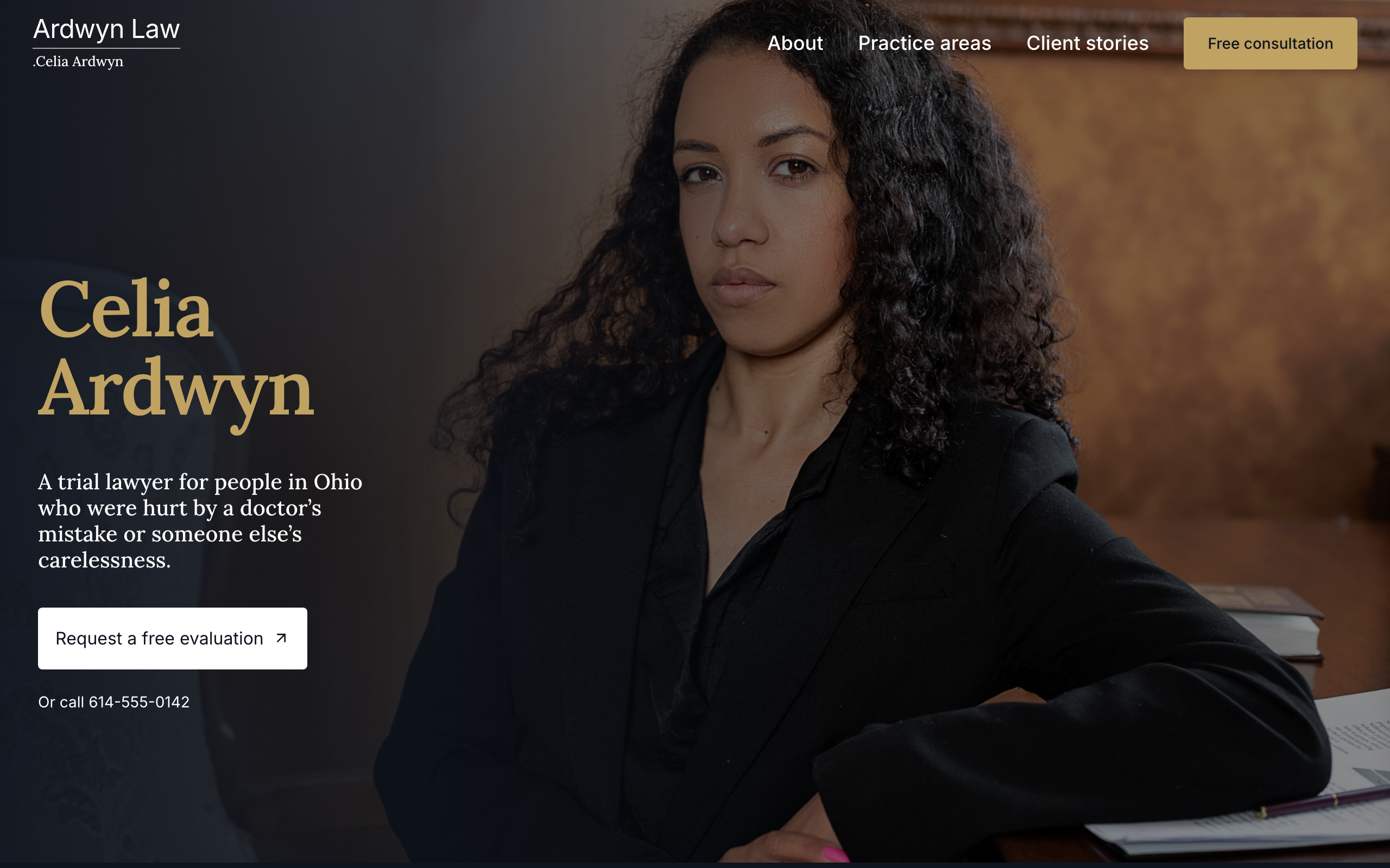
Docket
For a solo trial lawyer: your name up front, a page for each practice area and a free-evaluation form on every page.
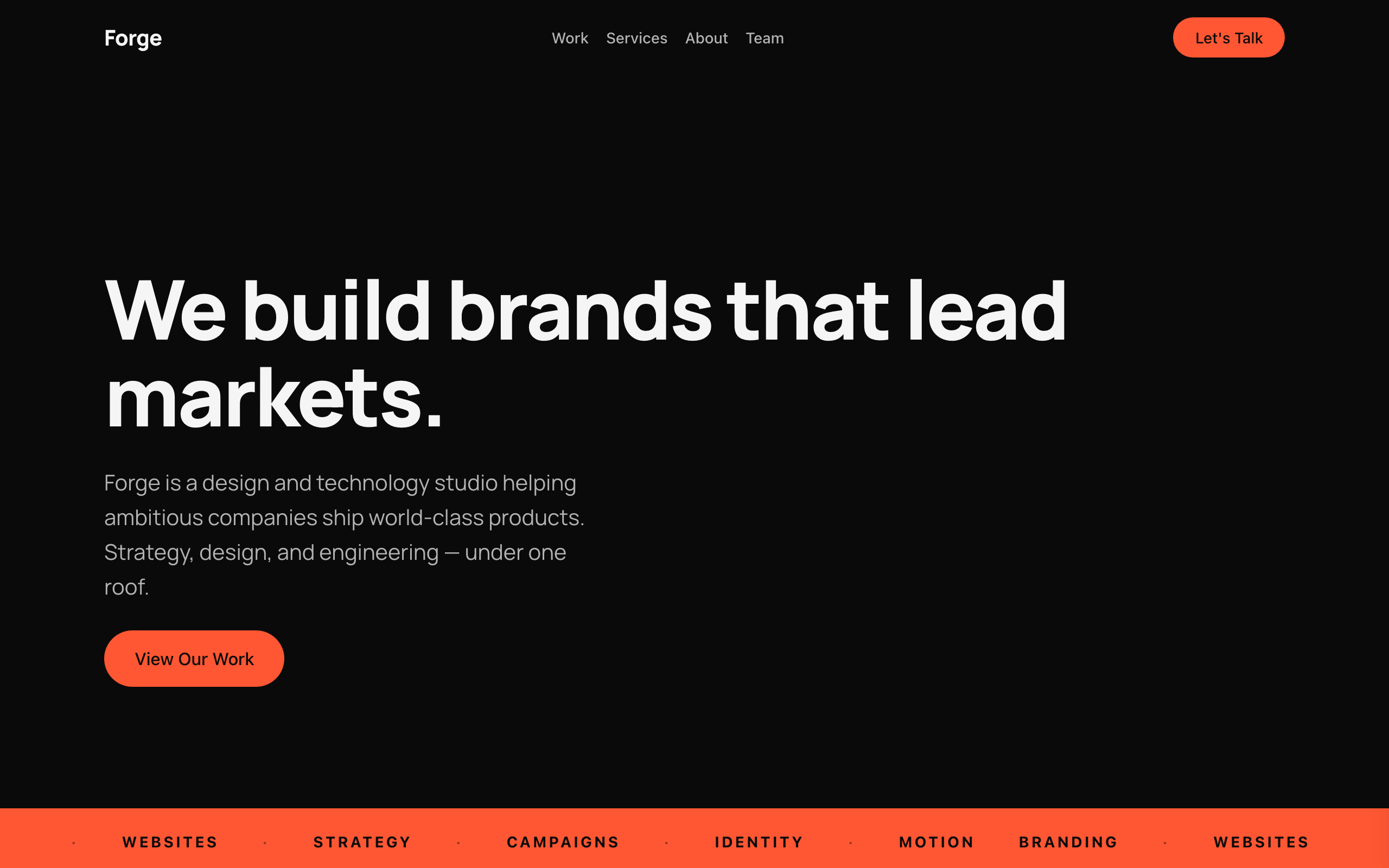
Flagship
A bold, dark one-page site for creative agencies and studios, with case studies and a contact form.