

Whitford
A website template for a boutique law firm
Whitford is built for boutique law firms — the three-to-six-attorney shops where the pitch is careful thinking, not volume. Every design choice errs toward understatement. No dropshadows, no gradients, no exclamation marks in the copy.
Who Whitford is for
Built for these, and tested against them.
- Boutique litigation, business, and estate-planning firms
- Solo attorneys with a professional web presence
- Accounting, tax, and advisory firms
- Consulting practices that lead with authority
What’s included
Everything below ships with the template, already filled in.
- Pages
- 7 pages, written and laid out
- Grows with you
- 3 practice entries at /practices/, 4 attorney entries at /attorneys/ — add one and its index and detail page both update
- Enquiries
- A working form — messages land in your Sitelas inbox
- Type
- Libre Caslon Text and Inter · light theme
- Everywhere
- Built and checked at phone, tablet and desktop widths
- Yours to change
- Every colour, word and photograph — in the editor or by asking an AI agent
About This Template
A firm site that trades on restraint
Authority through typography
Libre Caslon Text carries the headlines — the old-style serif that's printed on partnership letterhead and court filings for a hundred and fifty years. Inter handles body copy and form labels. Section labels render as real small-caps (font-variant: small-caps, not uppercase text-transform), which is the visual grammar of legal documents. Roman numerals segment the home page because §I / §II / §III reads as serious in a way 1 / 2 / 3 does not.
Professional services, not transactional
No product cards. No buy buttons. No time-slot booking form — legal intake is qualitative (prospective clients describe a situation, the firm reviews for conflicts + fit, then schedules). The contact page uses Sitelas's form primitive with a confidentiality notice that meets ABA Model Rule 1.18 expectations. If you prompt 'build me a bakery', the AI reaches for booking and commerce. If you prompt 'build me a law firm', it should reach for almost none of that — this fixture is the structural example of restraint.
Free to use · No credit card required
- 1Opens in the editor with the starter content in place
- 2Change the words and pictures to yours
- 3Publish to a sitelas.com address, or your own domain
Key Highlights
Questions about Whitford
Can I change how Whitford looks?
All of it. Colours, type, spacing, photographs and every word are yours to edit — in the visual editor, or by asking an AI agent to do it for you. Nothing is locked.
Do I need to know how to code to use Whitford?
No. You edit the page by clicking the thing you want to change. There is no code to write and nothing to install.
Can I add more practice entries later?
Yes — that is what the practice collection is for. Adding one from the editor creates its own page at /practices/ and updates the index automatically. You are not editing a list by hand.
What does Whitford cost?
Nothing to start, and there is no trial clock. A free site runs on a sitelas.com address; Pro is $9 a month per site when you want your own domain, analytics and more room.
Can I use my own domain?
Yes, on Pro. Point your domain at the site and SSL is issued automatically — there is no certificate to buy or renew.
Make Whitford yours
It opens in the editor with every page already written. Change what you want, publish when it reads like you.
Free to use · No credit card required
Related Templates
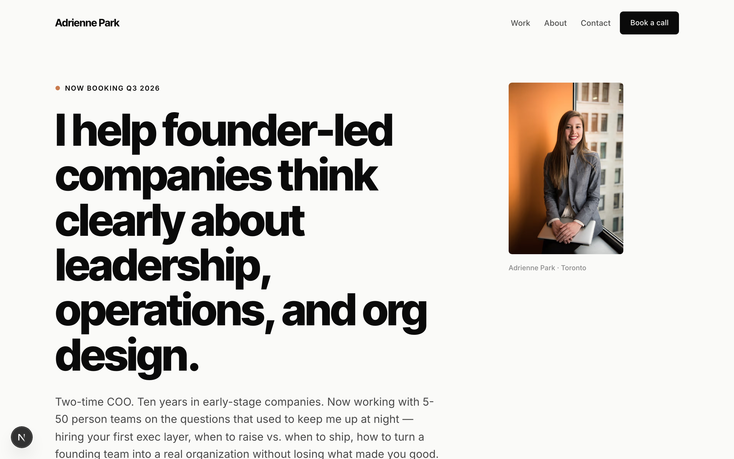
Park
Solo-consultant template. Modernist minimal — the first all-sans fixture in the catalog. Inter Tight heavy display + Inter body, near-monochrome charcoal on barely-warm white with a single burnt-coral accent. Typography-dominant hero (no full-bleed image), client-name strip in place of fake logos, case-study cards with outcome metrics, booking-form for discovery calls. No commerce. Generalizes across the solo-expert archetype: business coach, leadership consultant, fractional CFO/CTO, career coach, executive coach, private-practice therapist, tutor.
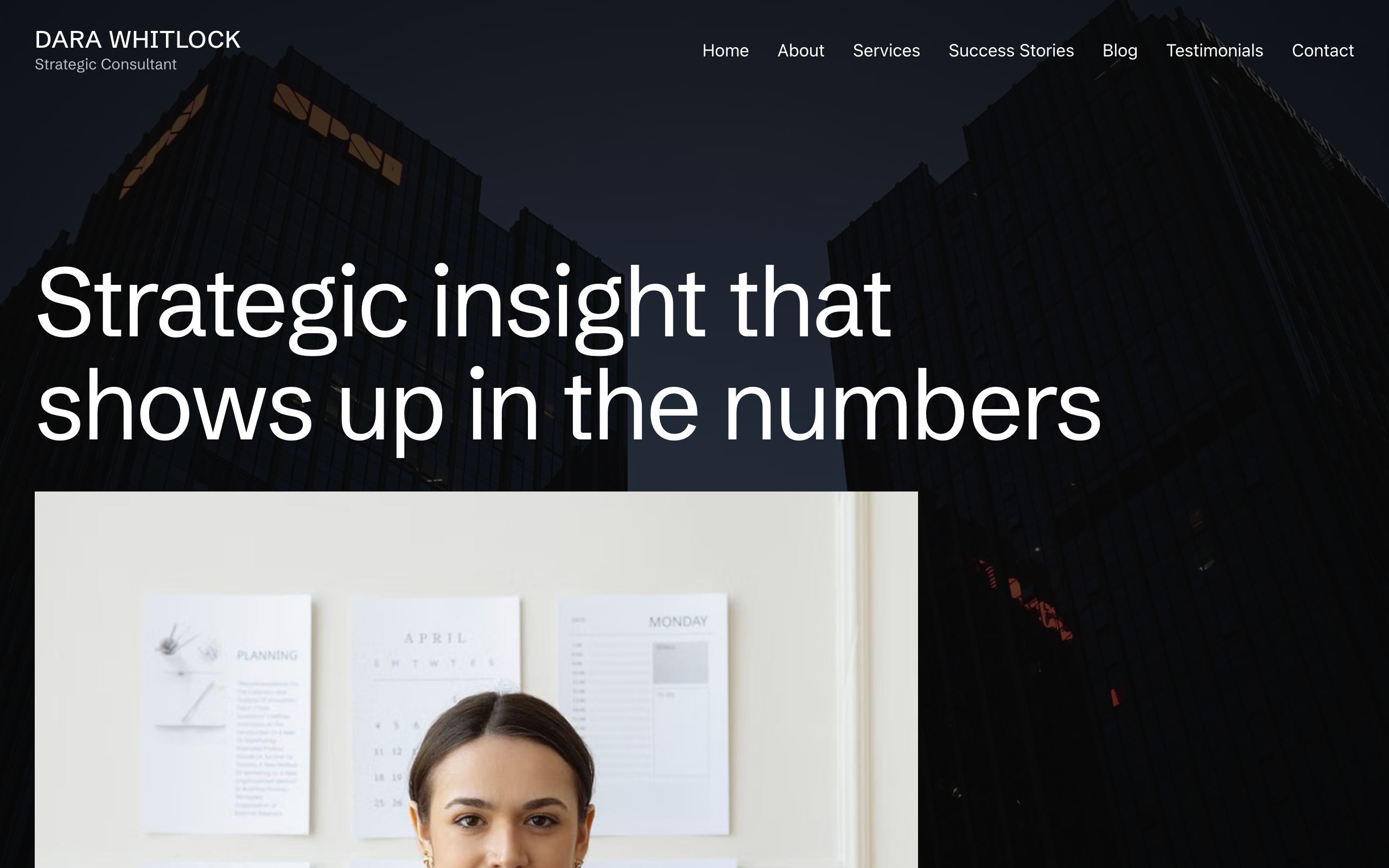
Plumbline
A consulting site built around one structural move: the photographs hold still while the page scrolls over them. Nine full-bleed plates — the home hero, two pull-quotes and every sub-page masthead — are pinned to the viewport, so the site reads as bands of moving text passing over stationary images. Ninety-pixel Schibsted Grotesk headlines, no corner rounding anywhere, one teal accent reserved for the booking control, and two black bands opened by a 45-degree teal corner bleed. Seven pages plus a blog collection. For a solo consultant, coach or adviser who sells judgement to one buyer at a time.
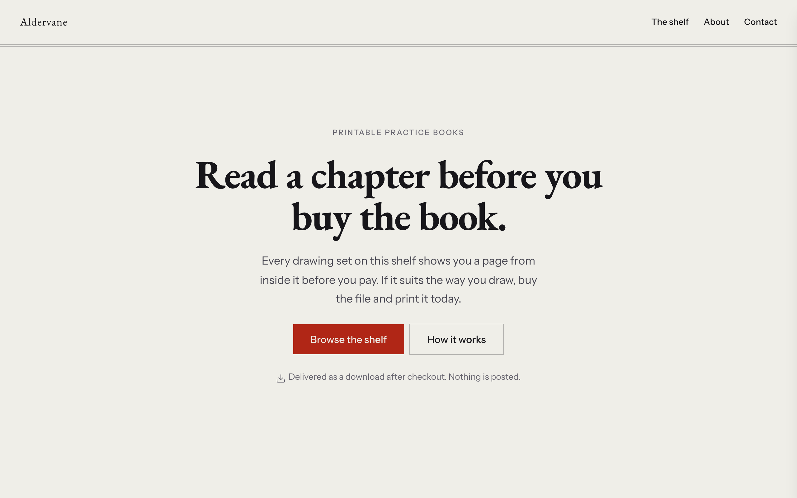
Quire
A shop for people who sell files rather than objects. Nothing here ships, nothing runs out of stock, and no product is ever shown as a cover: every item appears as an open spread — a page from inside the book on the left leaf, and the price, extent and buy button on the right, with one hairline as the gutter. A running head sits over every section, a section label in sans on the left and a folio numeral in serif on the right, so the whole site reads as something set rather than something built. The product collection carries a sample-page image, a link to a longer sample, page extent, format, price and one Stripe payment link per item, plus a coming-soon status for sets that are still being written. Warm paper ground, EB Garamond for anything that belongs to a book, Instrument Sans for anything that belongs to the shop, one rubric red that only ever means buy. Distinct from counter (physical stock, lead times and shipping, with downloads as an aside), kilnwork (the making is the pitch) and halo (a link hub with a subscription, not a catalogue).