

Gable
A website template for a residential renovation contractor
Gable is built for residential renovation contractors who compete on craft, not on price. The home page opens with a featured before/after pair — large, unembellished, with the project metadata printed underneath like a caption in an architecture monograph. The /work page scales the pattern to six projects so prospects can see what the shop actually ships. Projects are content, not page structure — publishing one updates the home feature, the index and its own page at once.
Who Gable is for
Built for these, and tested against them.
- Residential renovation contractors
- Custom home builders
- Kitchen and bath remodelers
- Interior designers with a project portfolio
- Landscape architects and designers
- Millwork and cabinetry shops
What’s included
Everything below ships with the template, already filled in.
- Pages
- 4 pages, written and laid out
- Grows with you
- 6 project entries at /work/ — add one and its index and detail page both update
- Enquiries
- A working form — messages land in your Sitelas inbox
- Type
- Spectral and Inter · light theme
- Everywhere
- Built and checked at phone, tablet and desktop widths
- Yours to change
- Every colour, word and photograph — in the editor or by asking an AI agent
About This Template
A trade site that leads with work
Craft-forward, not rustic
The palette is cool slate blue (deep chrome), warm bone (background), and oxidized rust (accent labels and before-markers). It reads like an architectural drawing — precise, quiet, well-made. Spectral carries the headings, a contemporary slab-influenced serif with the feel of engineering type. No faux-handmade script, no 'since 1950' sepia, no 'we're passionate about craftsmanship'. The work speaks.
No commerce, no booking
Contact intake is qualitative: project type, square footage, timeline, budget range, free-form notes. Contractors don't book discovery calls through a date picker — they walk the property and quote within ten days. The form captures what's needed to prep that first walk.
Free to use · No credit card required
- 1Opens in the editor with the starter content in place
- 2Change the words and pictures to yours
- 3Publish to a sitelas.com address, or your own domain
Key Highlights
Questions about Gable
Can I change how Gable looks?
All of it. Colours, type, spacing, photographs and every word are yours to edit — in the visual editor, or by asking an AI agent to do it for you. Nothing is locked.
Do I need to know how to code to use Gable?
No. You edit the page by clicking the thing you want to change. There is no code to write and nothing to install.
Can I add more project entries later?
Yes — that is what the project collection is for. Adding one from the editor creates its own page at /work/ and updates the index automatically. You are not editing a list by hand.
What does Gable cost?
Nothing to start, and there is no trial clock. A free site runs on a sitelas.com address; Pro is $9 a month per site when you want your own domain, analytics and more room.
Can I use my own domain?
Yes, on Pro. Point your domain at the site and SSL is issued automatically — there is no certificate to buy or renew.
Make Gable yours
It opens in the editor with every page already written. Change what you want, publish when it reads like you.
Free to use · No credit card required
Related Templates
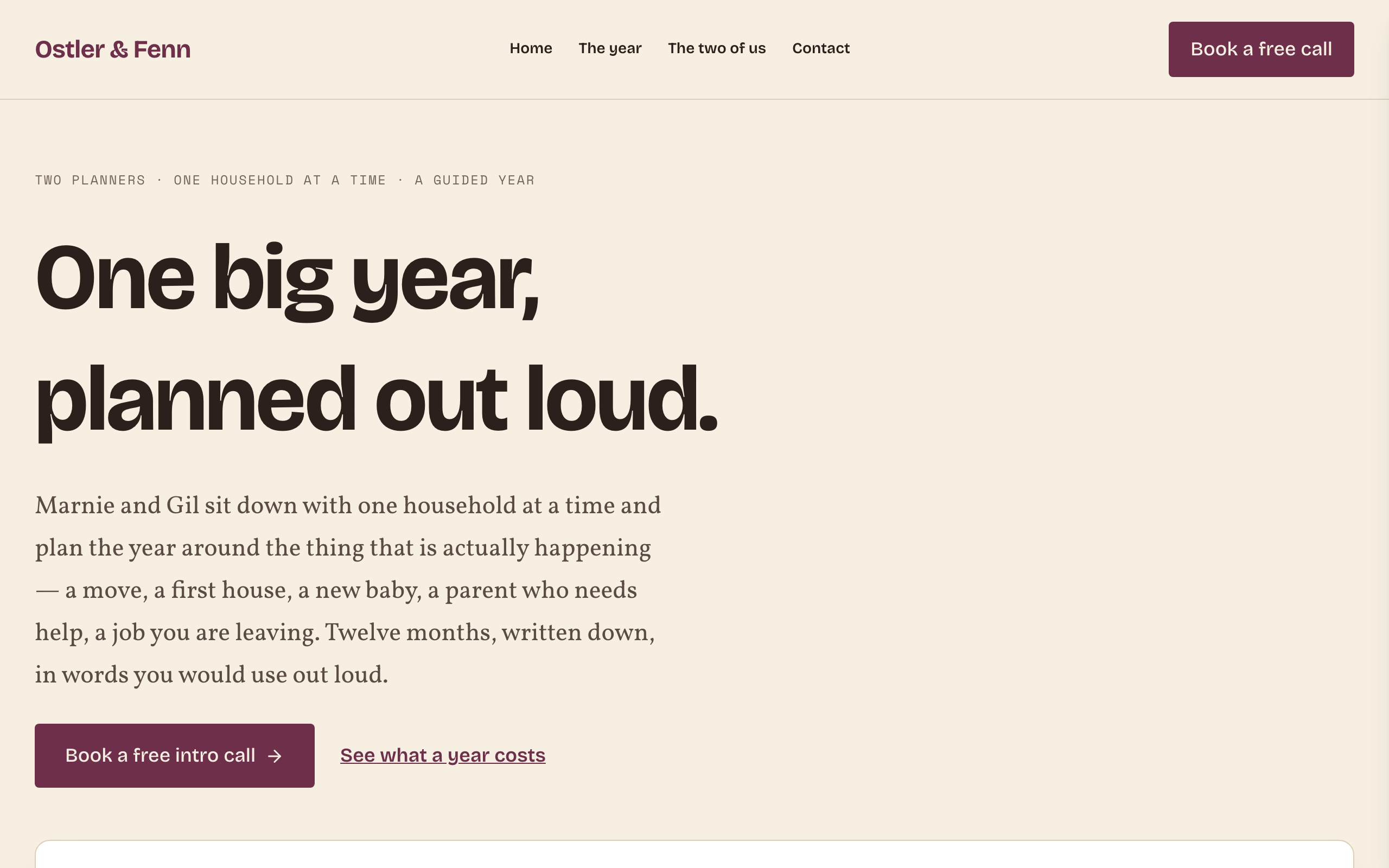
Throughline
Two named founders selling a guided, priced, year-long process to families and individuals — not to companies. Oat paper, plum ink and a citron highlighter; Bricolage Grotesque display over a Vollkorn serif body with a Space Mono ruler. The signature is a twelve-cell year bar: the same chart carries the month-by-month timeline AND the price ladder, so a visitor can see exactly which part of the year each tier buys. Four pages — Home / The year / The two of us / Contact — and one conversion, a free thirty-minute intro call. No hype, no guarantees, no logos: testimonials come from clients, prices are published, and a whole section says what the program is not. Distinct from `park` (B2B coaching, no prices), `meridian` (authority-formal, corporate buyer) and `dossier` (solo freelancer, contact-only).
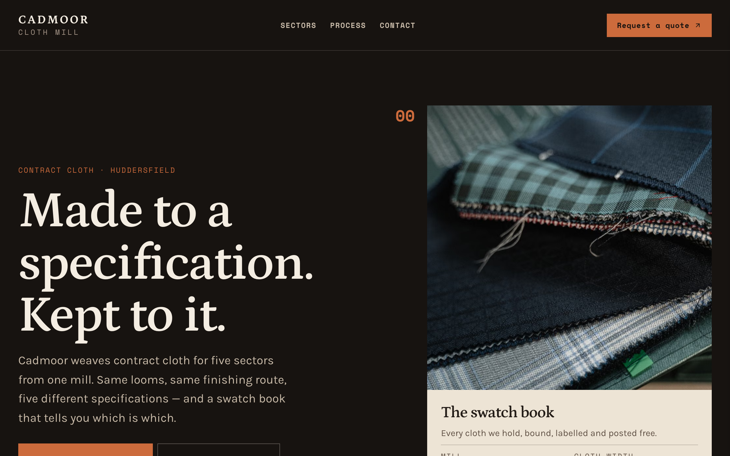
Warp
Editorial-warm manufacturer template on a dark ground, built as a materials swatch book. Cadmoor Cloth Mill persona. Cream leaves tipped onto warm near-black, each with a square patch, a printed Space Mono specification grid and a rust index tab. Sectors and materials are both collections, so the sector register and the material library scale from three items to fifteen with no structural edits. Petrona on Karla with Space Mono spec type. Multi-page (Home / Sectors / Process / Contact) plus per-sector and per-cloth detail pages. Quote request, never a price.
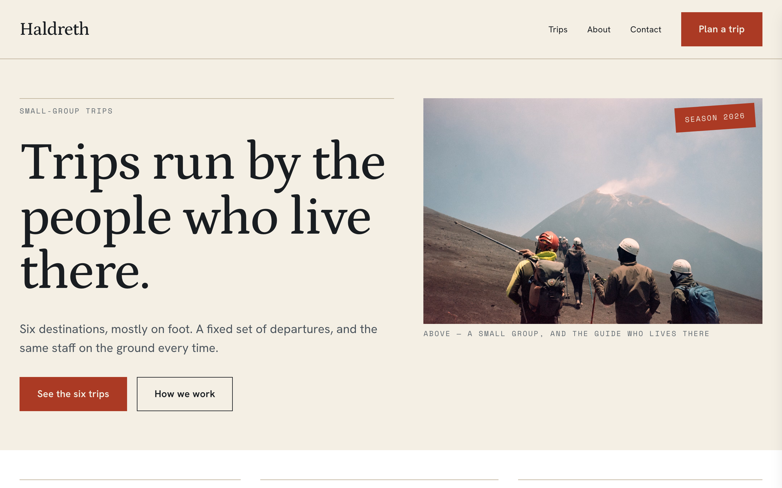
Wayfare
Catalogue site for a small tour operator selling a fixed set of destination packages. Built around a printed trip dossier: every trip is a ruled sheet carrying the route, the length, the departures, the group size and the from-price, and the same sheet is the row on the index, the card on the home page and the top of the detail page. A package collection drives all of it, and each detail page carries its own enquiry form scoped to that trip. For the operator whose pitch is local staff on the ground rather than the lowest price.