
About This Template
Make a statement
Flagship is built for companies that want to look like the market leader. Full-width sections with alternating backgrounds create visual rhythm as visitors scroll through your story. Each band is a self-contained composition — different layout, different feel.
Content-first hierarchy
From the purely typographic hero to the numbered service list, every section prioritizes clarity over decoration. Bold headings, generous whitespace, and a single accent color keep visitors focused.
Built for agencies and studios
The staggered project grid, team portraits, and single-quote testimonial section follow the patterns used by the world's best creative agencies. Flagship gives you that level of polish out of the box.
Launch in 6 Steps
Write your hero headline
List your core services
Upload 4-6 project images
Add team member photos
Set your CTA email/link
Customize brand colors
Flagship
A full-width section-stack layout with alternating backgrounds, numbered service list, staggered project grid, and bold typographic hero. The classic modern agency pattern.
Free to use · No credit card required
Key Highlights
Built For
Related Templates
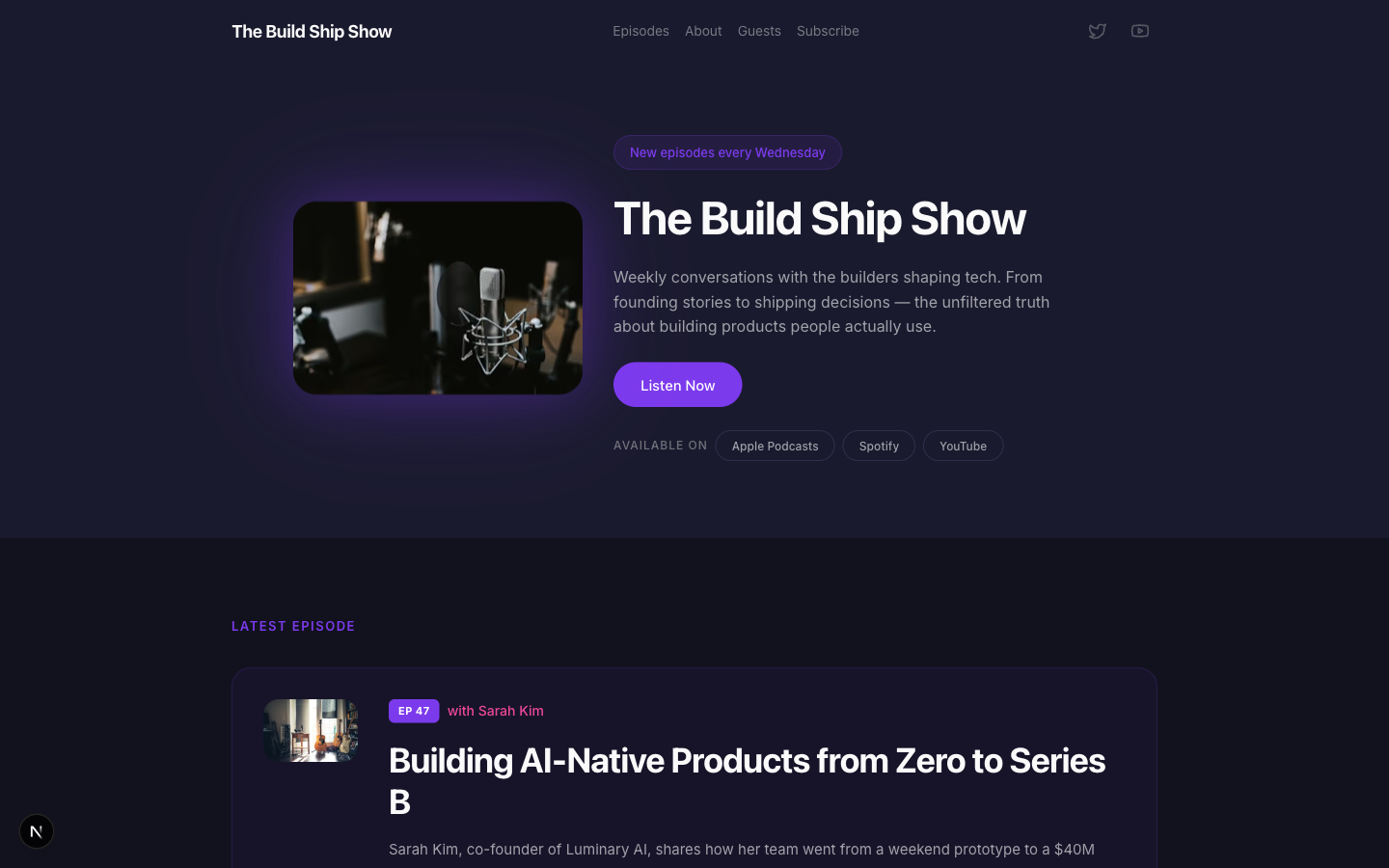
Airwave
A bold podcast and creator page with dark charcoal tones, electric purple accents, episode listings, guest spotlights, and platform subscription links — designed for shows that want to look as good as they sound.
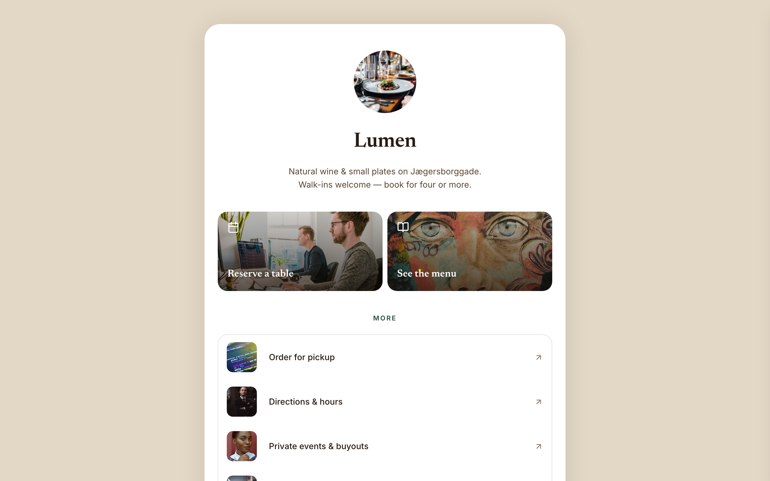
Amber
Warm hospitality link-in-bio for a café, wine bar, or restaurant — a faithful Linktree profile-card. A warm-sand page gutter with one elevated, fully-rounded ~600px centered white card; no header, no footer, and no email-capture section (a venue converts on reserve/menu/call). Ink-brown type, a bottle-green accent, Newsreader + Inter. Inside the card: circular logo → serif name → one-line bio → a 2-up photo-backed action pair (Reserve · Menu) → a grouped flat list panel with photo thumbnails → a social/contact row with a real tap-to-call link, then a horizontal 'on now' shelf of 3 Stripe items, and a short about block the card ends on. The action tiles ARE the conversion (menu-reservation).
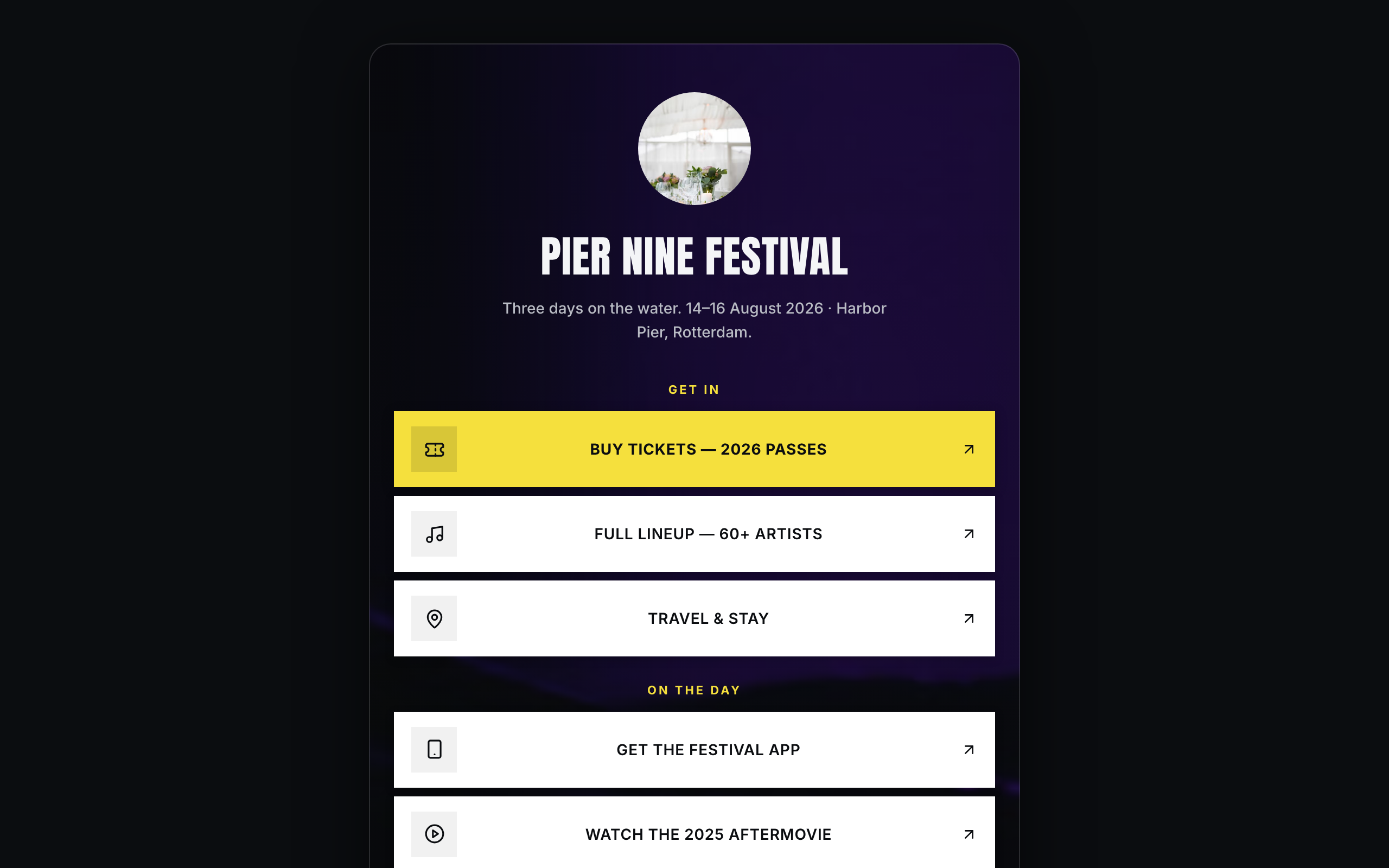
Arena
Brand/organization link-in-bio for festivals and live events — a faithful Linktree profile-card. A plain near-black page gutter with one elevated, fully-rounded ~600px centered card; the darkened event photo lives INSIDE the card. No header, no footer. Off-white type, festival-yellow accent, Anton + Inter. Inside the card over the photo: circular logo → bold condensed name → dates/location line → vertical stack of sharp white cards (square logo tile, 2-line label; the priority Buy-tickets card filled festival-yellow) → social-icon row, then a stacked passes strip with Stripe buy buttons, a short about block, and the inline presale-list capture the card ends on. The cards ARE the conversion (ticket-sale).