

Deckle
A website template for a novelist with a backlist to show and a new book to sell
Most author templates are a marketing page with book covers dropped into a grid. Deckle is built the other way round: the books are the structure. Every cover stands on a hairline rule that carries on past the last book to both edges of the screen, so a row of three reads as a shelf rather than three cards, and the catalogue page runs those shelves edge to edge.
Who Deckle is for
Built for these, and tested against them.
- Novelists, poets and non-fiction writers with more than one book behind them
- A first-time or self-published author who wants the one book to look like it belongs on a shelf
- Anyone whose backlist includes titles that are out of print and still worth showing
- Writers who do readings and festivals and need the diary to stay current
- A small press or imprint with a list to show and no shop to run
What’s included
Everything below ships with the template, already filled in.
- Pages
- 5 pages, written and laid out
- Grows with you
- 9 book entries at /books/, 5 event entries at /events/ — add one and its index and detail page both update
- Enquiries
- A working form — messages land in your Sitelas inbox
- Type
- DM Serif Display and Roboto Mono · colorful theme
- Everywhere
- Built and checked at phone, tablet and desktop widths
- Yours to change
- Every colour, word and photograph — in the editor or by asking an AI agent
About This Template
A shelf, and the jacket you take off it
Two faces, two jobs
Everything a reader reads — the title, the blurb, the letters, the long piece about the book — is set in DM Serif Display. Everything a reader checks — format, extent, publication date, ISBN, the date of a reading — is Roboto Mono. Nothing on the site wears the wrong one, which is why a page of facts never reads like a page of prose.
The backlist is a collection, not a page
Books and readings are both content collections. Adding the tenth novel is one instruction in chat: the shelf on the home page picks it up, the catalogue picks it up, it gets its own page with the jacket unfolded across it, and it appears in the sitemap. The same is true of a reading — put in the date and it moves from "coming up" to "already been" on its own when you change one field.
Out of print is a state, not a deletion
Two of the nine starter books are out of print. Their pages still exist, still carry the cover and the blurb, and swap the order button for a line telling you where to look. Most catalogues in this category can only show what is for sale, which is not what a backlist is.
Written like a jacket, not like an ad
The copy is short, plain and present tense, and it describes rather than sells. There is no "ORDER NOW!" anywhere; the asks are specific — order a signed copy, reserve a place, take the letter — and each says what actually happens next.
When to pick something else
Deckle is the wrong template for these. Where there is a better one, it is linked.
- Maker selling a physical object that is not a book — try Kilnwork, Counter or Stockroom
- Writer selling digital files, courses or templates rather than printed books — try Quire
- Blogger or newsletter whose product is the writing itself, not books — try Narrative or Daybook
- Academic publishing papers and talks rather than trade books — try Lectora or Folio
- Site that needs a real cart, stock levels or shipping — every book here points out to a retailer
- Podcaster or audio archive — try Airwave or Patchbay
- Link-in-bio or one-page profile — try Halo or Rivet
- Agency, studio or service business of any kind
Free to use · No credit card required
- 1Opens in the editor with the starter content in place
- 2Change the words and pictures to yours
- 3Publish to a sitelas.com address, or your own domain
Key Highlights
Questions about Deckle
Can I change how Deckle looks?
All of it. Colours, type, spacing, photographs and every word are yours to edit — in the visual editor, or by asking an AI agent to do it for you. Nothing is locked.
Do I need to know how to code to use Deckle?
No. You edit the page by clicking the thing you want to change. There is no code to write and nothing to install.
Can I add more book entries later?
Yes — that is what the book collection is for. Adding one from the editor creates its own page at /books/ and updates the index automatically. You are not editing a list by hand.
What does Deckle cost?
Nothing to start, and there is no trial clock. A free site runs on a sitelas.com address; Pro is $9 a month per site when you want your own domain, analytics and more room.
Can I use my own domain?
Yes, on Pro. Point your domain at the site and SSL is issued automatically — there is no certificate to buy or renew.
Make Deckle yours
It opens in the editor with every page already written. Change what you want, publish when it reads like you.
Free to use · No credit card required
Related Templates
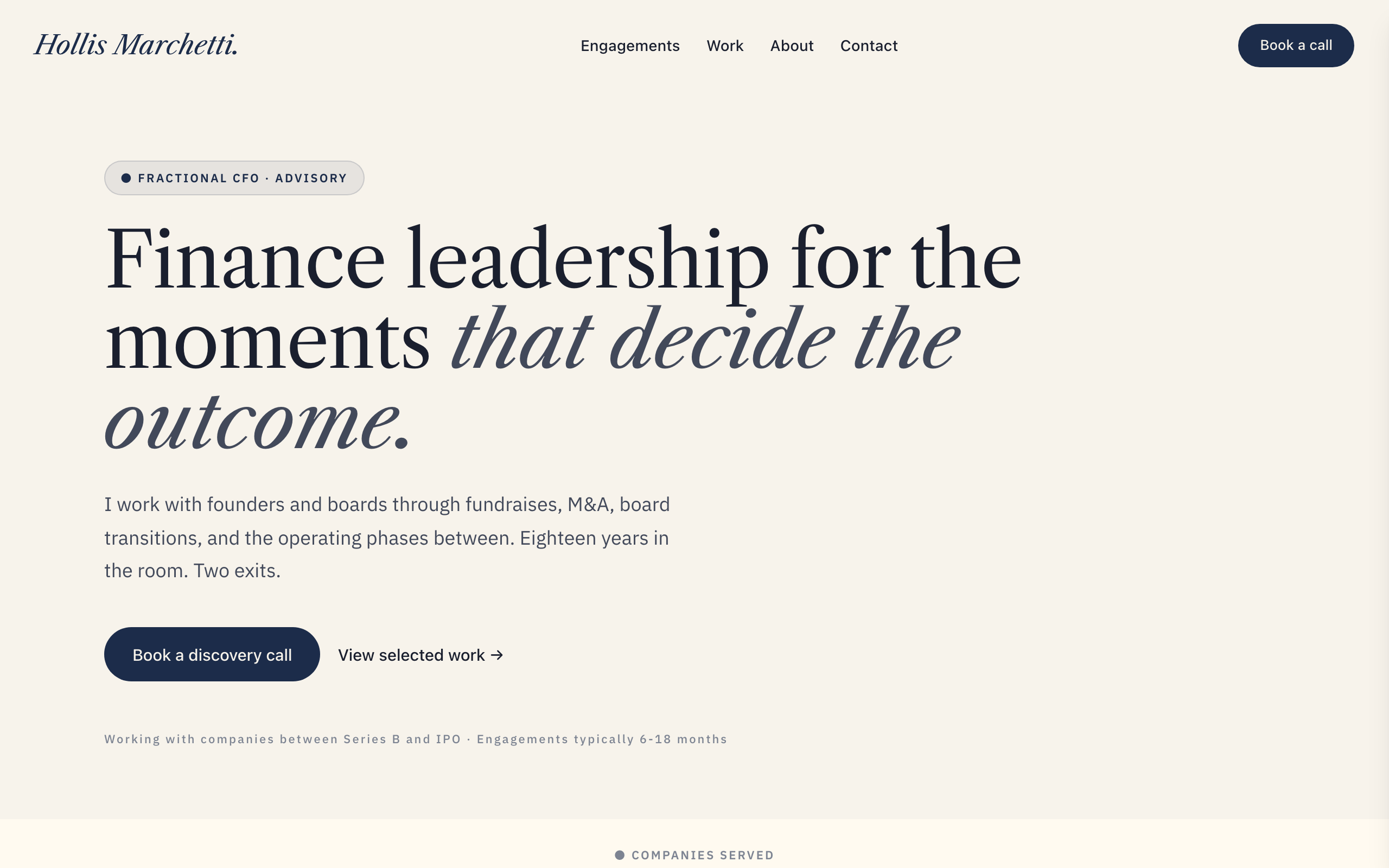
Meridian
Authority-formal solo-expert site for fractional executives, strategic advisors, and management consultants. Oxford navy on warm ivory, italic Libre Caslon Text display + IBM Plex Sans body, restrained typography-led layouts. Multi-page (Home / Engagements / Work / About / Contact). Conversion is a discovery call. Distinct from Park (modernist solo consultant) — Meridian is monograph-feel, signature-typography, senior-fee positioning. Distinct from Whitford (b2b-firm law) — Meridian is solo, not a firm.
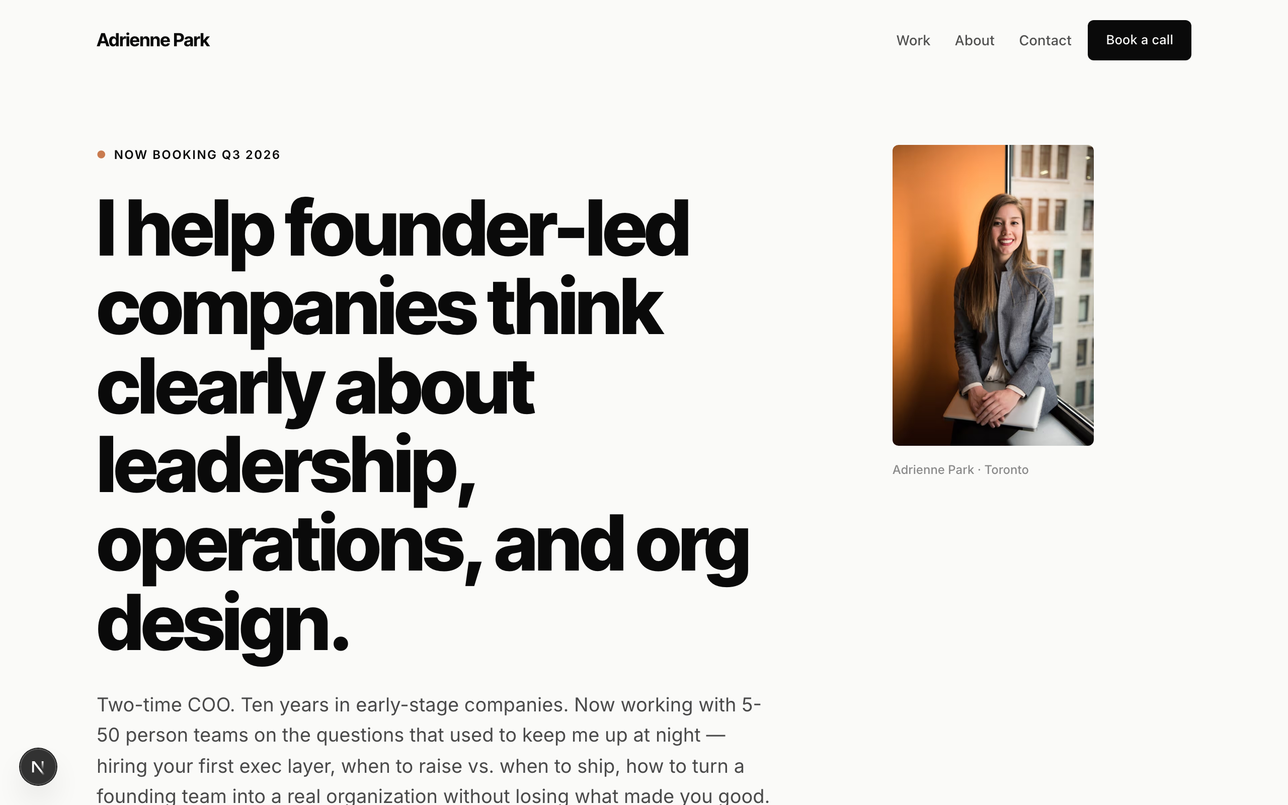
Park
Solo-consultant template. Modernist minimal — the first all-sans fixture in the catalog. Inter Tight heavy display + Inter body, near-monochrome charcoal on barely-warm white with a single burnt-coral accent. Typography-dominant hero (no full-bleed image), client-name strip in place of fake logos, case-study cards with outcome metrics, booking-form for discovery calls. No commerce. Generalizes across the solo-expert archetype: business coach, leadership consultant, fractional CFO/CTO, career coach, executive coach, private-practice therapist, tutor.
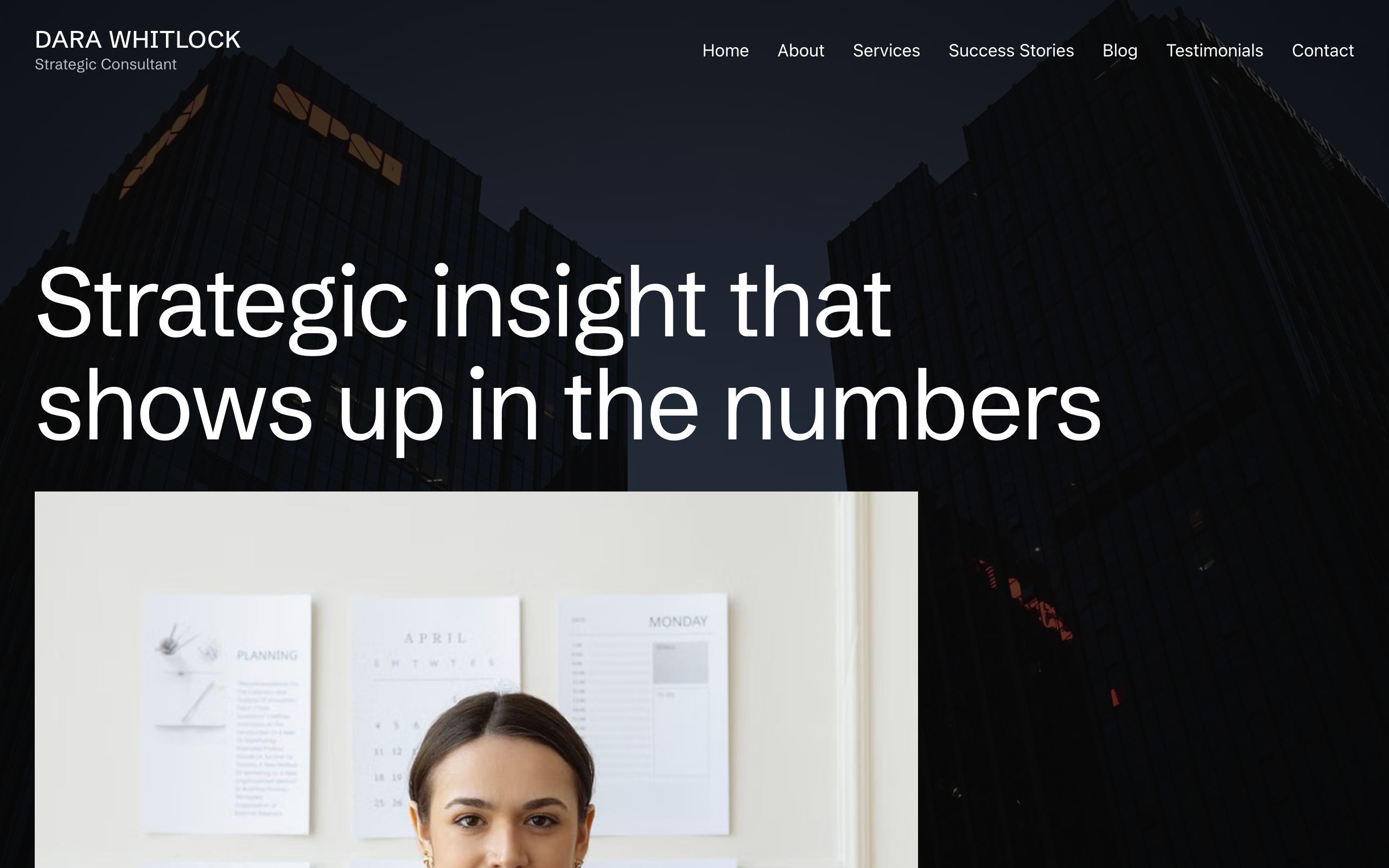
Plumbline
A consulting site built around one structural move: the photographs hold still while the page scrolls over them. Nine full-bleed plates — the home hero, two pull-quotes and every sub-page masthead — are pinned to the viewport, so the site reads as bands of moving text passing over stationary images. Ninety-pixel Schibsted Grotesk headlines, no corner rounding anywhere, one teal accent reserved for the booking control, and two black bands opened by a 45-degree teal corner bleed. Seven pages plus a blog collection. For a solo consultant, coach or adviser who sells judgement to one buyer at a time.