

Counter Small online shop template
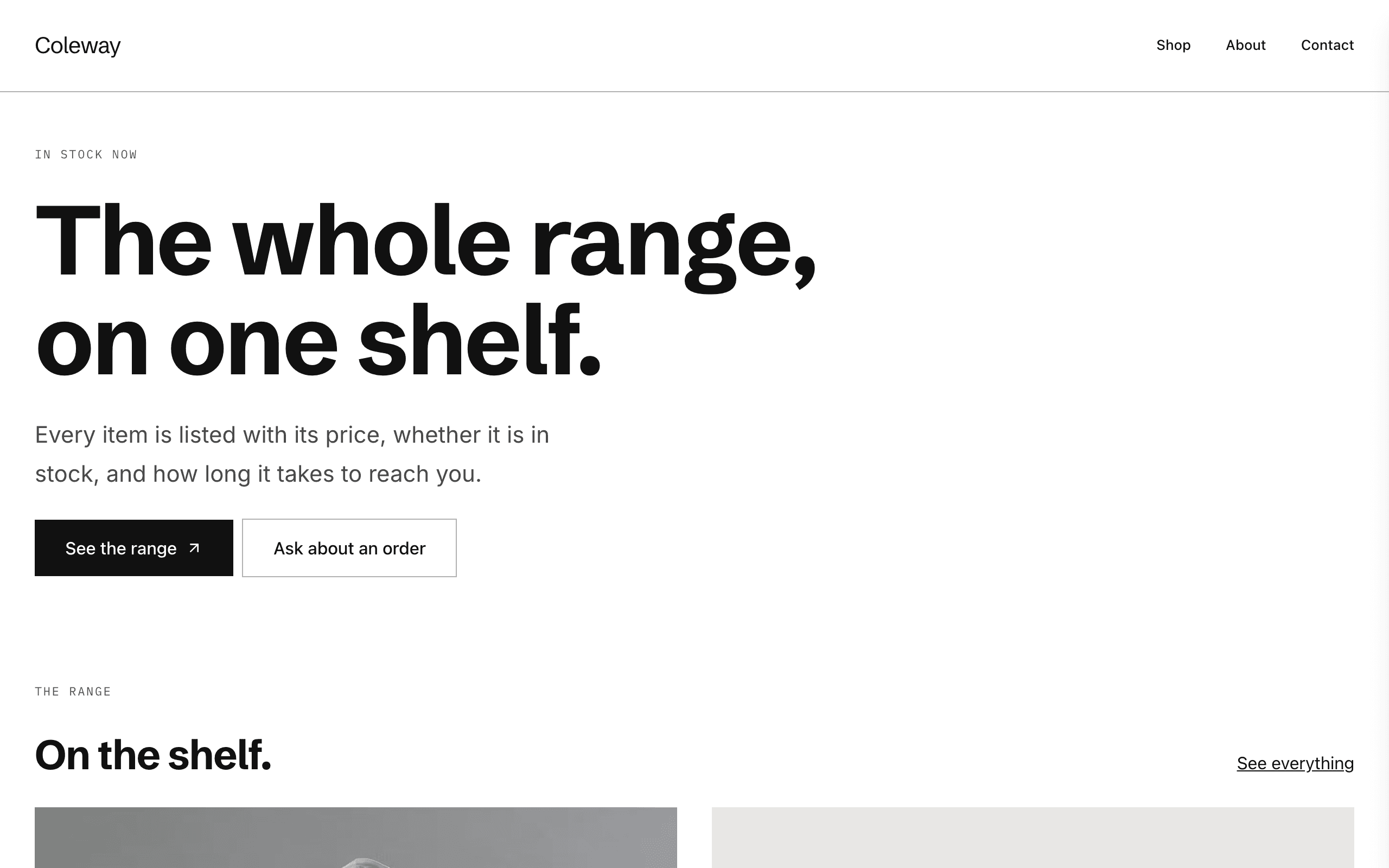
Counter suits any small range of physical products, from bags and bike parts to prints and preserves. Each item shows its price, whether it is in stock or made to order, and a buy button that opens your Stripe checkout.
Who Counter is for
Built for these, and tested against them.
- Anyone selling a physical object with a price on it
- A small range held in stock, sent from a shelf
- Sellers who also take made-to-order work alongside the range
- Anyone selling a file — a guide, a pattern, a template — beside physical goods
- Sellers currently taking orders through direct messages
What’s included
Everything below ships with the template, already filled in.
- Pages
- 4 pages, written and laid out
- Grows with you
- 6 product entries at /shop/ — add one and its index and detail page both update
- Enquiries
- A working form — messages land in your Sitelas inbox
- Fonts
- Schibsted Grotesk and Inter · light theme
- Everywhere
- Built and checked at phone, tablet and desktop widths
- Yours to change
- Every colour, word and photograph — in the editor or by asking an AI agent
Build Counter by asking your AI agent
No editor required. The agent writes your copy, swaps the photos and publishes the site.
- 1Connect Sitelas to Claude, ChatGPT or another AI agent that supports MCP. How to connect
- 2Ask for it in plain words: “Build a website for anyone selling a physical object with a price on it using the Counter template.”
- 3Open the preview link it sends back, ask for changes, and publish when it reads right.
Then keep changing it from the same chat
- Rewrite the copy“Rewrite every page in a warmer, friendlier voice.”
- Change the design“Make the colours earthier and use a serif for headings.”
- Add or remove pages“Add a Pricing page and remove the Blog.”
- Rearrange sections“Move the testimonials higher and add an FAQ.”
- Swap the photos“Replace the photos with ones that fit my business.”
- Run the site“Show me this week's form messages, then publish.”
Everything here can also be done by hand in the visual editor.
About the Counter template
Built for any small range of products
Counter suits small shops selling physical things, from bags and bike parts to prints and preserves. The wording is neutral, so it reads correctly whatever you sell.
What's on the site
- Home with featured products
- The range, each product with its price, availability and lead time
- How this works, explaining ordering and delivery
- Contact
What to know
Each product has its own Stripe Payment Link; there is no cart or order system. Products are a collection, and square images mean phone photos look right.
When to pick something else
Counter is the wrong template for these. Where there is a better one, it is linked.
- A maker whose craft and process are the pitch — try Kilnwork
- Showing a body of work by category without prices — try Pazari
- Portfolio where the maker is the pitch and the conversion is an enquiry — try Cami
- Multi-product cart, inventory or order management
- Services sold by the hour or by appointment — try Gable or Park
- Novels, poetry and other published books — try Deckle
Free to use · No credit card required
- 1Opens in the editor with the starter content in place
- 2Change the words and pictures to yours
- 3Publish to a sitelas.com address, or your own domain
Key Highlights
Questions about Counter
Is there a shopping cart?
No. Each product has its own Stripe Payment Link, so there is no cart or order system to configure.
How do I add a product?
Products are a collection: add one in the editor, or describe it to your AI agent, and it joins the range with its own page.
Who is Counter for?
Counter is built for anyone selling a physical object with a price on it, a small stocked range sold direct, with one payment link per item and a seller whose range mixes in-stock items with made-to-order ones. Not built for a maker whose craft and process are the pitch — try Kilnwork instead.
What pages come with Counter?
4 pages, already written and laid out: Home, The range, How this works and Contact. Add, rename or remove pages whenever you like.
Can Claude or ChatGPT build my site from Counter?
Yes. Connect Sitelas to your AI agent and ask for a site that uses Counter. It fills in your details, sends you a preview link, and publishes when you approve. The same chat can keep running the site afterwards.
Can I change Counter without code?
Yes. Click any text, photo or colour to change it in the visual editor, or ask your AI agent to make the change. Nothing is locked.
What does it cost?
Nothing to start, with no trial clock. A free site runs on a sitelas.com address; Pro is $9 a month per site ($90 a year) for your own domain, analytics and more room.
Can I use my own domain?
Yes, on Pro. Point your domain at the site and the SSL certificate is issued and renewed for you.
Make Counter yours
It opens in the editor with every page already written. Change what you want, publish when it reads like you.
Free to use · No credit card required
Related templates
All makers & small shops templates →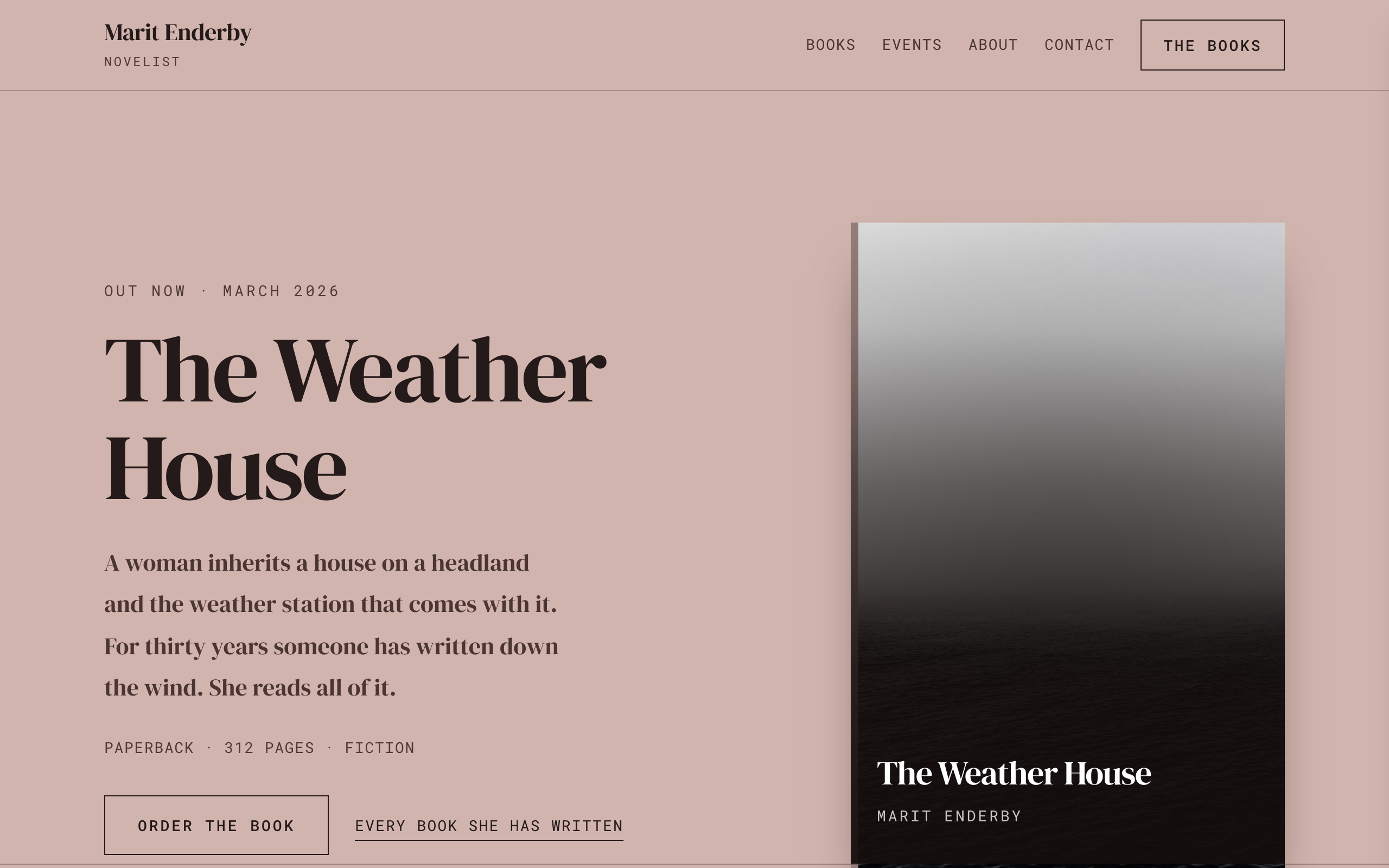
Deckle
An author site where the books are the structure: shelves of covers, a page per book and events.
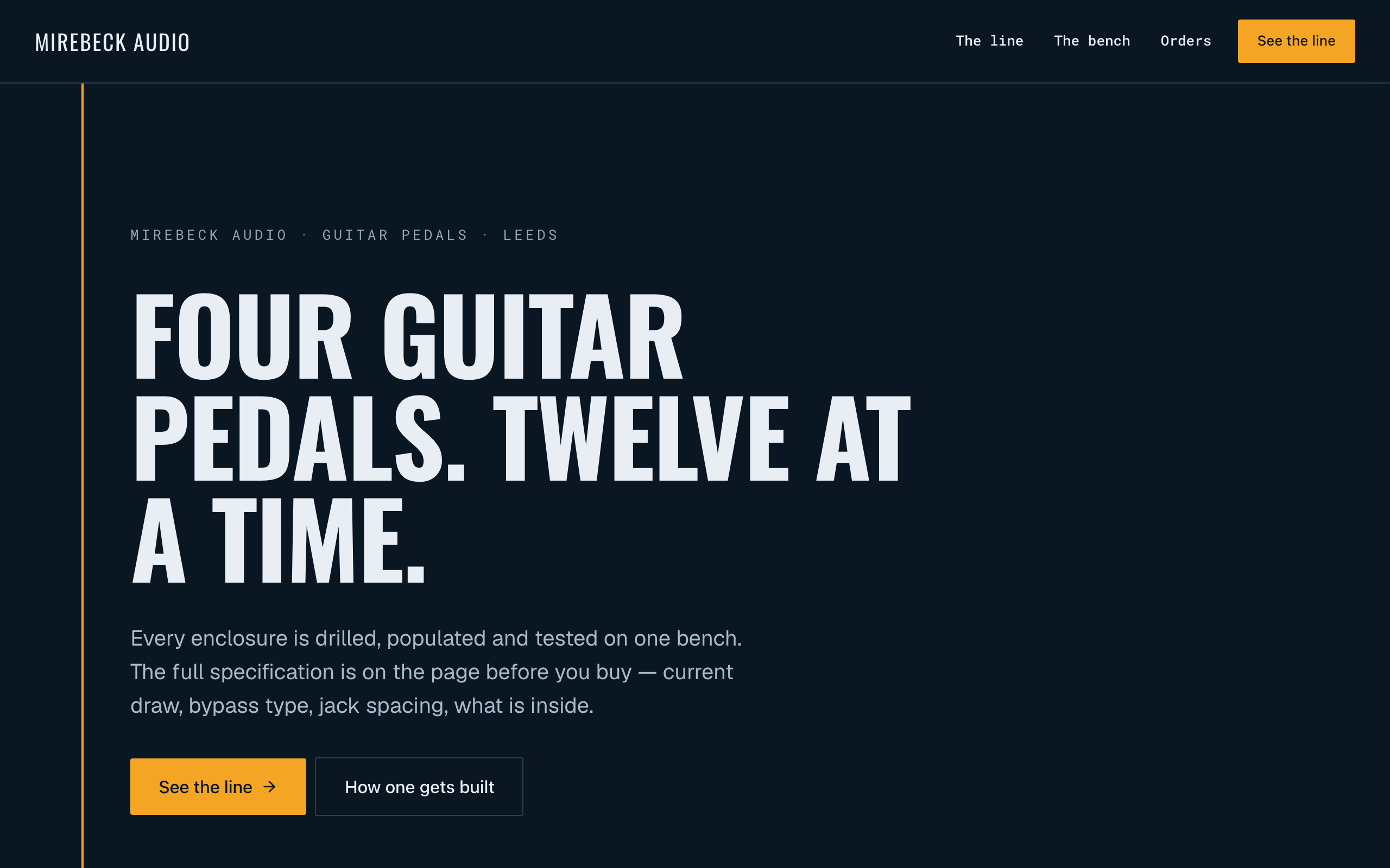
Ferrite
For makers of small-batch hardware: a spec block on every product, a Stripe buy link and repairs.
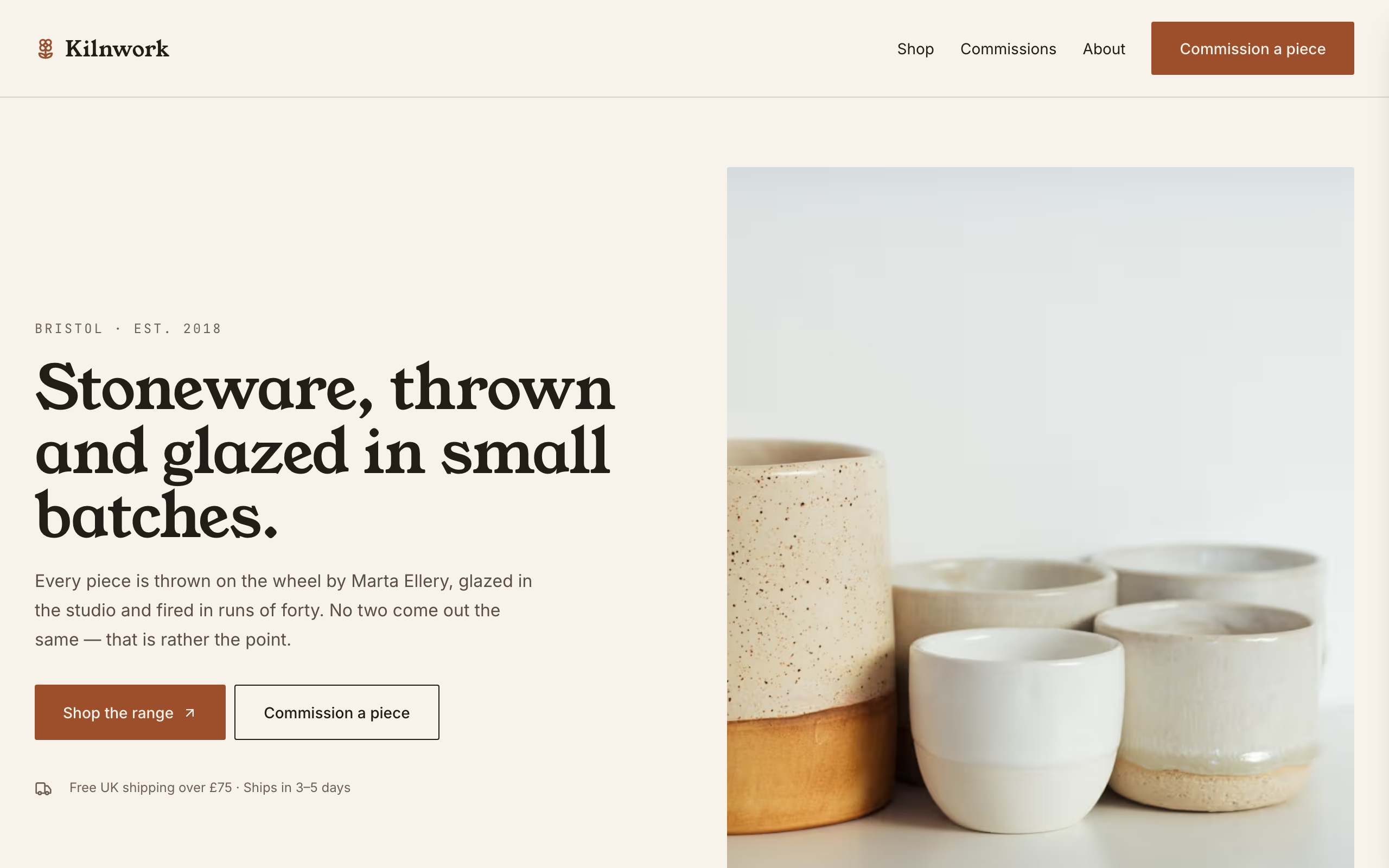
Kilnwork
For potters and makers selling a stocked range: a shop with Stripe buy links and a commissions form.
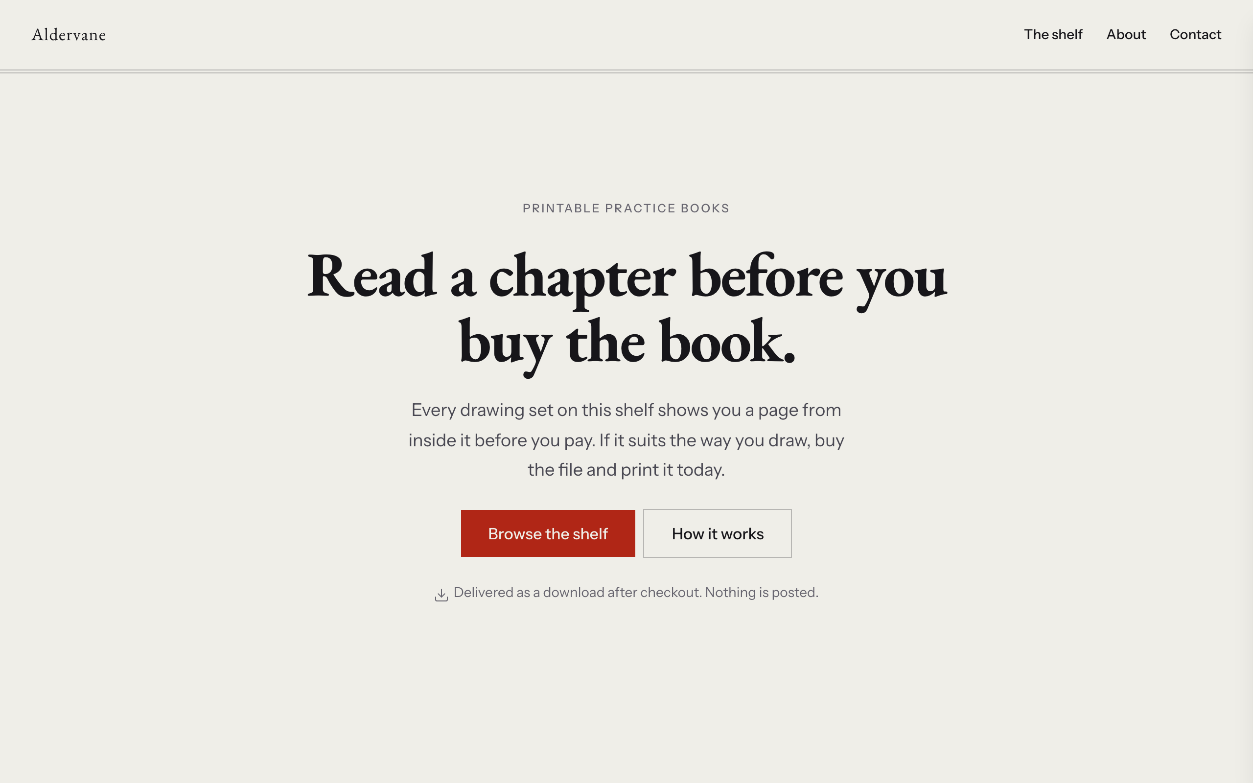
Quire
For selling PDFs and printables: page count, format, a sample page and a Stripe buy link per item.
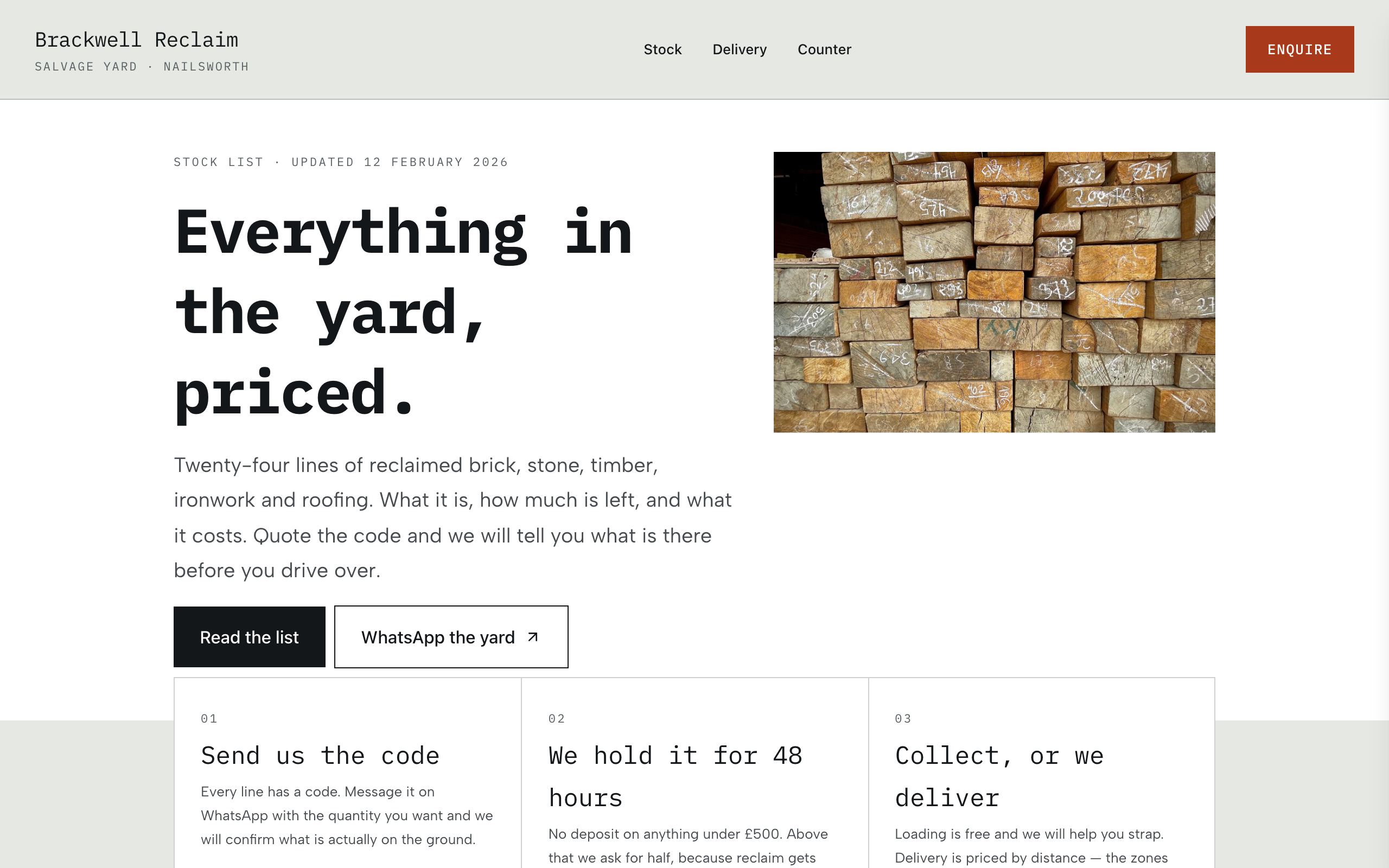
Stockroom
For resellers and yards: the whole stock list on one searchable page, with WhatsApp and phone on each item.
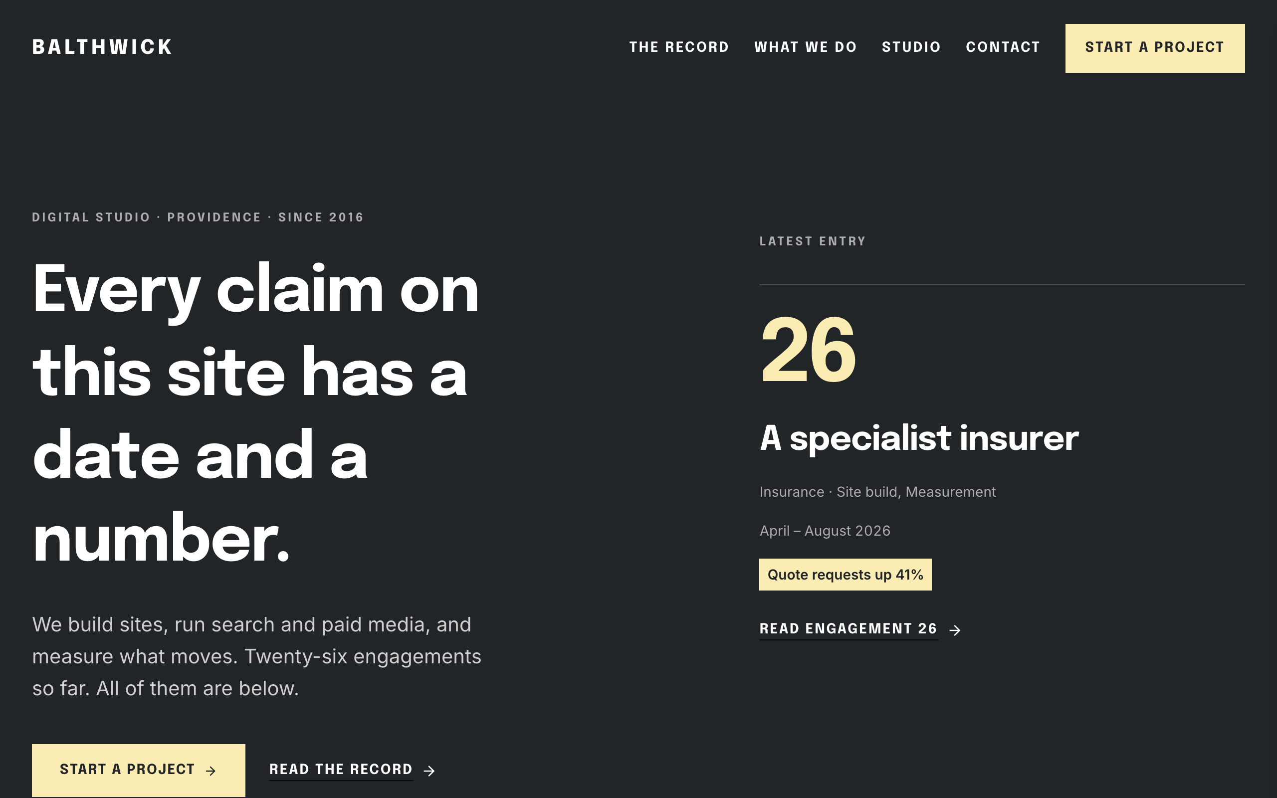
Daybook
For agencies hired on results: a dated record of engagements, each with the number it moved.