

Ferrite
A website template for a maker whose buyers compare products by specification rather than by looks
Most shop templates sell by showing the object. Ferrite sells by showing its specification. Every product carries a circuit type, a current draw, a bypass type, an enclosure size and a control list, and those sit in a hairline spec block above the description rather than buried in prose. If your buyers ask you the same three measurements every week, this is the template that answers them before they ask.
Who Ferrite is for
Built for these, and tested against them.
- Anyone building a physical product a buyer compares by specification
- Small-batch hardware — instruments, audio, lighting, bike parts, tools
- A maker selling four to twenty products rather than a hundred
- Sellers who publish a lead time and a run size honestly
- Anyone who repairs what they build and wants that said on the page
What’s included
Everything below ships with the template, already filled in.
- Pages
- 4 pages, written and laid out
- Grows with you
- 4 product entries at /pedals/ — add one and its index and detail page both update
- Enquiries
- A working form — messages land in your Sitelas inbox
- Type
- Oswald and Geist · dark theme
- Everywhere
- Built and checked at phone, tablet and desktop widths
- Yours to change
- Every colour, word and photograph — in the editor or by asking an AI agent
About This Template
For the buyer who reads the numbers
The spine
A two-pixel accent rule runs the full height of every page. Each section attaches to it at a labelled node — a small filled circle and a mono label in the accent. It is a real column in the layout rather than a decoration, so it survives at 390px, where it narrows to a 22px gutter instead of disappearing.
Motion, used three times
The stat strip arrives left to right. The range switches on one unit at a time. The build stages pass down the page in sequence. All three are data.animation on the parent with a stagger, so the owner can change or remove them from the property panel without touching JSON.
What it is not
It is not a warm craft shop — the making is not the story here, the measuring is. If your pitch is the hands and the clay, kilnwork is the better template. If your range is mixed and non-technical, counter is a neutral white shelf that will not fight your product. If you are selling a file rather than a physical object, quire is built around the free sample.
When to pick something else
Ferrite is the wrong template for these. Where there is a better one, it is linked.
- A maker whose craft and process are the pitch
- A mixed or non-technical range that needs a neutral ground
- Selling a downloadable file on the strength of a free sample — try Quire
- A body of work shown by category with nothing priced — try Pazari
- Multi-product cart, inventory or order management
- Services sold by the hour or by appointment — try Gable or Park
Free to use · No credit card required
- 1Opens in the editor with the starter content in place
- 2Change the words and pictures to yours
- 3Publish to a sitelas.com address, or your own domain
Key Highlights
Questions about Ferrite
Can I change how Ferrite looks?
All of it. Colours, type, spacing, photographs and every word are yours to edit — in the visual editor, or by asking an AI agent to do it for you. Nothing is locked.
Do I need to know how to code to use Ferrite?
No. You edit the page by clicking the thing you want to change. There is no code to write and nothing to install.
Can I add more product entries later?
Yes — that is what the product collection is for. Adding one from the editor creates its own page at /pedals/ and updates the index automatically. You are not editing a list by hand.
What does Ferrite cost?
Nothing to start, and there is no trial clock. A free site runs on a sitelas.com address; Pro is $9 a month per site when you want your own domain, analytics and more room.
Can I use my own domain?
Yes, on Pro. Point your domain at the site and SSL is issued automatically — there is no certificate to buy or renew.
Make Ferrite yours
It opens in the editor with every page already written. Change what you want, publish when it reads like you.
Free to use · No credit card required
Related Templates
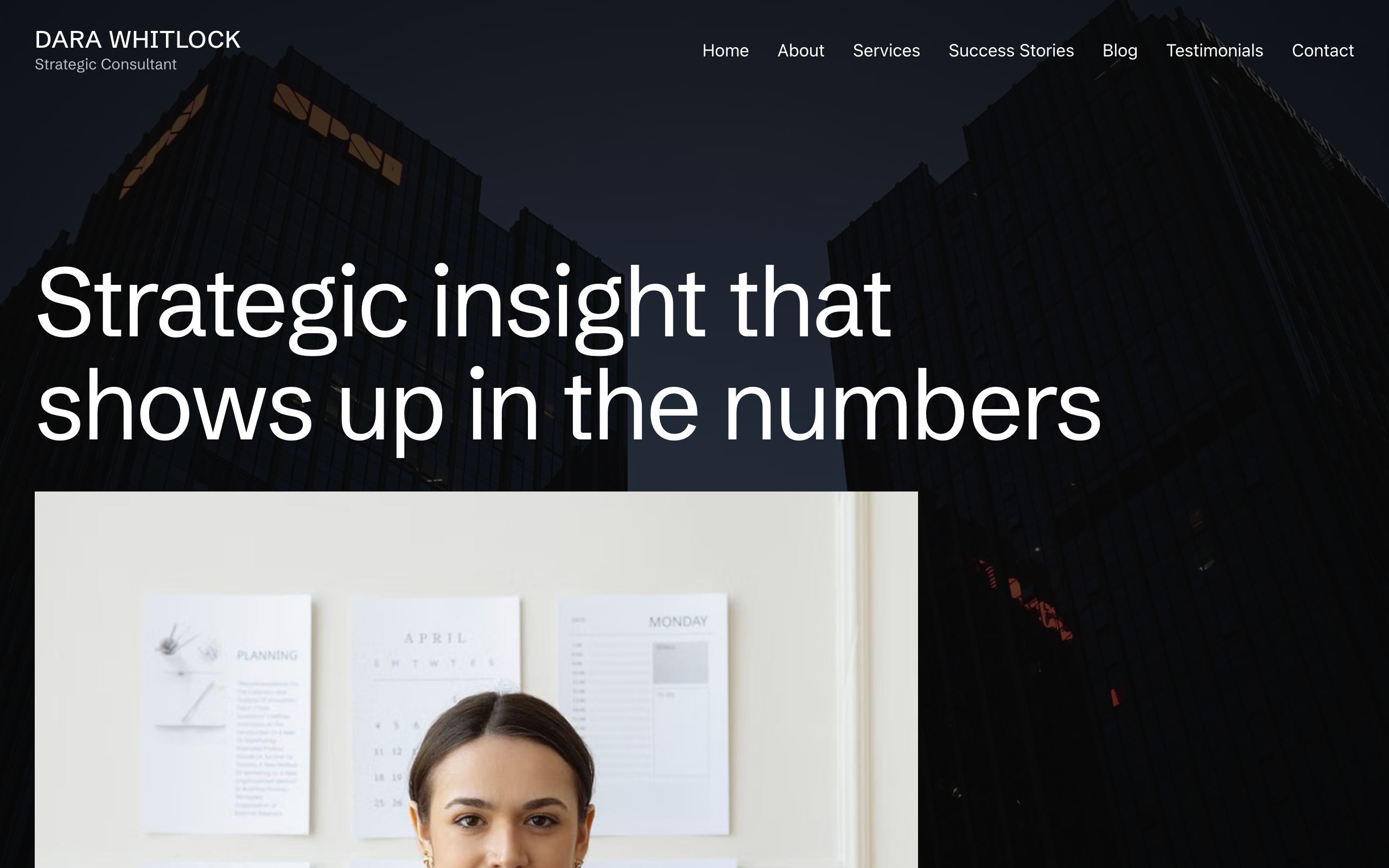
Plumbline
A consulting site built around one structural move: the photographs hold still while the page scrolls over them. Nine full-bleed plates — the home hero, two pull-quotes and every sub-page masthead — are pinned to the viewport, so the site reads as bands of moving text passing over stationary images. Ninety-pixel Schibsted Grotesk headlines, no corner rounding anywhere, one teal accent reserved for the booking control, and two black bands opened by a 45-degree teal corner bleed. Seven pages plus a blog collection. For a solo consultant, coach or adviser who sells judgement to one buyer at a time.
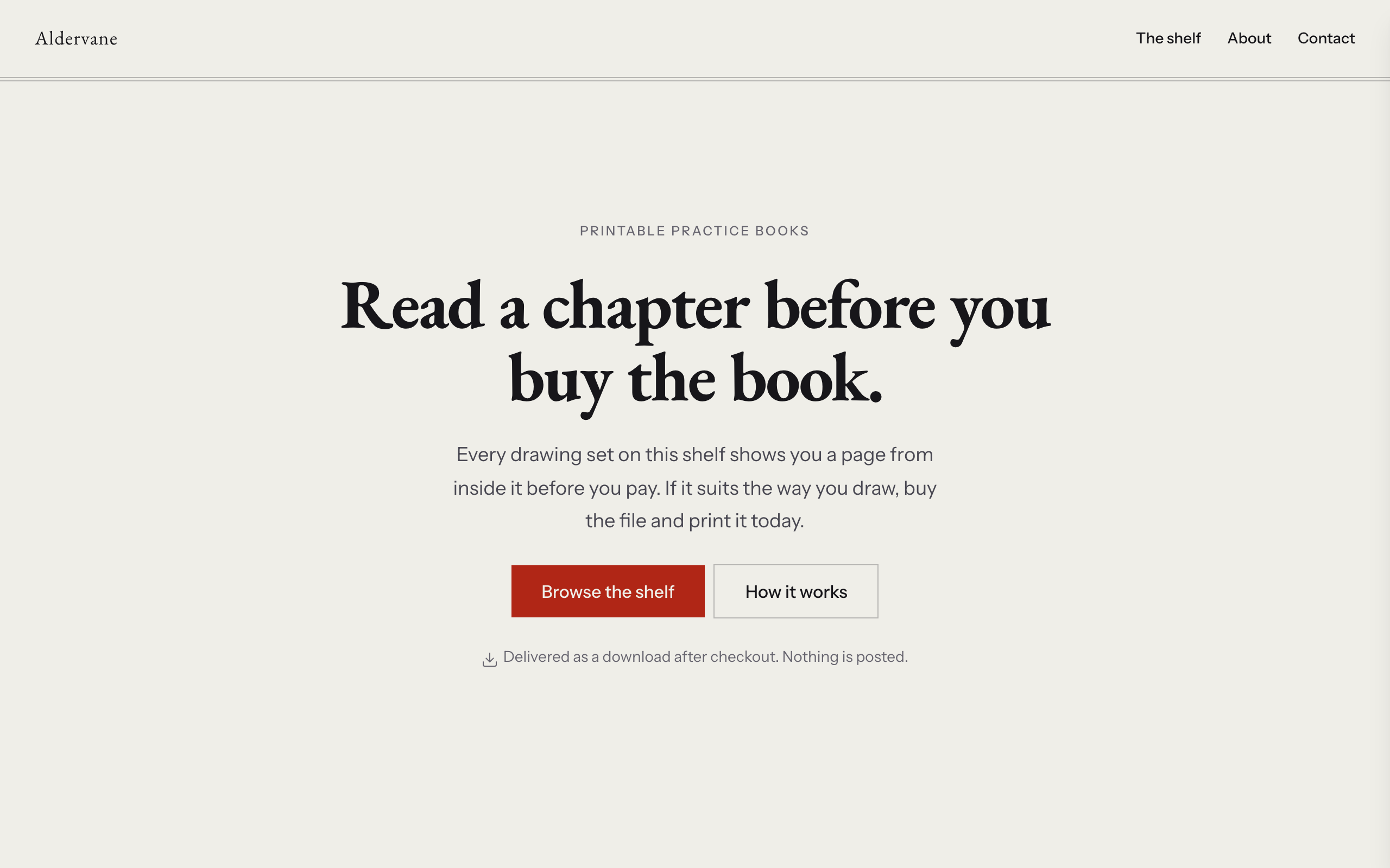
Quire
A shop for people who sell files rather than objects. Nothing here ships, nothing runs out of stock, and no product is ever shown as a cover: every item appears as an open spread — a page from inside the book on the left leaf, and the price, extent and buy button on the right, with one hairline as the gutter. A running head sits over every section, a section label in sans on the left and a folio numeral in serif on the right, so the whole site reads as something set rather than something built. The product collection carries a sample-page image, a link to a longer sample, page extent, format, price and one Stripe payment link per item, plus a coming-soon status for sets that are still being written. Warm paper ground, EB Garamond for anything that belongs to a book, Instrument Sans for anything that belongs to the shop, one rubric red that only ever means buy. Distinct from counter (physical stock, lead times and shipping, with downloads as an aside), kilnwork (the making is the pitch) and halo (a link hub with a subscription, not a catalogue).
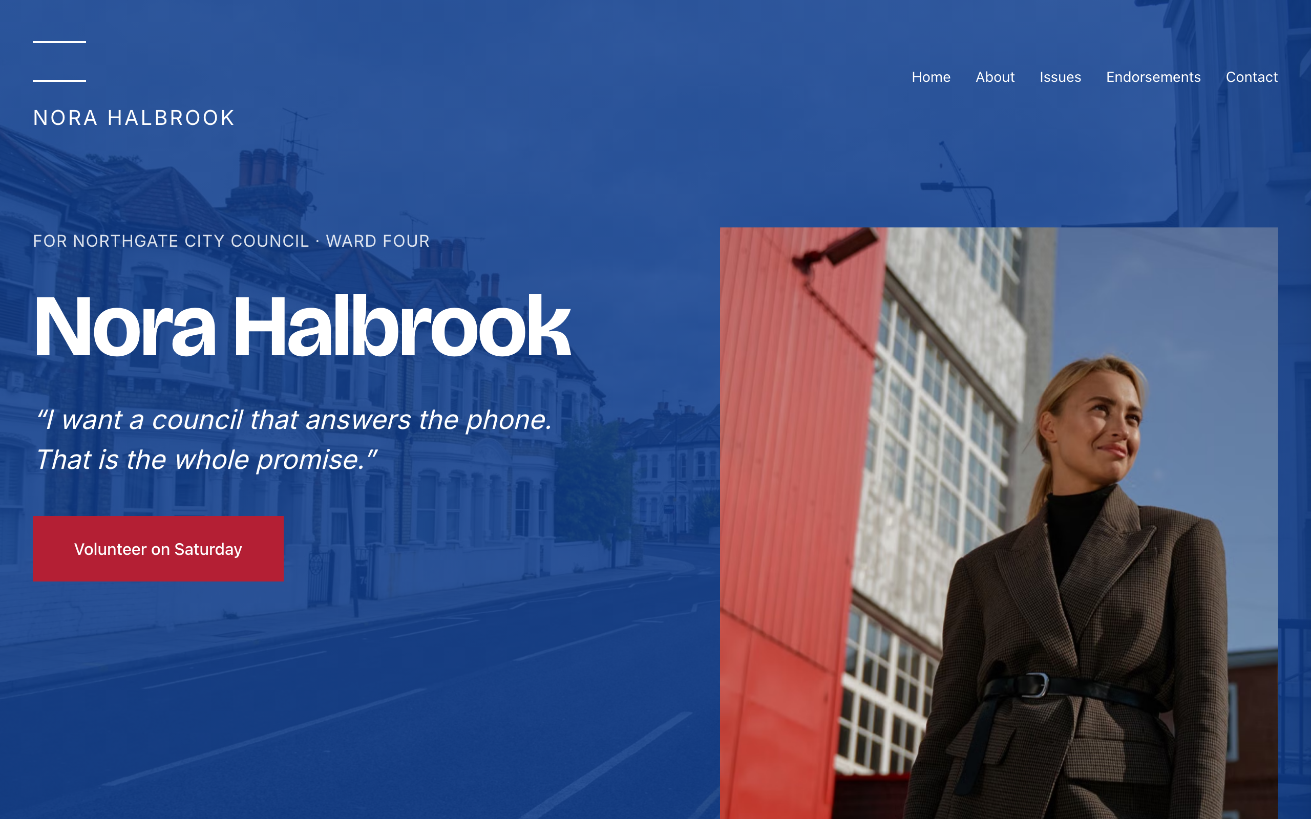
Quorum
Political campaign template for a candidate running a local race. Crimson labels open every section, then one black statement at rally scale on a pale lavender ground; three full-bleed photographic bands punctuate the sequence. Inter throughout, sharp corners, no shadows. Issues are a collection with position-paper detail pages, so a policy is one edit rather than a dead anchor; endorsements are a collection too, because the list grows through a campaign. Contact form, office map, and a footer built for the disclaimer a campaign has to carry.