
About This Template
A site for senior advisory work
Meridian is built for the solo expert selling expertise to senior leadership — fractional CFOs, fractional COOs, strategic advisors, management consultants taking high-value engagements with founders and boards. The visual register is authority-formal: Oxford navy, warm ivory, restrained typography-led layouts that feel closer to a printed monograph than a modern SaaS site.
Authority through Caslon and restraint
Libre Caslon Text carries the headlines in its natural italic display weight — the old-style serif that's printed on partnership letterhead and law-school diplomas for a hundred and fifty years. IBM Plex Sans handles body copy for a quiet, technical-but-warm pairing. Roman numerals (I. / II. / III.) segment the engagement types because the visual grammar of the senior-fee category is closer to chapter markers than feature cards.
Multi-page narrative, single conversion
Five pages — Home, Engagements, Work, About, Contact — let the prospect read down the way they would read a partner's bio book before a first meeting. Every CTA points to /contact, where the form is a discovery-call request. Distinct from Park (modernist solo consultant register) and Whitford (b2b boutique law firm). Meridian is for the individual whose name is the brand, working with companies between Series B and IPO.
Launch in 5 Steps
Swap your name and current title
Update the three engagement shapes to match your offers
Replace selected-outcomes with three real engagements (year, company, metric)
Set typical engagement-fee range to your real number
Connect the contact-page form to your scheduling inbox
Meridian
Authority-formal solo-expert site for fractional executives, strategic advisors, and management consultants. Oxford navy on warm ivory, italic Libre Caslon Text display + IBM Plex Sans body, restrained typography-led layouts. Multi-page (Home / Engagements / Work / About / Contact). Conversion is a discovery call. Distinct from Park (modernist solo consultant) — Meridian is monograph-feel, signature-typography, senior-fee positioning. Distinct from Whitford (b2b-firm law) — Meridian is solo, not a firm.
Free to use · No credit card required
Key Highlights
Built For
Related Templates
Airwave
A bold podcast and creator page with dark charcoal tones, electric purple accents, episode listings, guest spotlights, and platform subscription links — designed for shows that want to look as good as they sound.
Amber
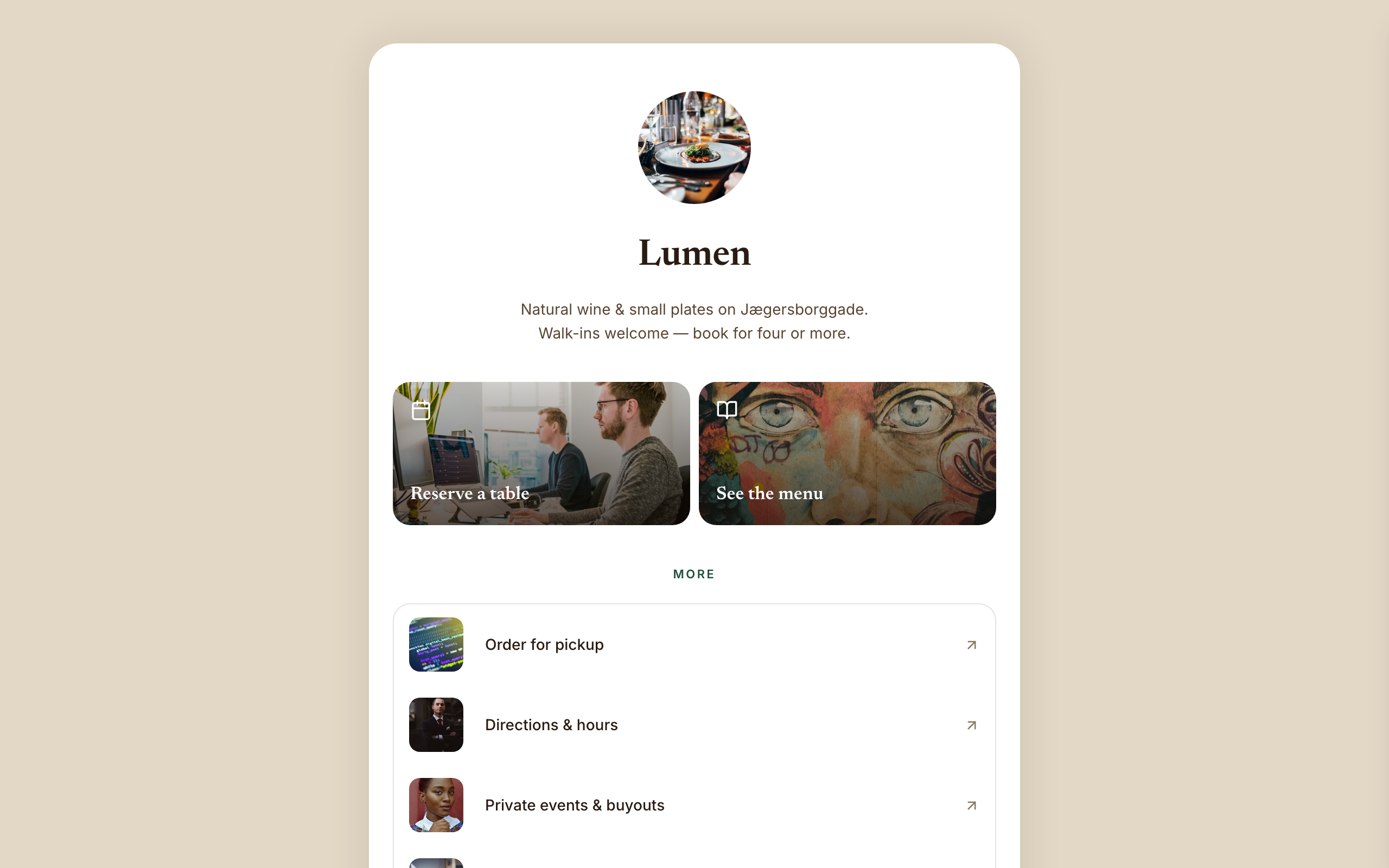
Warm hospitality link-in-bio for a café, wine bar, or restaurant — a faithful Linktree profile-card. A warm-sand page gutter with one elevated, fully-rounded ~600px centered white card; no header, no footer, and no email-capture section (a venue converts on reserve/menu/call). Ink-brown type, a bottle-green accent, Newsreader + Inter. Inside the card: circular logo → serif name → one-line bio → a 2-up photo-backed action pair (Reserve · Menu) → a grouped flat list panel with photo thumbnails → a social/contact row with a real tap-to-call link, then a horizontal 'on now' shelf of 3 Stripe items, and a short about block the card ends on. The action tiles ARE the conversion (menu-reservation).
Arena
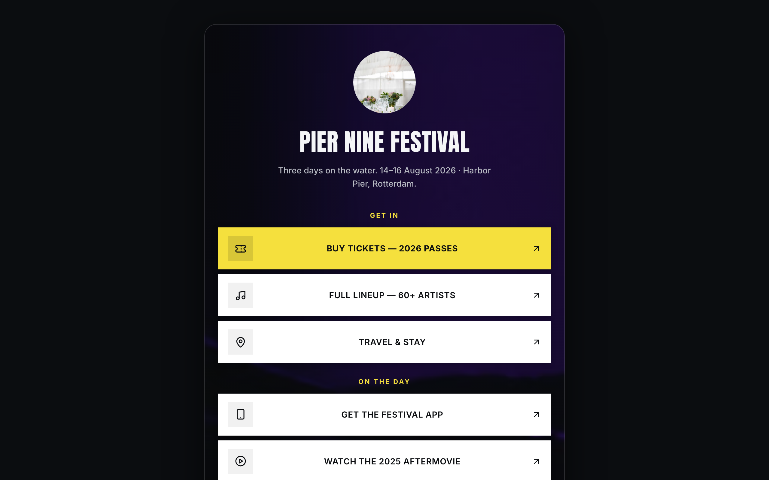
Brand/organization link-in-bio for festivals and live events — a faithful Linktree profile-card. A plain near-black page gutter with one elevated, fully-rounded ~600px centered card; the darkened event photo lives INSIDE the card. No header, no footer. Off-white type, festival-yellow accent, Anton + Inter. Inside the card over the photo: circular logo → bold condensed name → dates/location line → vertical stack of sharp white cards (square logo tile, 2-line label; the priority Buy-tickets card filled festival-yellow) → social-icon row, then a stacked passes strip with Stripe buy buttons, a short about block, and the inline presale-list capture the card ends on. The cards ARE the conversion (ticket-sale).