

Throughline Life transition coach website template
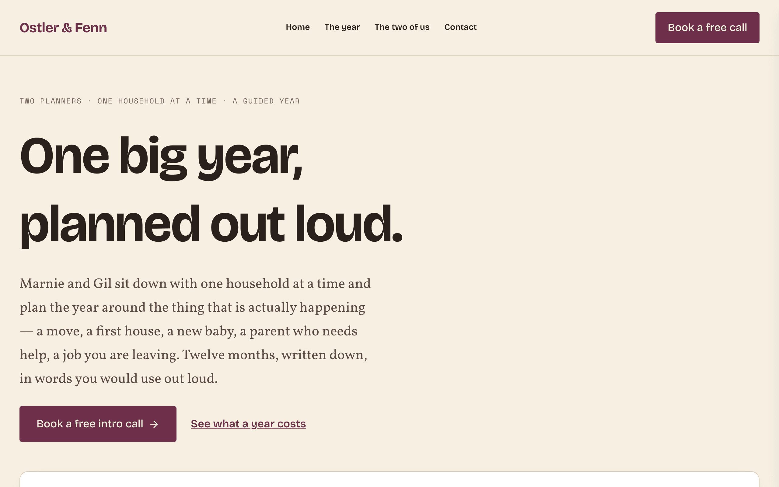
Throughline is for a small practice, often two founders, that guides families through one big year: a move, a new baby, a parent who needs care or an estate to sort out. Every page is written for a household, not a company.
Who Throughline is for
Built for these, and tested against them.
- A two-person practice guiding households through one large life change over a year
- Money or life planners who sell a program to families rather than a product
- Relocation, downsizing, estate-sorting and family-caregiving navigators
- College or career transition guides who work with the family, not a school
- Anyone selling a fixed-length guided process with published tiers and a free intro call
What’s included
Everything below ships with the template, already filled in.
- Pages
- 4 pages, written and laid out
- Enquiries
- A working form — messages land in your Sitelas inbox
- Fonts
- Bricolage Grotesque and Vollkorn · light theme
- Everywhere
- Built and checked at phone, tablet and desktop widths
- Yours to change
- Every colour, word and photograph — in the editor or by asking an AI agent
Build Throughline by asking your AI agent
No editor required. The agent writes your copy, swaps the photos and publishes the site.
- 1Connect Sitelas to Claude, ChatGPT or another AI agent that supports MCP. How to connect
- 2Ask for it in plain words: “Build a website for two founders selling a guided year-long program to families using the Throughline template.”
- 3Open the preview link it sends back, ask for changes, and publish when it reads right.
Then keep changing it from the same chat
- Rewrite the copy“Rewrite every page in a warmer, friendlier voice.”
- Change the design“Make the colours earthier and use a serif for headings.”
- Add or remove pages“Add a Pricing page and remove the Blog.”
- Rearrange sections“Move the testimonials higher and add an FAQ.”
- Swap the photos“Replace the photos with ones that fit my business.”
- Run the site“Show me this week's form messages, then publish.”
Everything here can also be done by hand in the visual editor.
About the Throughline template
Built for practices that guide families
Families facing a move, a new baby, an ageing parent or an estate want to know who will help, what the year involves and what it costs. Throughline answers those in plain words, with the price on the page and a free call as the next step.
What's on the site
- Home with your program tiers and prices
- The year, a month-by-month timeline of what happens
- The two of us, introducing the founders
- Contact, with a form to book a free intro call
What to know
The only call to action is a free intro call, so there is no online payment or booking calendar. A 'what this is not' section names the limits of the service, which builds trust with families deciding who to let in.
When to pick something else
Throughline is the wrong template for these. Where there is a better one, it is linked.
- Corporate, fractional-executive or B2B advisory — the buyer here is a household — try Park or Meridian
- Agency or studio selling to companies — try Flagship or Obsidian
- Single-practitioner clinical practice — try Riverbend
- Class or session timetable with a schedule to book — try Lotus
- Kids program sold to parents choosing a school — try Marigold
- Anything that needs a booking calendar or a payment button — the only conversion is a free call
Free to use · No credit card required
- 1Opens in the editor with the starter content in place
- 2Change the words and pictures to yours
- 3Publish to a sitelas.com address, or your own domain
Key Highlights
Questions about Throughline
Can I publish my prices?
Yes. The program tiers show the price difference at a glance, with a month-by-month timeline of what happens.
Can clients book or pay online?
No. The one call to action is a free intro call through the contact form. Add a Calendly page if you want online booking.
Who is Throughline for?
Throughline is built for two founders selling a guided year-long program to families, a life or money planner working with households rather than companies and a relocation or downsizing guide with priced packages. Not built for corporate, fractional-executive or B2B advisory — the buyer here is a household — try Park or Meridian instead.
What pages come with Throughline?
4 pages, already written and laid out: Home, The year, The two of us and Contact. Add, rename or remove pages whenever you like.
Can Claude or ChatGPT build my site from Throughline?
Yes. Connect Sitelas to your AI agent and ask for a site that uses Throughline. It fills in your details, sends you a preview link, and publishes when you approve. The same chat can keep running the site afterwards.
Can I change Throughline without code?
Yes. Click any text, photo or colour to change it in the visual editor, or ask your AI agent to make the change. Nothing is locked.
What does it cost?
Nothing to start, with no trial clock. A free site runs on a sitelas.com address; Pro is $9 a month per site ($90 a year) for your own domain, analytics and more room.
Can I use my own domain?
Yes, on Pro. Point your domain at the site and the SSL certificate is issued and renewed for you.
Make Throughline yours
It opens in the editor with every page already written. Change what you want, publish when it reads like you.
Free to use · No credit card required
Related templates
All consultants & coaches templates →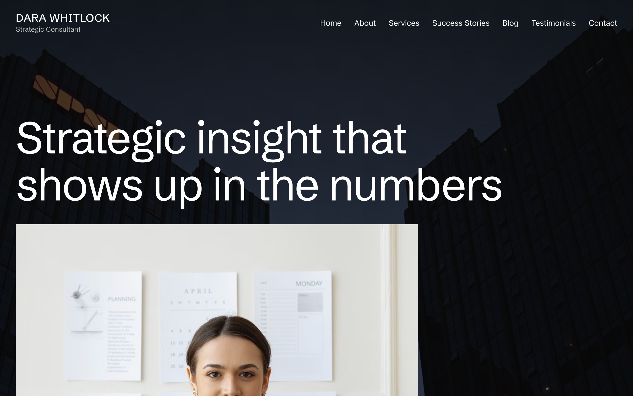
Plumbline
For independent consultants and coaches: full-bleed photography, services, success stories and a blog.
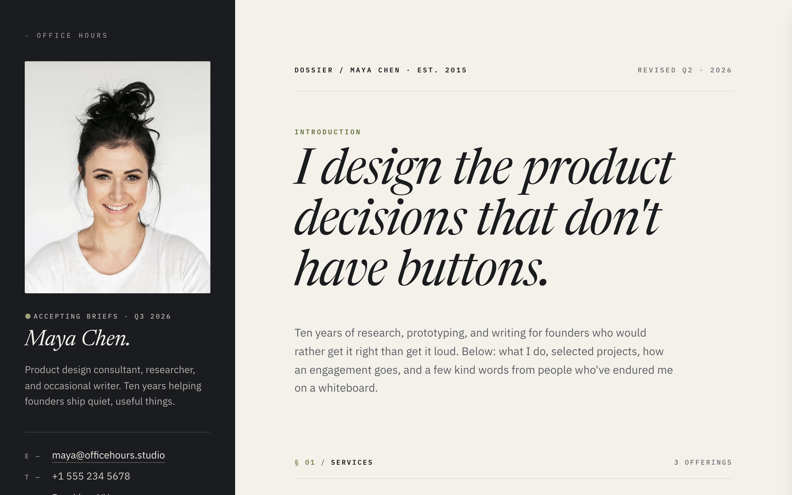
Dossier
A split-screen site for freelancers: contact details always visible, case studies and services beside them.
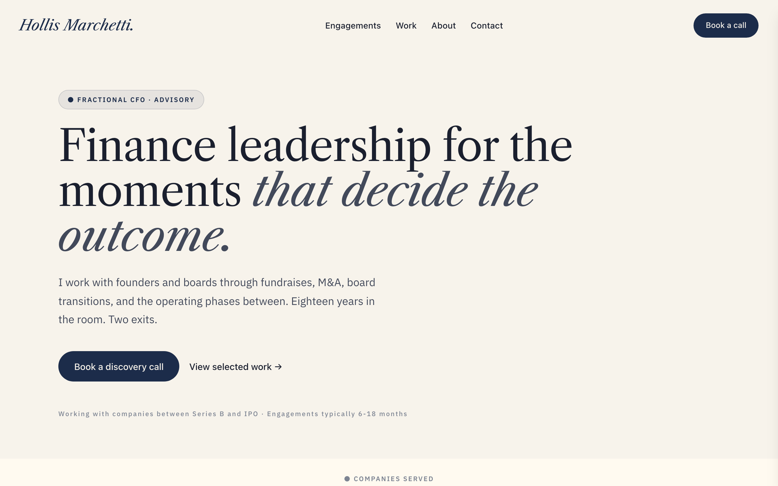
Meridian
For fractional executives and advisors: a formal site built around a written record of engagements.
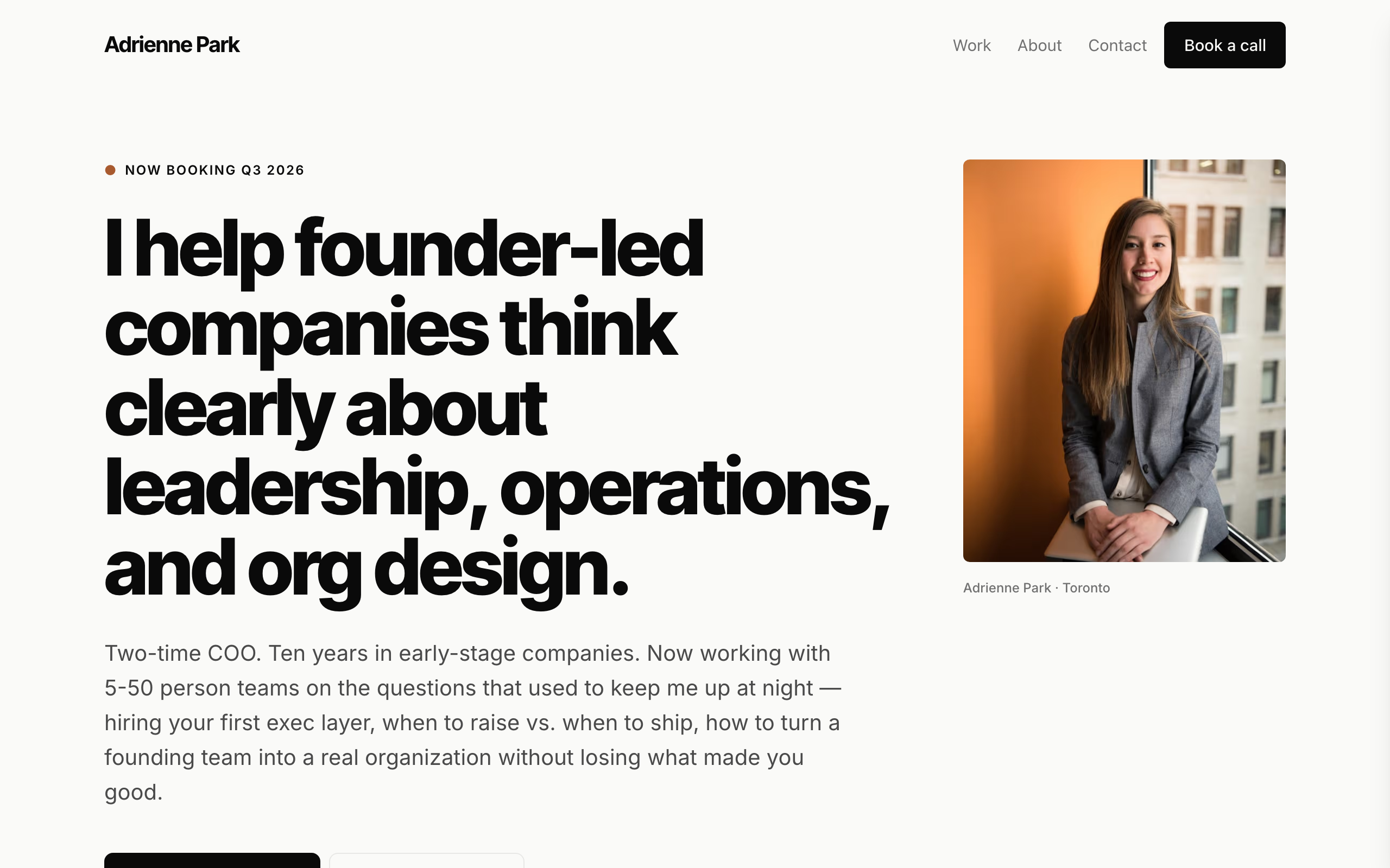
Park
A modern, minimal site for coaches and solo advisors, with case studies and a discovery-call form.

Whitford
An understated site for boutique law firms and partnerships: practice areas, attorney bios and contact.
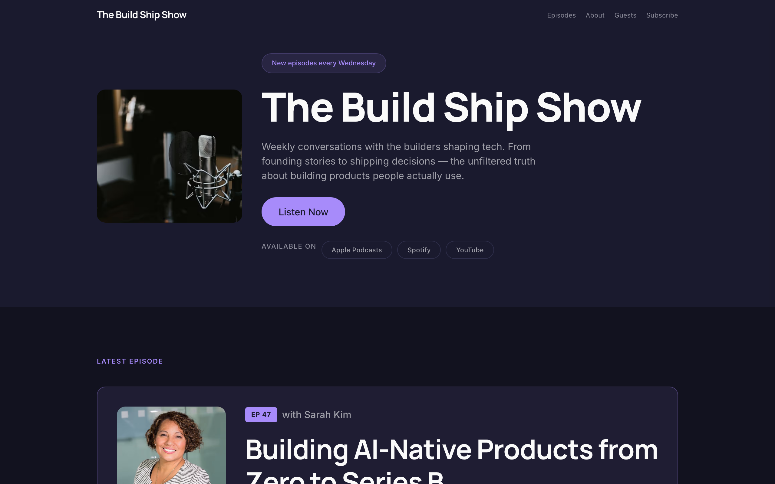
Airwave
A dark podcast site: cover art up front, the latest episode, an episode archive, guests and listening links.