

Marigold
A website template for a preschool
Marigold is built for small, independent early-childhood schools — the kind run by owner-teachers with 30 families on their roster, not the chains. Parents vetting childcare need trust signals (teacher credentials, licensing, safety, philosophy) and picture of what their kid's day actually looks like. Every section serves one of those two needs.
Who Marigold is for
Built for these, and tested against them.
- Independent preschools and early-childhood programs
- Private K–8 and Montessori schools
- Music schools and youth arts programs
- Tutoring services and enrichment programs
- Summer camps and seasonal programs
- Sunday schools and faith-based kids' programs
What’s included
Everything below ships with the template, already filled in.
- Pages
- 4 pages, written and laid out
- Grows with you
- 6 teacher entries at /teachers/ — add one and its index and detail page both update
- Enquiries
- A working form — messages land in your Sitelas inbox
- Type
- DM Serif Display and Inter · light theme
- Everywhere
- Built and checked at phone, tablet and desktop widths
- Yours to change
- Every colour, word and photograph — in the editor or by asking an AI agent
About This Template
A preschool site that respects both kids and parents
Warm, not cartoonish
DM Serif Display is a rounded Didone — the serif warmth of a picture-book title page without the patronizing whimsy of cartoon sans-serifs. The palette is deep brick terracotta (confident primary), marigold yellow (the name earning its keep as a single accent color), and warm cream. Photos of children are used with restraint; text carries most of the weight because parents are reading, not scanning.
Multi-step enrollment, not a single CTA
Enrollment is a process — tour, application, waitlist, acceptance. The home page breaks this into a three-step visual flow so parents see what they're signing up for. The primary CTA is 'Schedule a tour' (booking-form primitive), because that's the first real step. The /enroll page carries the longer form and the tuition specifics. No fake urgency, no countdown timers — the banner-bar announces the actual fall enrollment window.
When to pick something else
Marigold is the wrong template for these. Where there is a better one, it is linked.
Free to use · No credit card required
- 1Opens in the editor with the starter content in place
- 2Change the words and pictures to yours
- 3Publish to a sitelas.com address, or your own domain
Key Highlights
Questions about Marigold
Can I change how Marigold looks?
All of it. Colours, type, spacing, photographs and every word are yours to edit — in the visual editor, or by asking an AI agent to do it for you. Nothing is locked.
Do I need to know how to code to use Marigold?
No. You edit the page by clicking the thing you want to change. There is no code to write and nothing to install.
Can I add more teacher entries later?
Yes — that is what the teacher collection is for. Adding one from the editor creates its own page at /teachers/ and updates the index automatically. You are not editing a list by hand.
What does Marigold cost?
Nothing to start, and there is no trial clock. A free site runs on a sitelas.com address; Pro is $9 a month per site when you want your own domain, analytics and more room.
Can I use my own domain?
Yes, on Pro. Point your domain at the site and SSL is issued automatically — there is no certificate to buy or renew.
Make Marigold yours
It opens in the editor with every page already written. Change what you want, publish when it reads like you.
Free to use · No credit card required
Related Templates
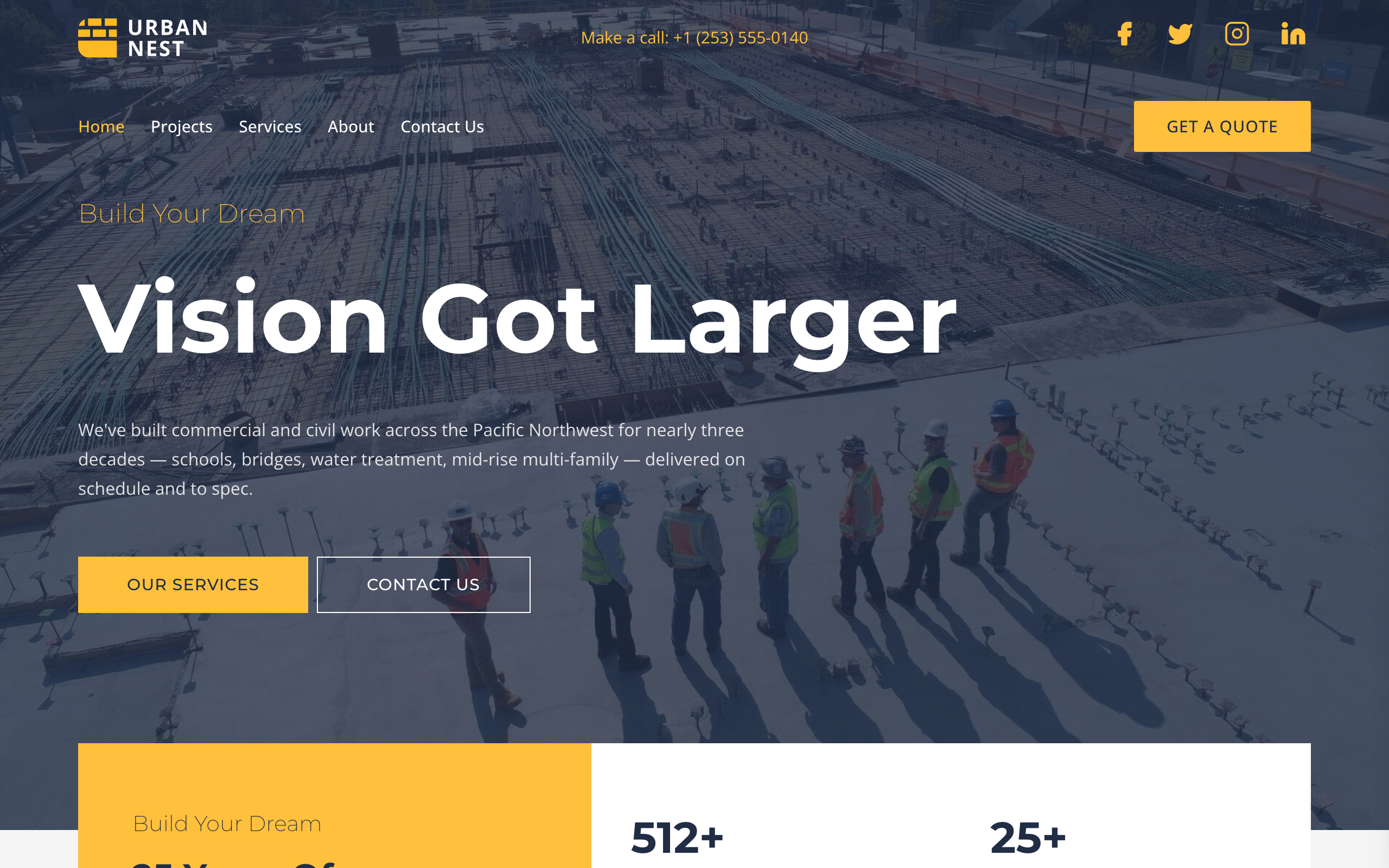
Ironclad
Utilitarian-trustworthy construction GC template — Urban Nest persona. Deep slate navy + industrial yellow + sharp 0/2-radius buttons. Transparent absolute header (logo / phone / socials over hero divider, then nav + Get a Quote pill). Full-bleed dark hero with 90px Montserrat 700 headline, yellow stats card overlapping the hero/services boundary, six-tile services grid on a 1200px container, two-tone sustainability split with image overlays, three-location row + Transform Communities CTA, asymmetric founders strip with bottom-fade meta + ABOUT US CTA, four-project full-bleed work strip, dark 2x2 testimonial grid with yellow bottom borders, quote form + FAQ split. Multi-page (Home / Projects / Services / About / Contact). Montserrat 200/500/700 on Open Sans.
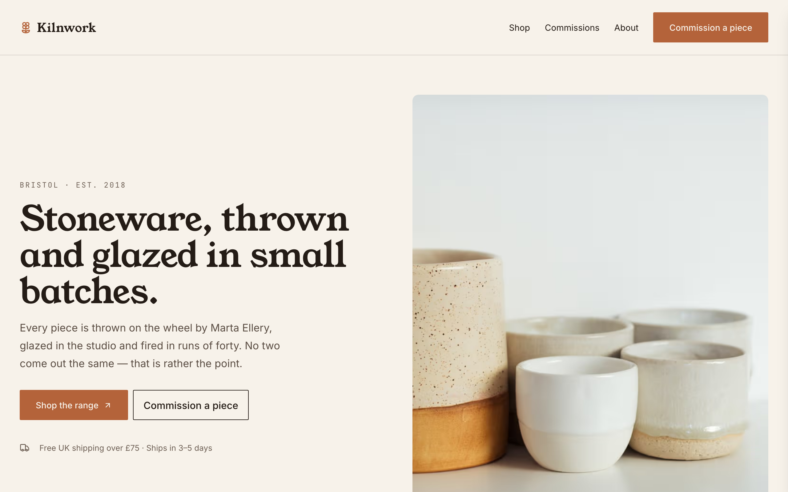
Kilnwork
Catalogue-first shop for a maker who sells physical work — ceramics, jewellery, candles, small-batch food. Warm clay palette on oatmeal, Young Serif display over Inter. A product collection with one Stripe payment link per item drives the shop; a separate commissions page carries the made-to-order enquiry form. Built for the maker who has a stocked range AND takes custom orders, which is the shape most small studios actually trade in. Distinct from cami and pazari (portfolios where the work is the pitch and the conversion is an enquiry) — here the conversion is a purchase.
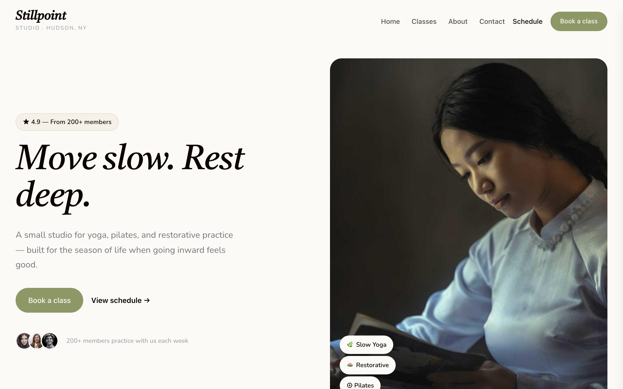
Lotus
Calm-professional wellness studio. Warm cream background with sage and coral accents, Castoro serif display + Nunito body. Designed for yoga / pilates / restorative-movement studios with a small-studio feel — soft photography, image-led hero, services-list class menu, simple membership tiers, and a booking-form conversion. Multi-page with home + classes + about + contact.