
About This Template
A site for cause-driven nonprofits
Compass is built for the community foundation, the multi-program charity, and the faith-based or civic-action org running real programs on real budgets. The visual register is humanitarian: deep oxblood, warm peach cream, gold accents, Playfair Display set in bold upright serif. It feels like a printed annual report, not a tech startup.
Charis-parity, faithful and warm
This is a faithful port of the Charis Framer template — layered hero image stack with the curved oxblood blob behind, the gold spark mark, the bold serif callout band, white cause cards with gold goal badges and outline arrow buttons, the numbered-circle trust pillars over an emotive full-bleed photo, the centered pull-quote testimonial, the photo marquee, and the bright gold pill newsletter panel.
Cause cards with goals; donation that converts
Each cause card on Home and /causes carries a gold pill badge with the explicit funding goal — the signature Charis detail that converts. Three donation tiers on /get-involved are wired to stripe-payment-link primitives. A volunteer interest form on the same page captures sign-ups by role and availability without a separate scheduling tool.
Launch in 5 Steps
Replace the org name everywhere with your charity
Update the three causes and their goal $ amounts
Paste real Stripe Payment Link URLs into each tier card
Replace humanitarian photography with photos from your causes
Connect the volunteer & donation forms to your inbox
Compass
Faithful Charis-parity port. Oxblood + warm peach cream + gold accent + Playfair Display bold serif. Layered hero image stack with curved oxblood blob, white cause cards with gold goal badges, Lucide-icon decorative marks over emotive photos, gold pill newsletter panel, dark-square buttons with trailing arrow icons. Multi-page (Home / Causes / Get Involved / About).
Free to use · No credit card required
Key Highlights
Built For
Related Templates
Airwave
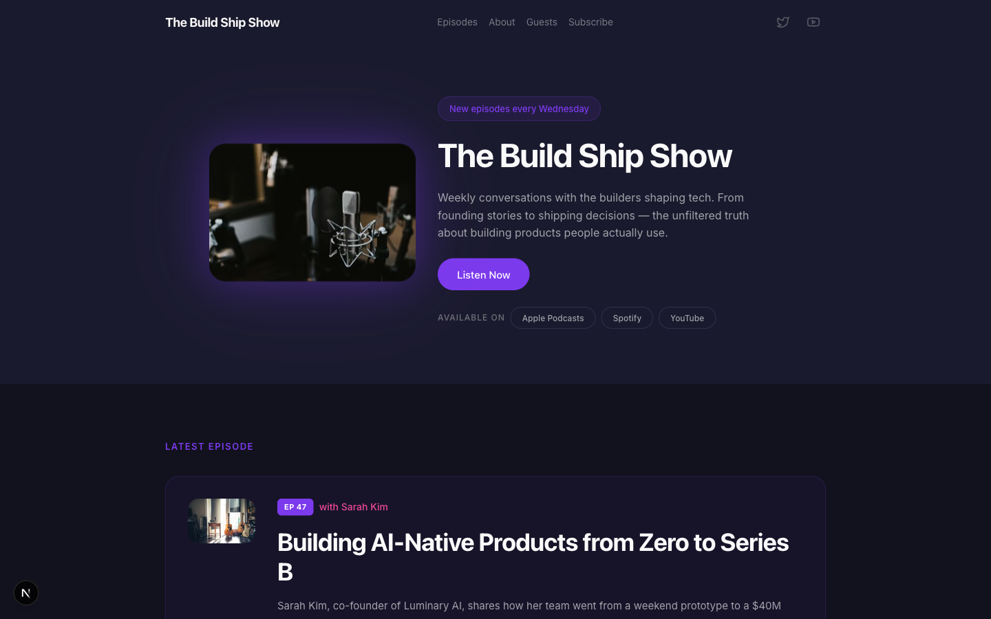
A bold podcast and creator page with dark charcoal tones, electric purple accents, episode listings, guest spotlights, and platform subscription links — designed for shows that want to look as good as they sound.
Amber
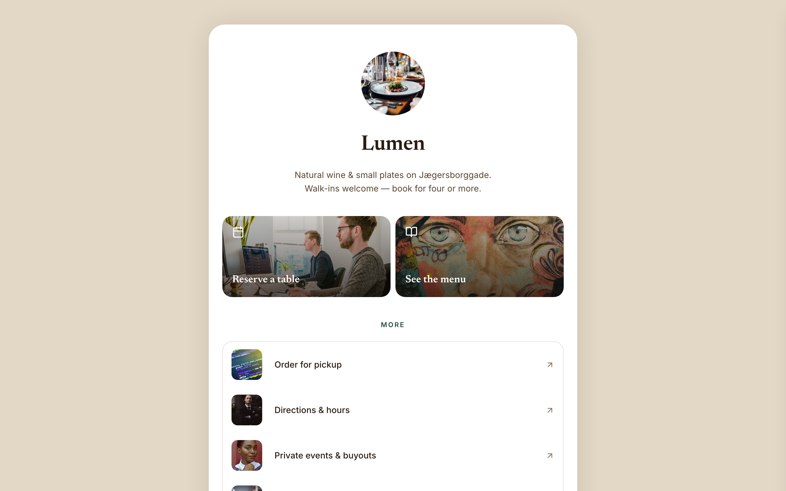
Warm hospitality link-in-bio for a café, wine bar, or restaurant — a faithful Linktree profile-card. A warm-sand page gutter with one elevated, fully-rounded ~600px centered white card; no header, no footer, and no email-capture section (a venue converts on reserve/menu/call). Ink-brown type, a bottle-green accent, Newsreader + Inter. Inside the card: circular logo → serif name → one-line bio → a 2-up photo-backed action pair (Reserve · Menu) → a grouped flat list panel with photo thumbnails → a social/contact row with a real tap-to-call link, then a horizontal 'on now' shelf of 3 Stripe items, and a short about block the card ends on. The action tiles ARE the conversion (menu-reservation).
Arena
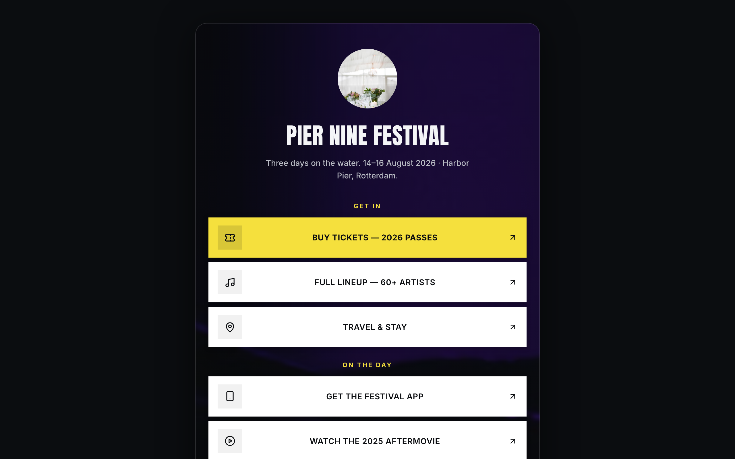
Brand/organization link-in-bio for festivals and live events — a faithful Linktree profile-card. A plain near-black page gutter with one elevated, fully-rounded ~600px centered card; the darkened event photo lives INSIDE the card. No header, no footer. Off-white type, festival-yellow accent, Anton + Inter. Inside the card over the photo: circular logo → bold condensed name → dates/location line → vertical stack of sharp white cards (square logo tile, 2-line label; the priority Buy-tickets card filled festival-yellow) → social-icon row, then a stacked passes strip with Stripe buy buttons, a short about block, and the inline presale-list capture the card ends on. The cards ARE the conversion (ticket-sale).