

Vista
A website template for a photographer with a print shop and a booking email link
Vista is a faithful link-in-bio: a plain near-black gutter framing one elevated, fully-rounded centered card whose own background is a darkened cinematic photo. Circular avatar, name, one-line bio, a vertical stack of glass buttons, a social row, then a print/sound shop and a drop-list capture — all inside the card. No header, no footer.
Who Vista is for
Built for these, and tested against them.
- Photographers with a print shop and a booking inbox
- DJs / producers routing traffic to mixes, sets, and releases
- Directors and visual artists who lead with atmosphere
- Creators whose Instagram feed is already dark and cinematic
- Anyone who wants a link hub that looks like a film still
What’s included
Everything below ships with the template, already filled in.
- Pages
- 1 page, written and laid out
- Enquiries
- A working form — messages land in your Sitelas inbox
- Type
- Cormorant and Inter · dark theme
- Everywhere
- Built and checked at phone, tablet and desktop widths
- Yours to change
- Every colour, word and photograph — in the editor or by asking an AI agent
About This Template
A real Linktree, on a site you own
Fine-dining-dark register
The photo is contained in the card, not bled to the viewport; the gutter is flat near-black. Off-white type, a muted-gold accent, Cormorant thin serif + Inter. Reads as the work, not a utility.
Subscribe-platform conversion
The glass buttons are the conversion — mix, print shop, booking, dates, reel, contact. The drop-list form is the second path — submissions land in your Sitelas inbox; add a webhook in its settings to forward them to your email tool.
When to pick something else
Vista is the wrong template for these. Where there is a better one, it is linked.
- Minimalist creator who wants a clean light link page — try Halo
- Bright lifestyle influencer link hub — try Prism
- Fine-dining restaurant site — try Juniper or Midnight-creative
- Full multi-page photography portfolio with galleries — try Pazari or Cami
- SaaS pre-launch waitlist — try Slate or Field
- Ecommerce storefront with cart + inventory
Free to use · No credit card required
- 1Opens in the editor with the starter content in place
- 2Change the words and pictures to yours
- 3Publish to a sitelas.com address, or your own domain
Key Highlights
Questions about Vista
Can I change how Vista looks?
All of it. Colours, type, spacing, photographs and every word are yours to edit — in the visual editor, or by asking an AI agent to do it for you. Nothing is locked.
Do I need to know how to code to use Vista?
No. You edit the page by clicking the thing you want to change. There is no code to write and nothing to install.
What does Vista cost?
Nothing to start, and there is no trial clock. A free site runs on a sitelas.com address; Pro is $9 a month per site when you want your own domain, analytics and more room.
Can I use my own domain?
Yes, on Pro. Point your domain at the site and SSL is issued automatically — there is no certificate to buy or renew.
Make Vista yours
It opens in the editor with every page already written. Change what you want, publish when it reads like you.
Free to use · No credit card required
Related Templates
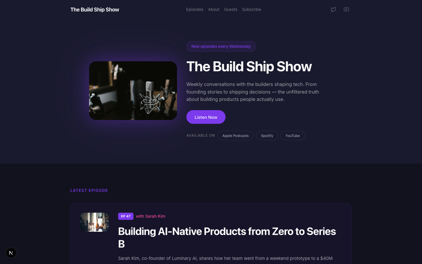
Airwave
A bold podcast and creator page with dark charcoal tones, electric purple accents, episode listings, guest spotlights, and platform subscription links — designed for shows that want to look as good as they sound.
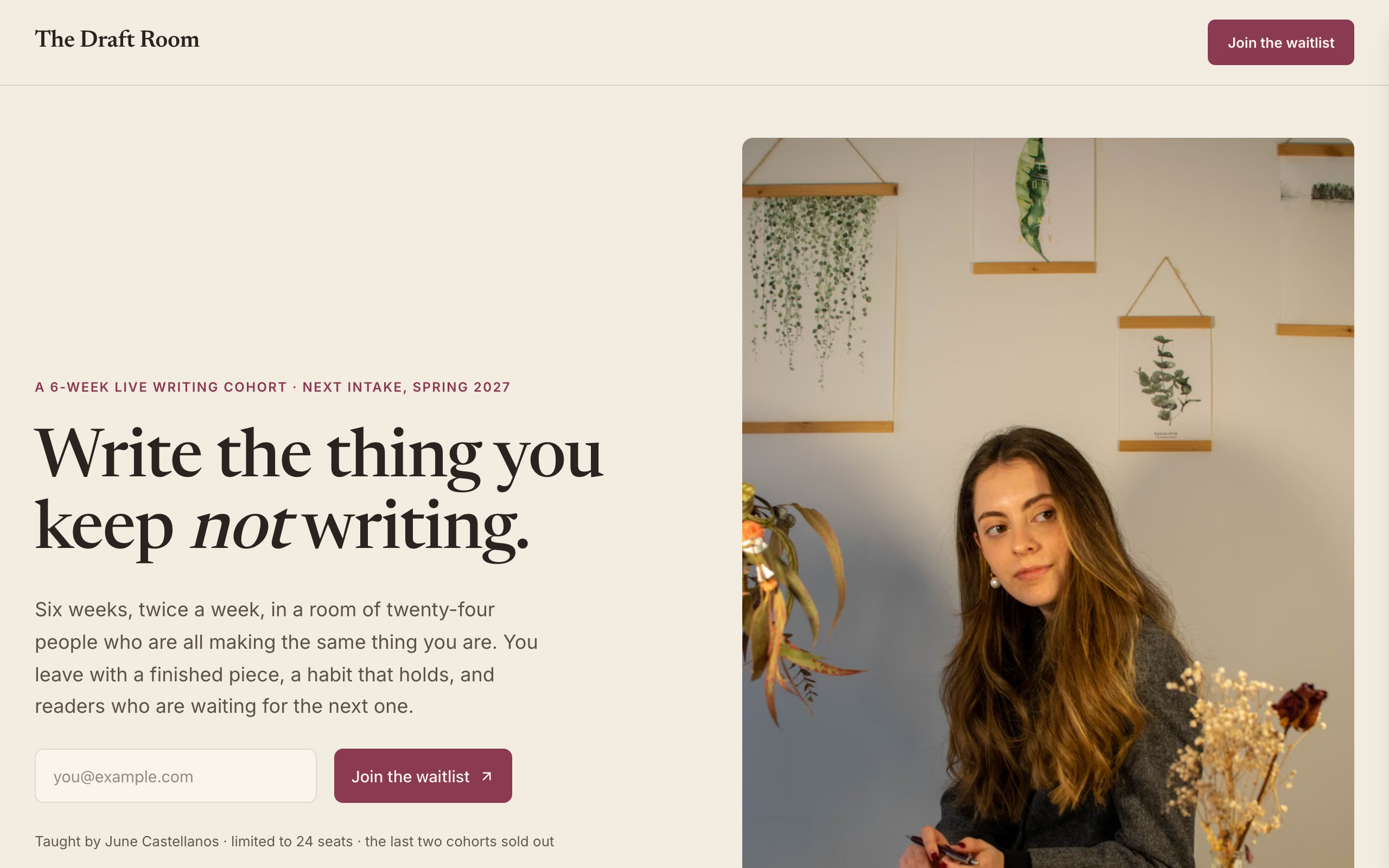
Atelier
Waitlist for a cohort-based COURSE — the first education/creator-course waitlist in the catalog. Instructor-led register: warm paper, ink, a single plum accent, Newsreader (a bookish reading serif) against Inter — warm and personal, deliberately NOT the cream-serif-terracotta default. Course-native signatures no product waitlist has: an instructor front-and-centre with a portrait (the teacher is the draw), a 'cohort at a glance' details card (format / duration / commitment / cohort size / next date / investment), a week-by-week syllabus, past-cohort testimonials with star ratings, and a 'join the waitlist for the next cohort' form. Single-page: split hero (waitlist form + instructor portrait) → cohort details card → six-week syllabus → who's teaching → testimonials → waitlist-momentum band → FAQ → waitlist CTA → footer. Conversion is newsletter-signup (join the next-cohort waitlist). Demo persona is 'The Draft Room', a 6-week live writing cohort taught by June Castellanos, but the design suits any cohort course or bootcamp. Distinct from every software / product / real-estate waitlist.
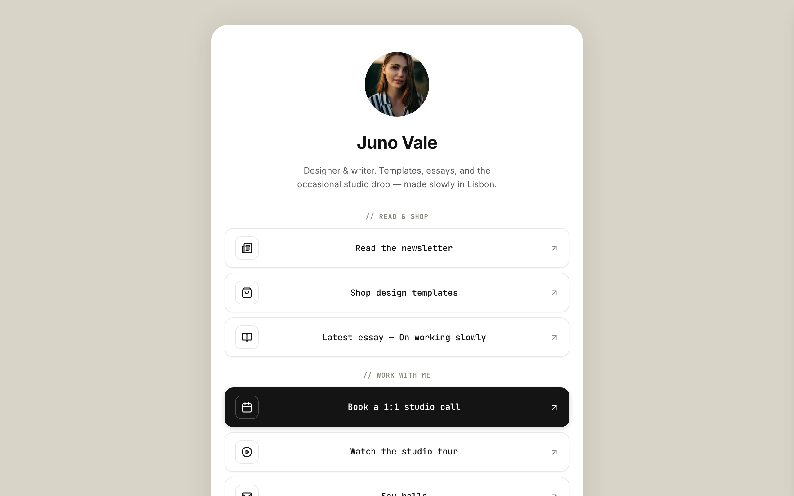
Halo
Modernist-minimal link-in-bio for multidisciplinary creators — a faithful Linktree profile-card. A warm-grey page gutter with one elevated, fully-rounded ~600px centered card that holds everything; no header, no footer. White card, ink type, a single muted-clay accent, Inter + JetBrains Mono. Inside the card, top to bottom: circular avatar → name → one-line bio → vertical stack of outlined link buttons (leading icon tile + trailing arrow) → social-icon row, then a stacked shop strip with Stripe buy buttons, a short about block, and the stacked newsletter capture the card ends on. The link buttons ARE the conversion (subscribe-platform).