

Reyes
A website template for a real estate broker
Reyes is built for solo brokers and small teams whose business is listings. The home page opens with a featured property — full-width photo plus overlay card carrying the price, address, and essential stats — then flows into a grid of current listings that read as a tight catalog.
Who Reyes is for
Built for these, and tested against them.
- Solo real-estate brokers and small agency teams
- Luxury property specialists
- Vacation rental managers and boutique hotel operators
- Anyone whose business is a catalog of high-value items
What’s included
Everything below ships with the template, already filled in.
- Pages
- 4 pages, written and laid out
- Grows with you
- 9 listing entries at /listings/ — add one and its index and detail page both update
- Enquiries
- A working form — messages land in your Sitelas inbox
- Type
- Prata and Inter · light theme
- Everywhere
- Built and checked at phone, tablet and desktop widths
- Yours to change
- Every colour, word and photograph — in the editor or by asking an AI agent
About This Template
A broker site that leads with inventory
Grounded-luxury, not breathless
The Prata display is a high-contrast Didone — the typography of real-estate brochures and interior magazines, without the try-hard gloss. Deep forest green carries the chrome and CTAs; warm ochre handles price chips and sold badges. The warm off-white background suggests prestige without shouting it. No 'dream homes', no 'passionate about connecting families', no exclamation marks.
Inventory is the product
Each listing is a link-block wrapping image + price + address + beds/baths/sqft metadata. Status chips (For Sale, Pending, Sold) differentiate active inventory from social proof. The /listings page scales the pattern to nine properties — the structural archetype for any catalog-driven service business: boutique hotel rooms, vacation rental inventory, dealership units.
When to pick something else
Reyes is the wrong template for these. Where there is a better one, it is linked.
- Mass-market real estate
- MLS-integrated platform
- Ecommerce
- Buy-now flow
Free to use · No credit card required
- 1Opens in the editor with the starter content in place
- 2Change the words and pictures to yours
- 3Publish to a sitelas.com address, or your own domain
Key Highlights
Questions about Reyes
Can I change how Reyes looks?
All of it. Colours, type, spacing, photographs and every word are yours to edit — in the visual editor, or by asking an AI agent to do it for you. Nothing is locked.
Do I need to know how to code to use Reyes?
No. You edit the page by clicking the thing you want to change. There is no code to write and nothing to install.
Can I add more listing entries later?
Yes — that is what the listing collection is for. Adding one from the editor creates its own page at /listings/ and updates the index automatically. You are not editing a list by hand.
What does Reyes cost?
Nothing to start, and there is no trial clock. A free site runs on a sitelas.com address; Pro is $9 a month per site when you want your own domain, analytics and more room.
Can I use my own domain?
Yes, on Pro. Point your domain at the site and SSL is issued automatically — there is no certificate to buy or renew.
Make Reyes yours
It opens in the editor with every page already written. Change what you want, publish when it reads like you.
Free to use · No credit card required
Related Templates
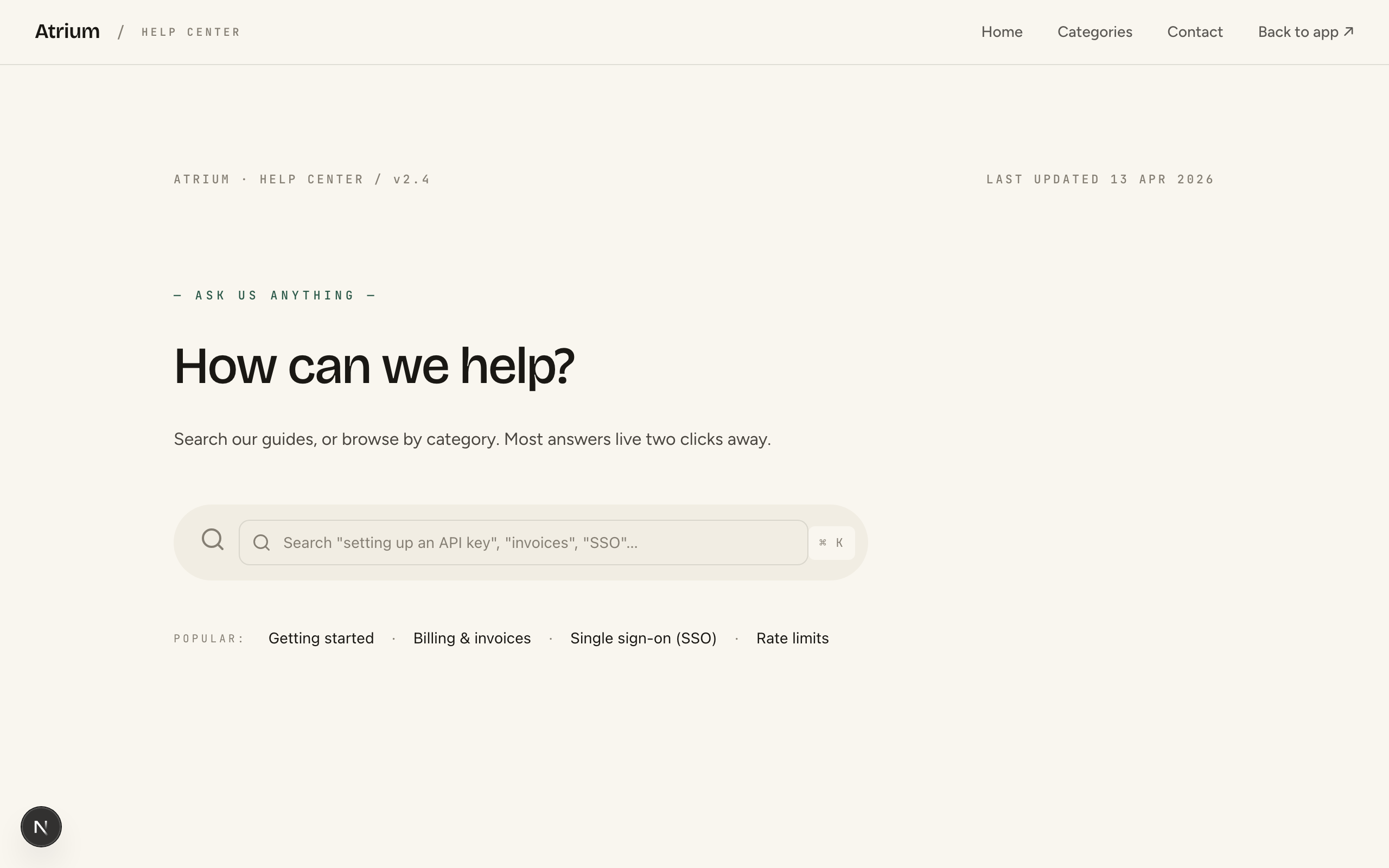
Atrium
Register-your-interest pre-launch for a new residential DEVELOPMENT — the first real-estate waitlist in the catalog. Image-led architectural register: cool limestone, ink, a single deep architectural-green accent, Bodoni Moda display against Inter — deliberately NOT the warm-cream-serif default. Real-estate-native signatures no software or product waitlist has: a register-interest form (name + email), a residences table (home type / size / from-price / availability), a location datasheet (walk-times to the neighbourhood), and a completion timeline. Single-page: split hero (register form + architectural photograph) → the homes table → the place / walk-times → the interiors (image + materials) → a philosophy statement → register-momentum band → FAQ → register CTA → footer with the developer disclaimer. Conversion is newsletter-signup (register your interest, no reservation). Demo persona is 'Marlowe Yard', 48 canalside homes in the Jordaan, Amsterdam, but the design suits any boutique development launch. Distinct from reyes (broker LISTINGS site, multi-page, lead-form) and from every software / product waitlist.
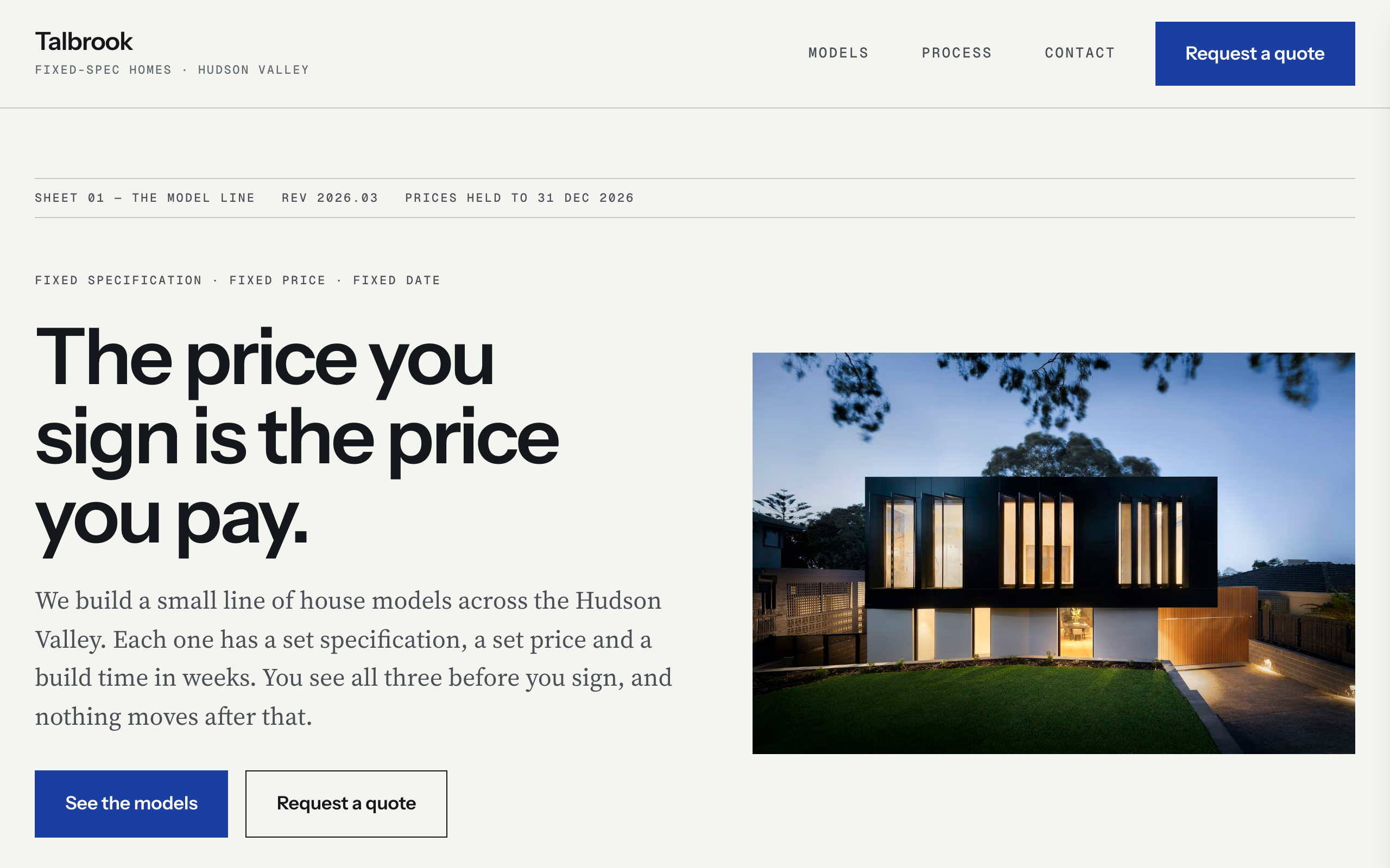
Parcel
For a builder or developer selling standard house MODELS rather than one-off listings. Fixed specification, fixed from-price, build time in weeks. The whole site is laid out as a spec sheet you could sign: hairline-ruled label/value ledgers carry the pitch on the home page, the comparison columns on the model index, and the specification on every model page. The signature move is a double ledger — 'In the price' beside 'Not in the price' — because the argument is 'no change to the price halfway through', not aspiration. Models are a content collection, so one row drives the home strip, the index and its own page. Instrument Sans display over a Source Serif 4 body with Geist Mono data labels; cool paper, ink and a single drafting blue. Quote-intake form, no commerce, no booking.
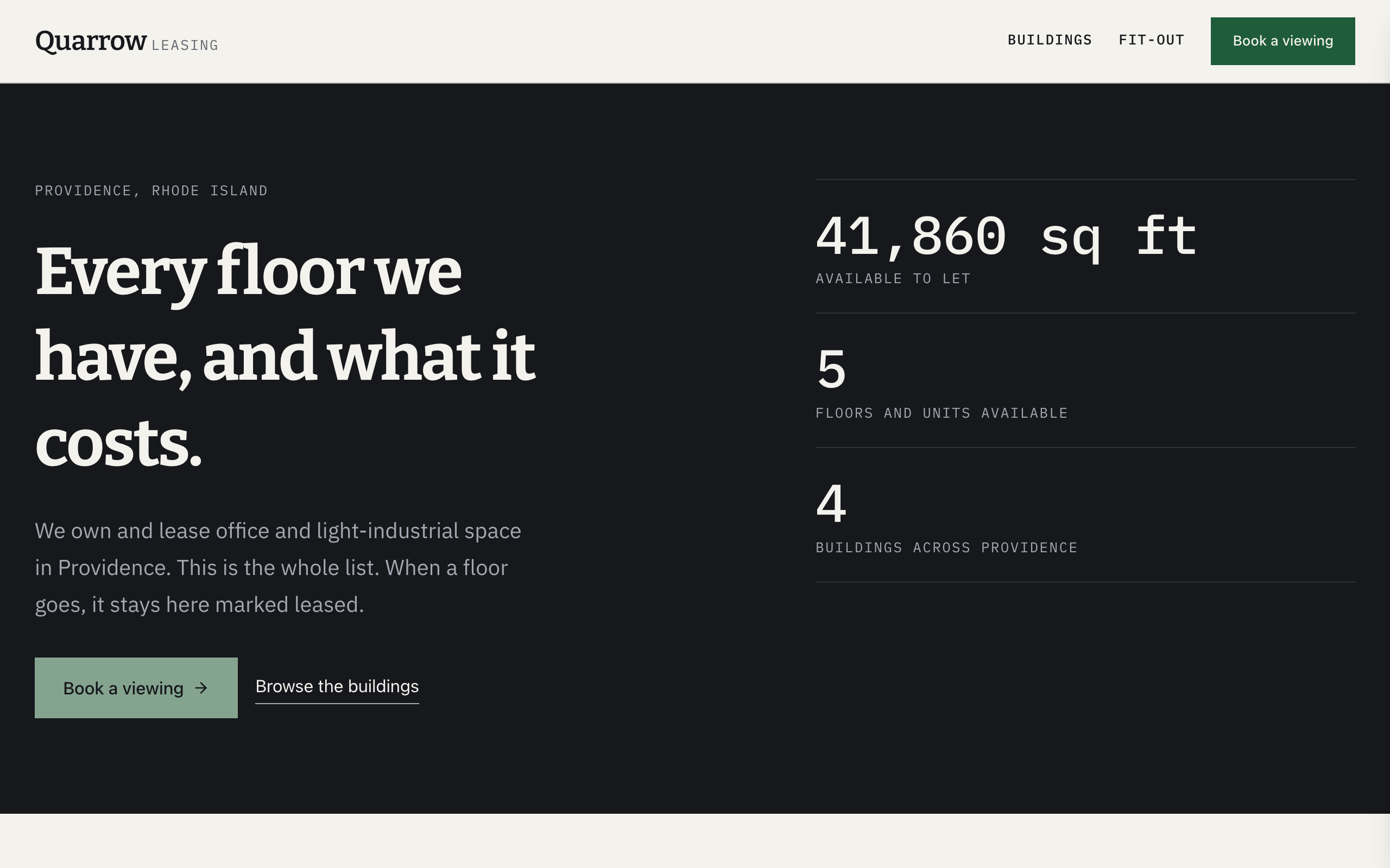
Riser
A commercial leasing site built as the document a broker actually keeps: the stacking plan. The whole availability schedule is a real table, full-bleed across the page, with every floor's status the loudest thing on screen — available, under offer, or leased and struck through. Warm paper ground, Bitter slab headings, IBM Plex Mono on every figure. Buildings are a collection, so marking a floor let on its building page is a three-field edit on one row rather than a page rewrite, and those pages stay true the week after launch. A before/after slider carries the fit-out story that photography alone cannot. Distinct from reyes (craft-luxury broker listings where the photograph does the selling), atrium (one pre-launch development capturing interest before anything exists) and foundry (a firm selling its team rather than its inventory).