
About This Template
Built for the company hiring page, not a recruiting agency
Hatch is the careers section for a funded startup that's hiring across engineering, design, product, and go-to-market. Every page addresses one audience — the candidate — and every conversion point is an application, not a lead form. Distinct from generic agency sites and from job-board landing pages.
A real open-roles surface, not a Notion list
The open-roles collection is the centerpiece. Roles live as content_items rows keyed by slug — the index page groups them by team (Engineering / Design / Product / Go-to-market) with status pills, location, and comp band visible up front. Each detail page renders the full role: about the role, what you'll do, who you are, plus a structured apply form (name, email, LinkedIn, portfolio, resume PDF, 'why this role?'). The form uses `formType: "application"` so the schema-aware Sheets dispatcher routes submissions to a dedicated tab.
Mission-led, not benefits-led
The top of the page is the mission and the values — not the perk list. Candidates who care about the work scroll for the role; candidates who only care about ping-pong tables self-select out. The benefits band ships concrete numbers (cash bands, equity bands, parental leave, learning budget, vacation) — comp transparency is a hiring filter, not a marketing line.
Launch in 9 Steps
Replace the company name (Hatch) and one-line mission everywhere
Update the founders / leadership names and avatar photos (currently 6 placeholders)
Replace the open-roles seed content with your real open positions (slug, title, team, location, comp, intro, role description, qualifications)
Update the comp bands and equity bands to your real numbers (or change to ranges if you can't disclose specifics)
Adjust the benefits band — parental leave, learning budget, vacation policy, healthcare — to your real policy
Swap the office locations (Brooklyn + Berlin placeholders) to your real HQ and hubs
Replace the press strip names or hide the section if you have no press yet
Wire the apply form to your hiring inbox at /dashboard/sites/<sub>/integrations — connect Google Sheets via OAuth and Google Drive for resume uploads
Replace the team-collaboration Unsplash hero with a real photo of your team if you have one
Hatch
Company careers page for funded tech / AI startups (Series A–C, 20–80 person teams). Deep slate navy + warm cream + coral accent, Fraunces serif on Inter — modern-tech-company register that reads as confident-but-human. Three pages plus role-detail (collection-driven): Home / Open roles / Life at Hatch / per-role detail with apply form. Conversion is candidate application (formType `application`, schema-aware Sheets dispatcher routes to its own tab). Distinct from `whitford` (law firm authority-formal) and `flagship` (agency / B2B sell) — this is a hiring page, not a sales page or a recruiting agency.
Free to use · No credit card required
Key Highlights
Built For
Related Templates
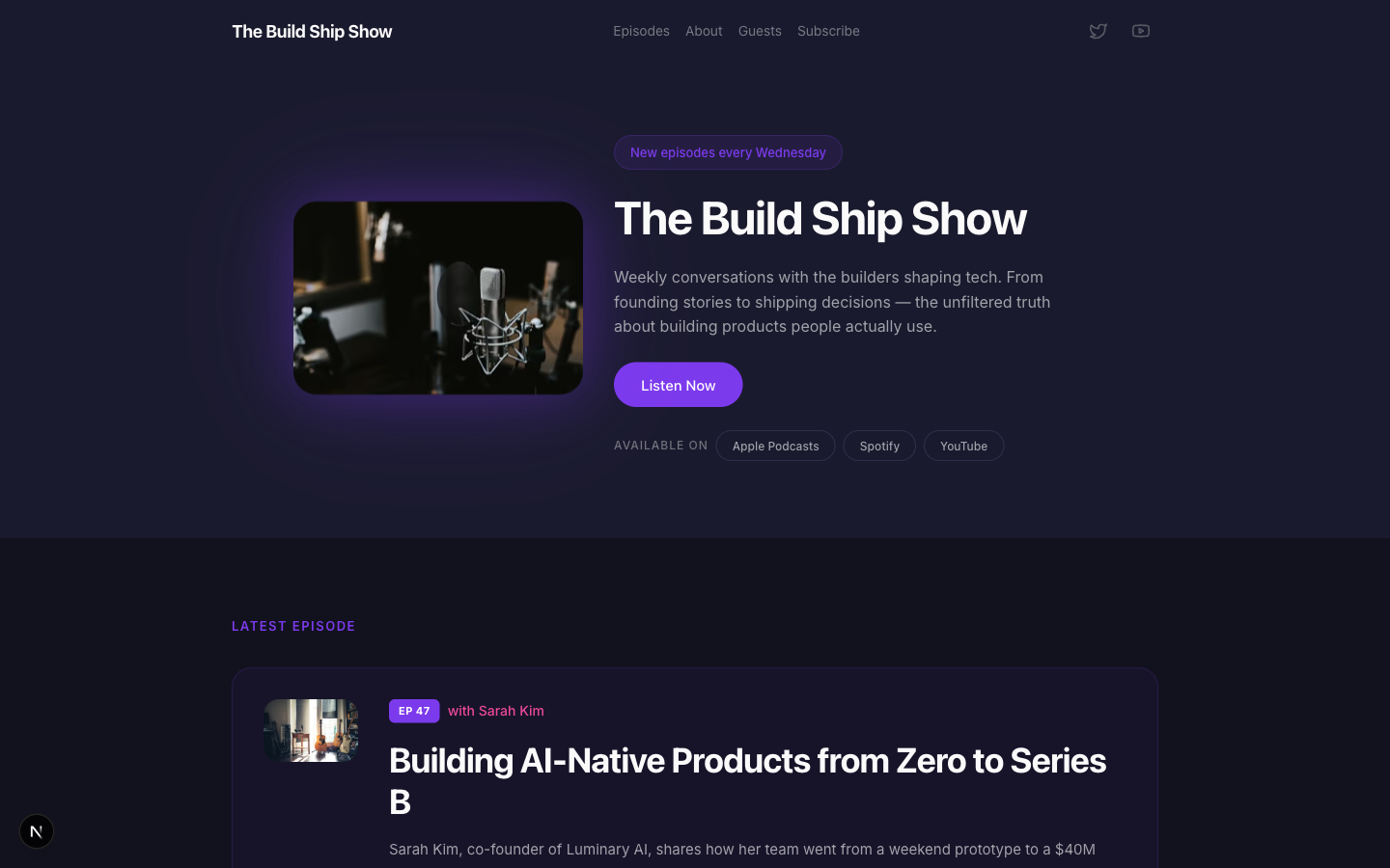
Airwave
A bold podcast and creator page with dark charcoal tones, electric purple accents, episode listings, guest spotlights, and platform subscription links — designed for shows that want to look as good as they sound.
Amber
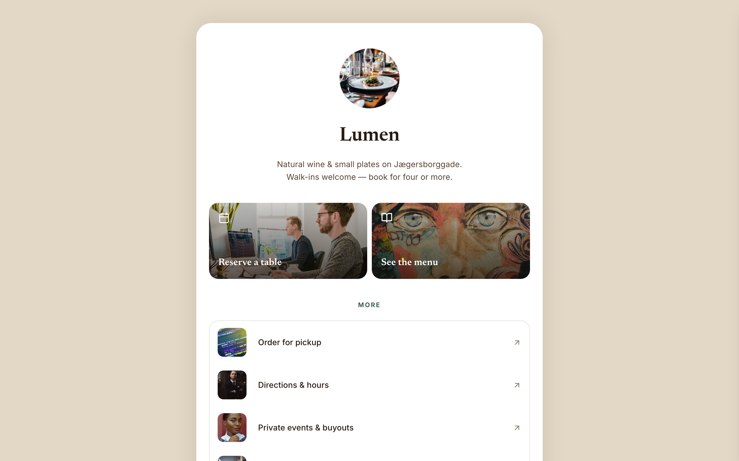
Warm hospitality link-in-bio for a café, wine bar, or restaurant — a faithful Linktree profile-card. A warm-sand page gutter with one elevated, fully-rounded ~600px centered white card; no header, no footer, and no email-capture section (a venue converts on reserve/menu/call). Ink-brown type, a bottle-green accent, Newsreader + Inter. Inside the card: circular logo → serif name → one-line bio → a 2-up photo-backed action pair (Reserve · Menu) → a grouped flat list panel with photo thumbnails → a social/contact row with a real tap-to-call link, then a horizontal 'on now' shelf of 3 Stripe items, and a short about block the card ends on. The action tiles ARE the conversion (menu-reservation).
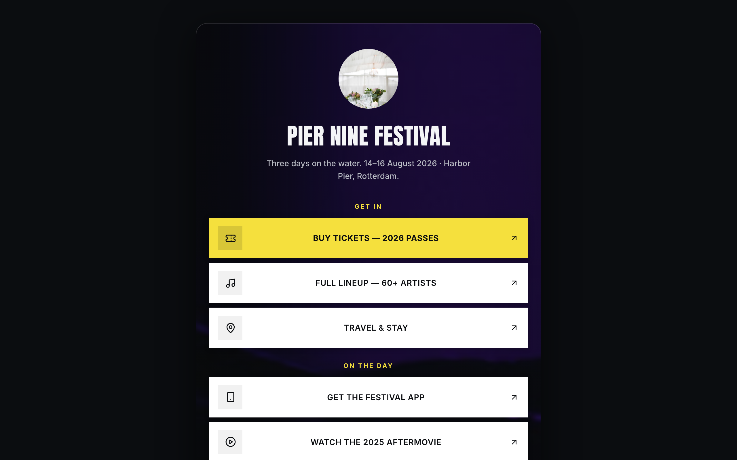
Arena
Brand/organization link-in-bio for festivals and live events — a faithful Linktree profile-card. A plain near-black page gutter with one elevated, fully-rounded ~600px centered card; the darkened event photo lives INSIDE the card. No header, no footer. Off-white type, festival-yellow accent, Anton + Inter. Inside the card over the photo: circular logo → bold condensed name → dates/location line → vertical stack of sharp white cards (square logo tile, 2-line label; the priority Buy-tickets card filled festival-yellow) → social-icon row, then a stacked passes strip with Stripe buy buttons, a short about block, and the inline presale-list capture the card ends on. The cards ARE the conversion (ticket-sale).